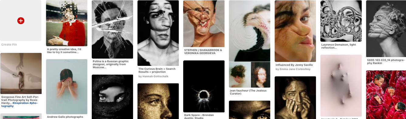
Freedom & Limitations
freedom
ˈfriːdəm/
noun
1.
the power or right to act, speak, or think as one wants.
"we do have some freedom of choice"
2.
the state of not being imprisoned or enslaved.
"the shark thrashed its way to freedom"
limitation
lɪmɪˈteɪʃ(ə)n/
noun
plural noun: limitations
1.
a limiting rule or circumstance; a restriction.
"severe limitations on water use"
2.
LAW
a legally specified period beyond which an action may be defeated or a property right does not continue.
Visual Representation
This Pinterest board further delves into more about what is meant by freedom and limitations and the different way it can be interpreted.
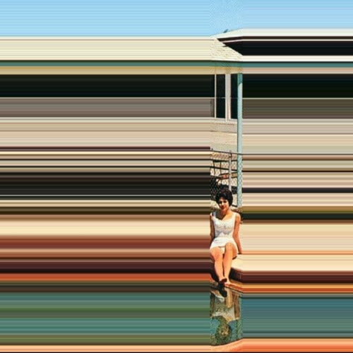
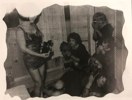
Alban Grosdidier
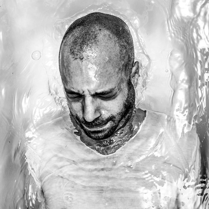
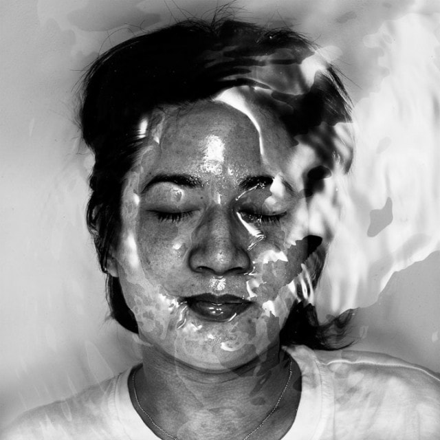
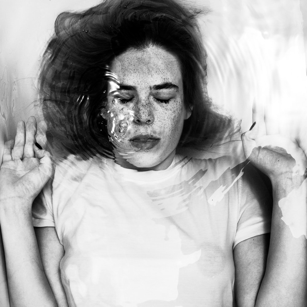
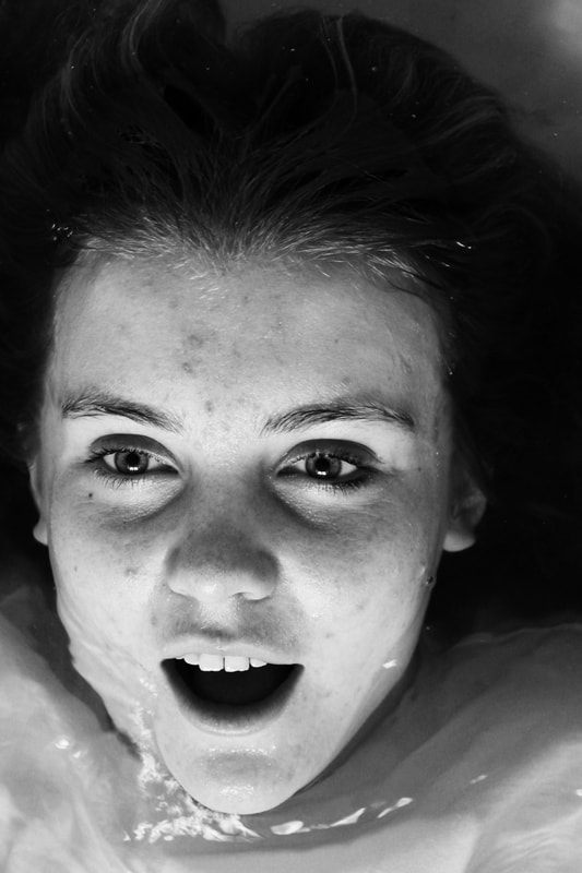
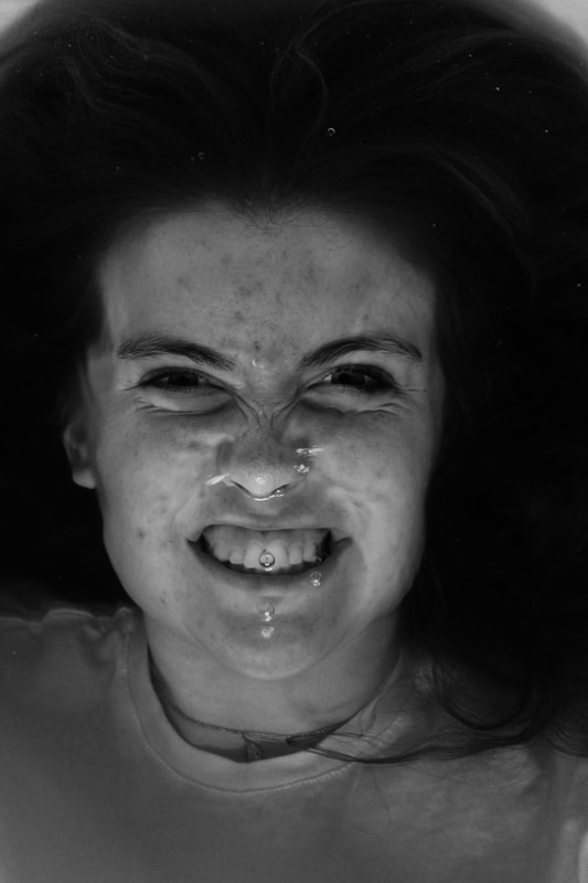
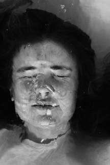
Alban Grosdidier is a French photographer born in 1989, living between London and Paris. He started his professional career in photography by collaborating to the editorial team of French anti-HIV festival Solidays in 2010; until 2013, he focused on HIV-focused movements, LGBTI groups, feminist activists and the event landscape in Paris. In 2012, his portrait series Drowning - a visual comment on big city life - and the subsequent street exhibitions in Paris became his first internationally recognised series. This marked the beginning of his career as a portrait photographer, with various collaborations in the music industry.
|
|
|
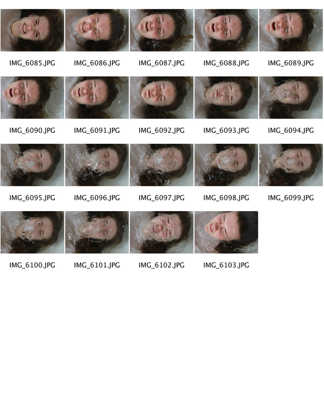
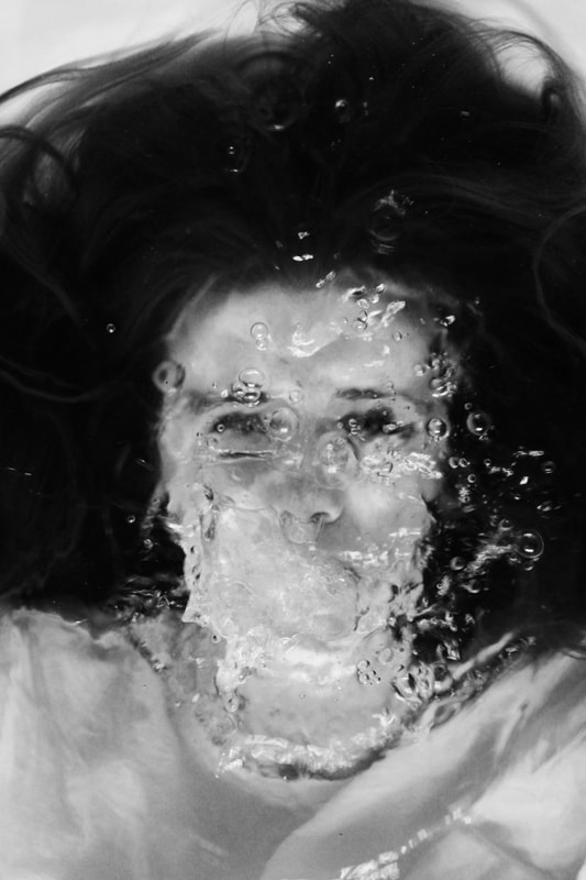
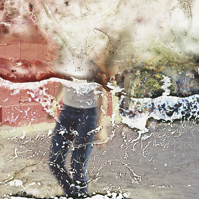
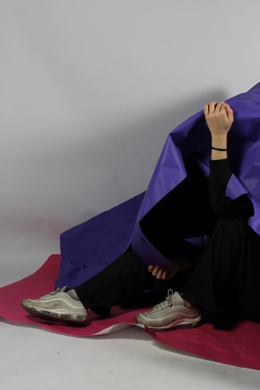
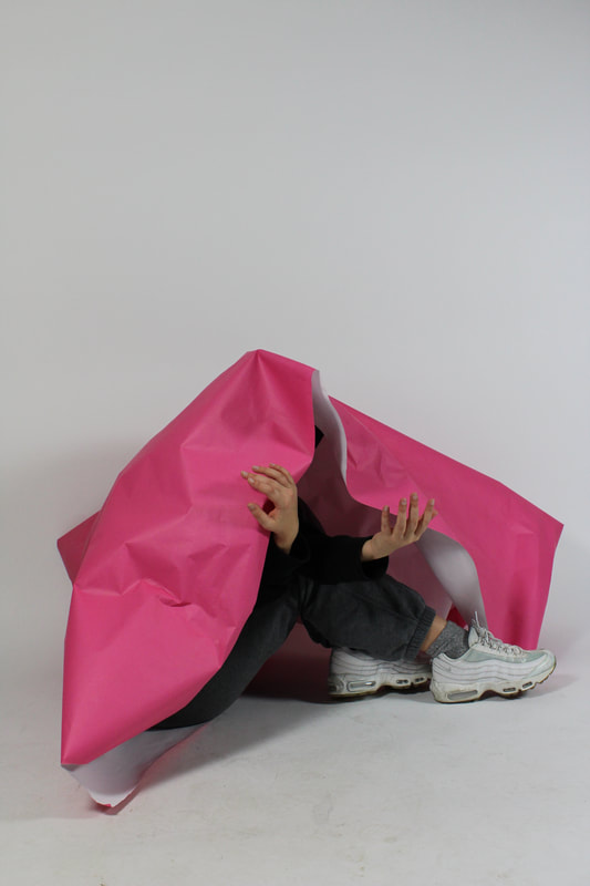
The images delve into the title of freedom and limitations because of two factors; the first being the perceived freedom of cities that Grossdidier focused this work on. Due to the hectic nature of the city that never sleeps the images captured a stressed yet closed of person against the ever moving and flowing water that represents the city. Another way these images can be depicted is through the freedom of water yet the limitations of the enclosed space of the bath. The addition of black and white editing within the photographs is effective due to the colours within the image being less significant so that they emotions within the photo are seen clearer.
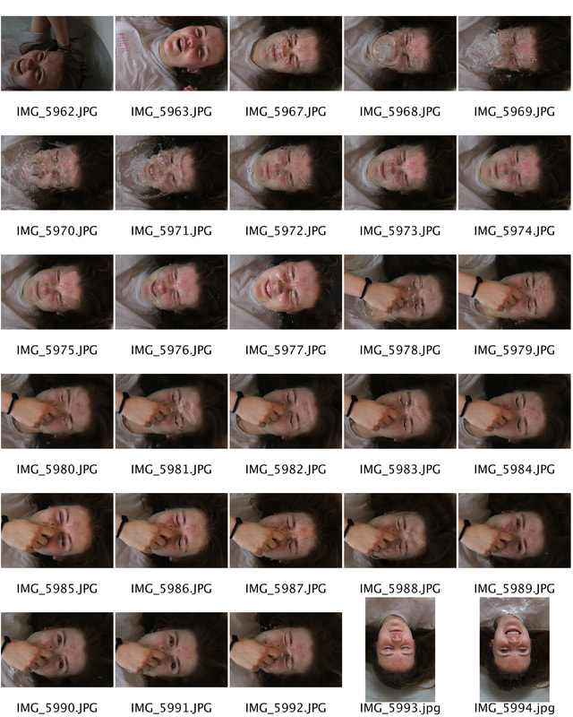
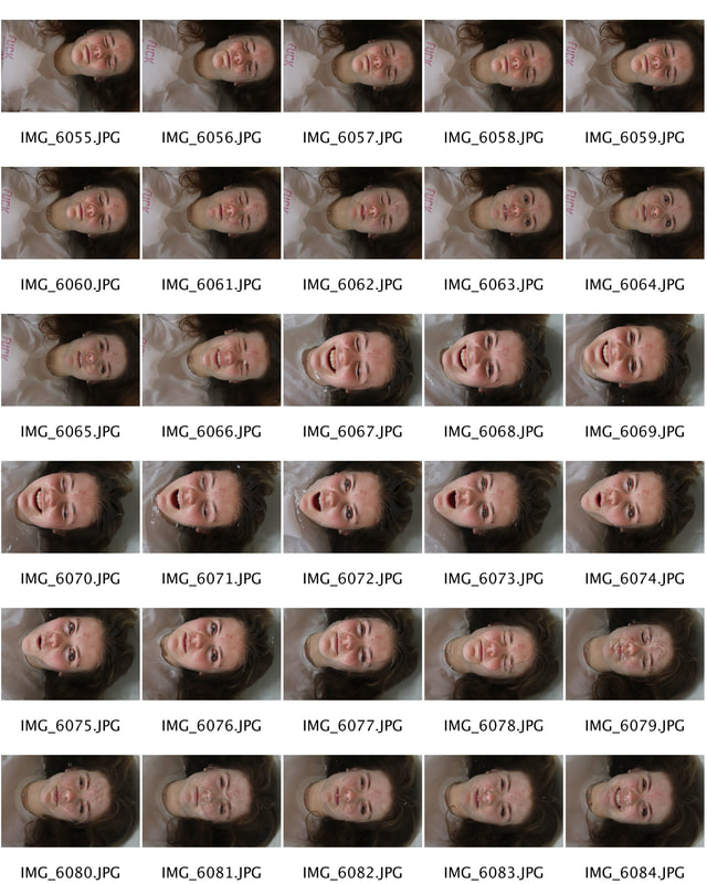
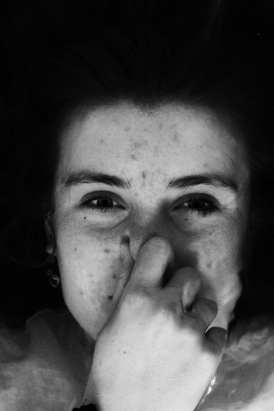
|
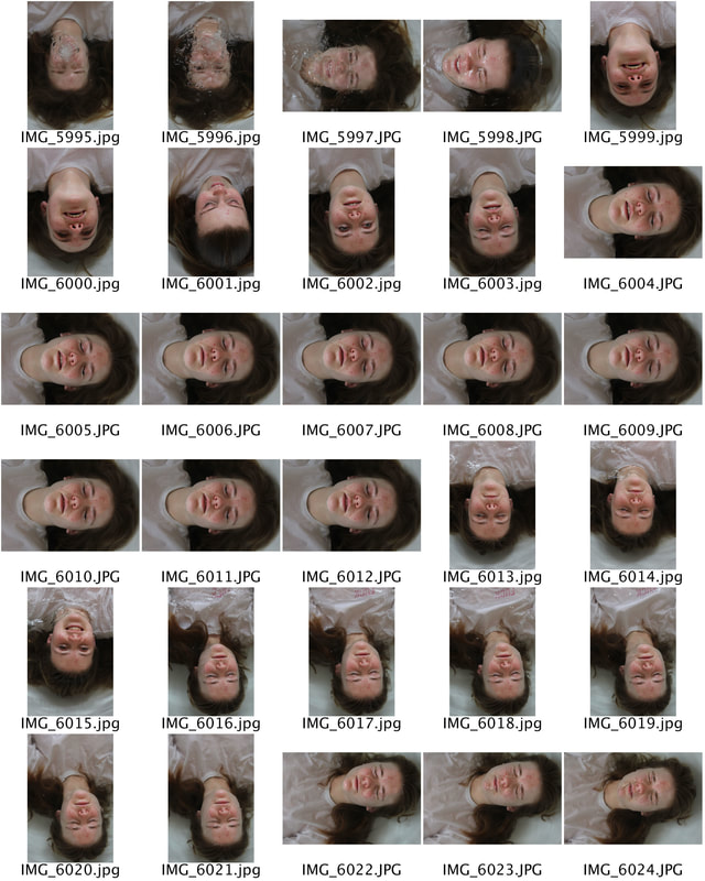
|
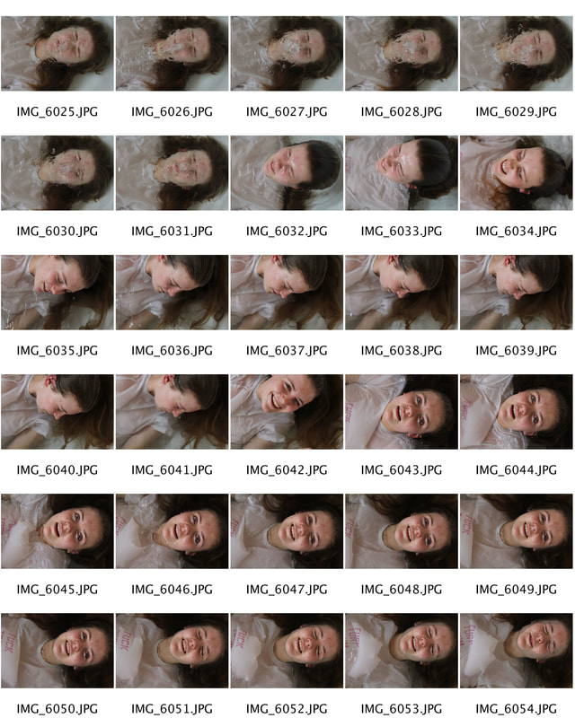
To photograph these images I asked the subject to go into the bath with a simplistic white T-shit on much like Alban Grossedier, I think this was an effective method of clothing as it is gender neutral and doesn't add much context to the subject. It further doesn't allow the subject to be as vulnerable as she may seem if nude. Next, I simply told her to go under water without any instructions - this allowed the photographs to be representative of her reaction to water and the camera. I think this was effective as the images didn't come out posed or fake. Finally, I edited the image in black and white so that there were no distractions from the water ripples and the subject.
|
|
|

|
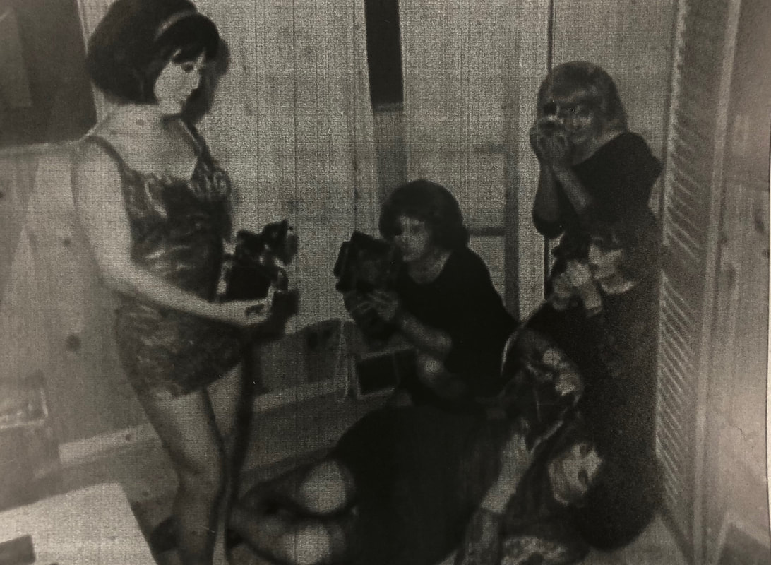
Artist & Me
|
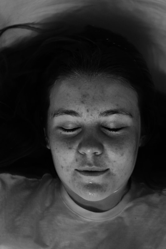
Similarities between mine and Grosdidier work included the effect of submerging the subject completely underwater - I felt that this was effective as it created a distored image of the subjects face due to the ripples within the water as well as the bubbles that emerged due to them exhaling. Additonally the use of the white t-shirt was effective as it made the concentration of the image purely on the face of the individuals. Differences within our work were due to the editing process although we both edited the photos in black and white in comparrison his images had a higher contrast. I think that this was effective as it allowed intricate details of the photos to be more visible.
|
|
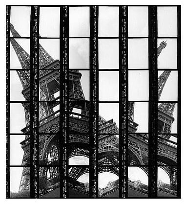
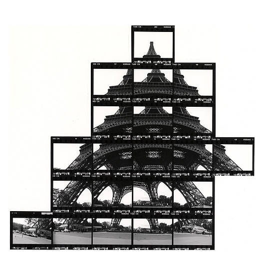
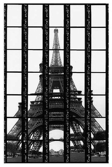
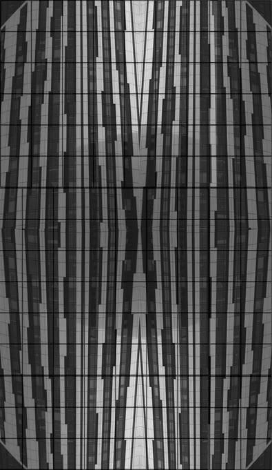
Thomas Kellner
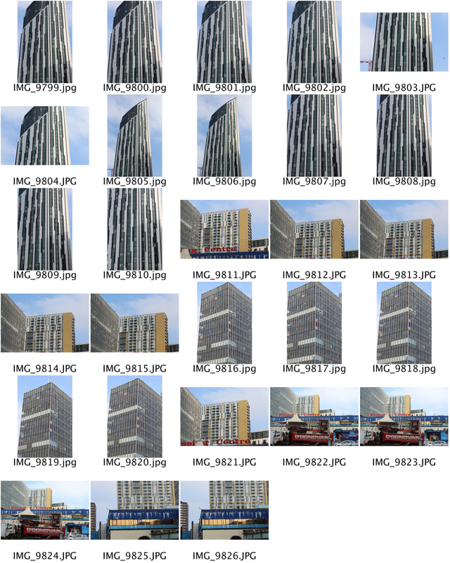
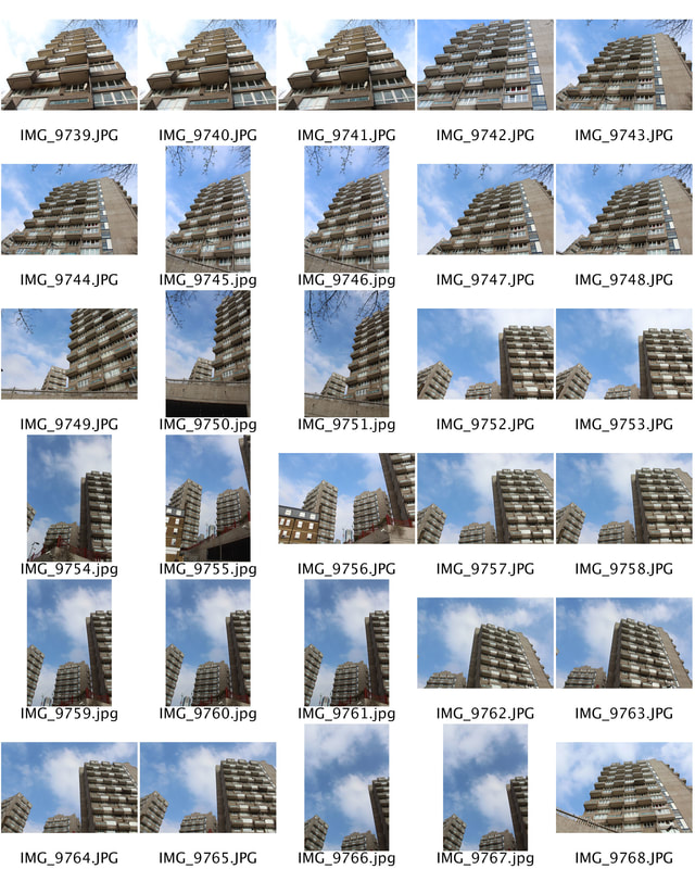
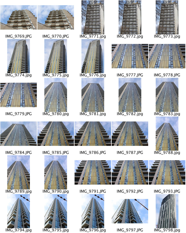
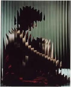
German photo artist Thomas Kellner is known for his photographs of seemingly dancing architectural exteriors and interiors of tourist attractions from all over the world. Even though his photographs show popular motives that have been mass-produced, his work is unique due to his new artistic method called “visual analytical synthesis” in which he does not take one shot but several thoughtfully planned ones in order to create a picture out of contact sheets. His work is often referred to Cubism considering that his creative process includes a construction but the results resemble a deconstruction. Thomas Kellner’s works imitate the wandering look of the eye, showing us segments of the total which come together as one image. Therefore his photographs do not deconstruct architecture but reconstruct our view on it. At the same time his work also reflects the flood of pictures we live in nowadays and furthermore contains the question of decaying cultural values.
|
|
|
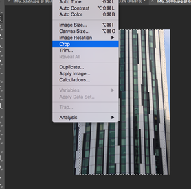
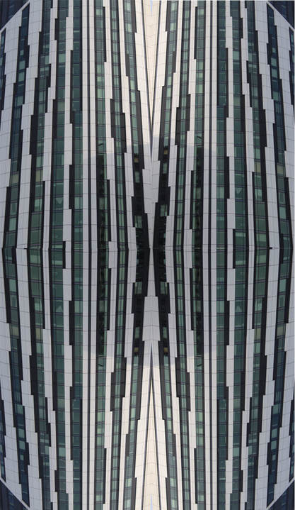
I visited Elephant and Castle where I knew both high rise council estates and modern office buildings were. I photographed them at a similar angle to Kellner, a worms view.
|
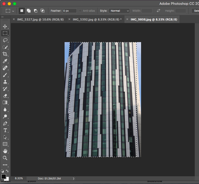
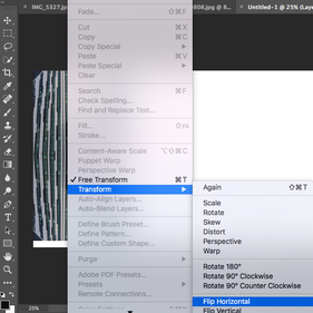
To edit the images I cropped the photo so only the glass windows and architecture was in the image and none of the sky or surrounding objects such as trees. Next, I copy and pasted the cropped images onto a new blank sheet and placed it onto the sheet four times so all of the images connected as they all had the same base, I flipped the images and rotated them on photoshop where necessary so the four separate images merged together as one.
The final outcome of this editing process creates and almost bulging effect within the middle of the image and additionally alludes to a rounded building. The image |
also shows no end or beginning to the building.
|
|
|
|
|
|
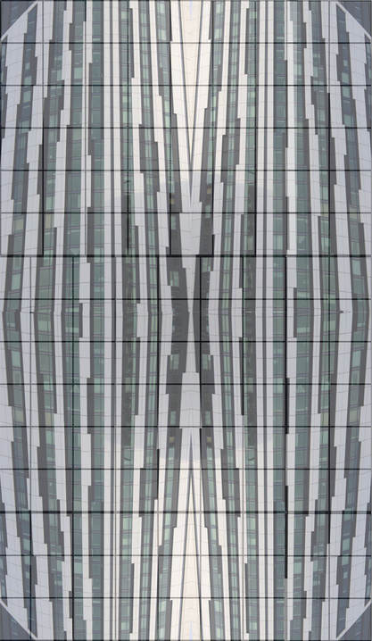
Here I added a grid to the image to create the contact sheet effect that Kellner uses within his work, whilst additionally editing the images into black and white.
|
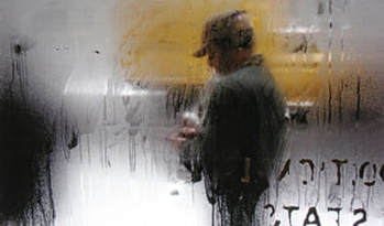
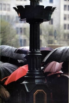
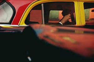
Saul Leiter
Saul Leiter was an American photographer and painter, one of his focuses was street photography. He took photographs through rainy car windows and fogged up glass to only give a glimpse of the people he photographed, the focus of the image allows those looking at the photo to create there own impression of those they are viewing, and also displays the barrier between the photographer and the subject. Contextually, Leiter lies between modernism and post modernism. With his photographic career stemming from the 40's; visually his imagery is formatted in a documentary style, yet with closer expectation we see themes of alienation and isolation.
|
|
|
The first photograph creates a eerie and mysterious effect, due to the lack of context through the use of the misted glass, as well as the lack of range in its colour palette. Furthermore, the offset subject gives and unsettling atmosphere to the image due to the unconventional angle that is very unseen in portrait photography. The composition of the second image, presents order within chaos. Initally we see that the photograph has been taken in a economically stable area, with a crowd of people going to work. The photographer then mirrors this creating a compositionally harmonious image, with the grid like format, as the black lamppost performing as a masculine divide as well as the contrast of the bright white buildings and the stark black umbrella's. Yet this is opposed with the sea of black umbrellas and the one vibrant red umbrella, symbolising creativity in an otherwise controlled environment.
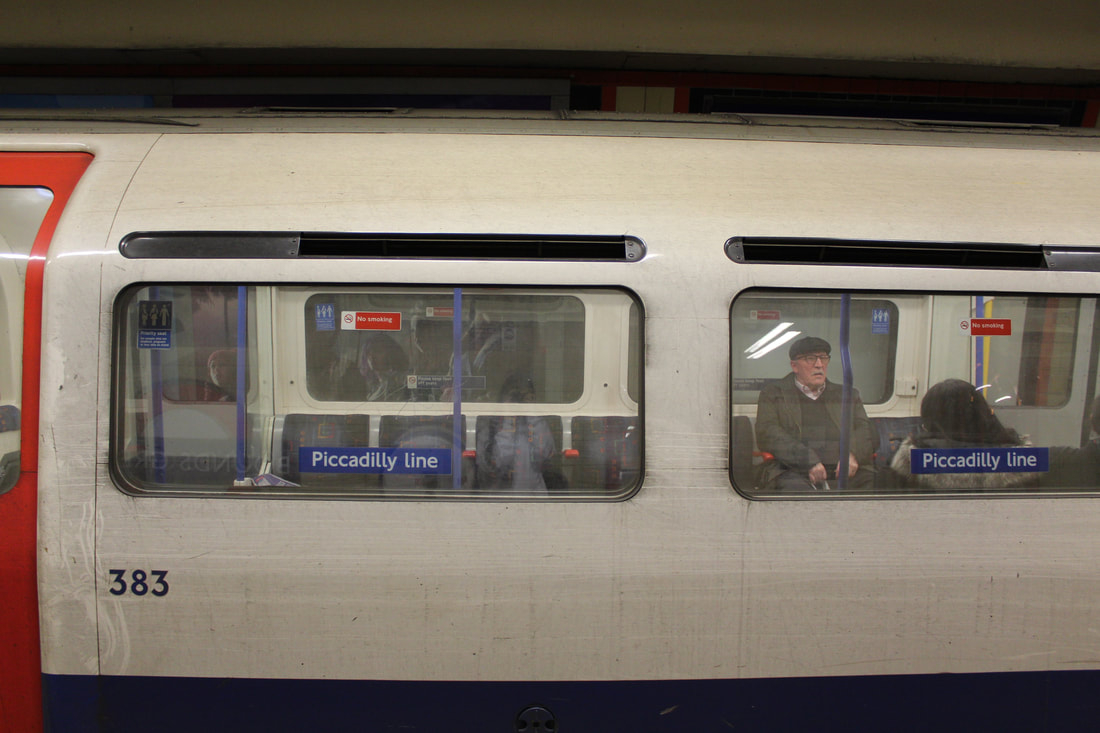
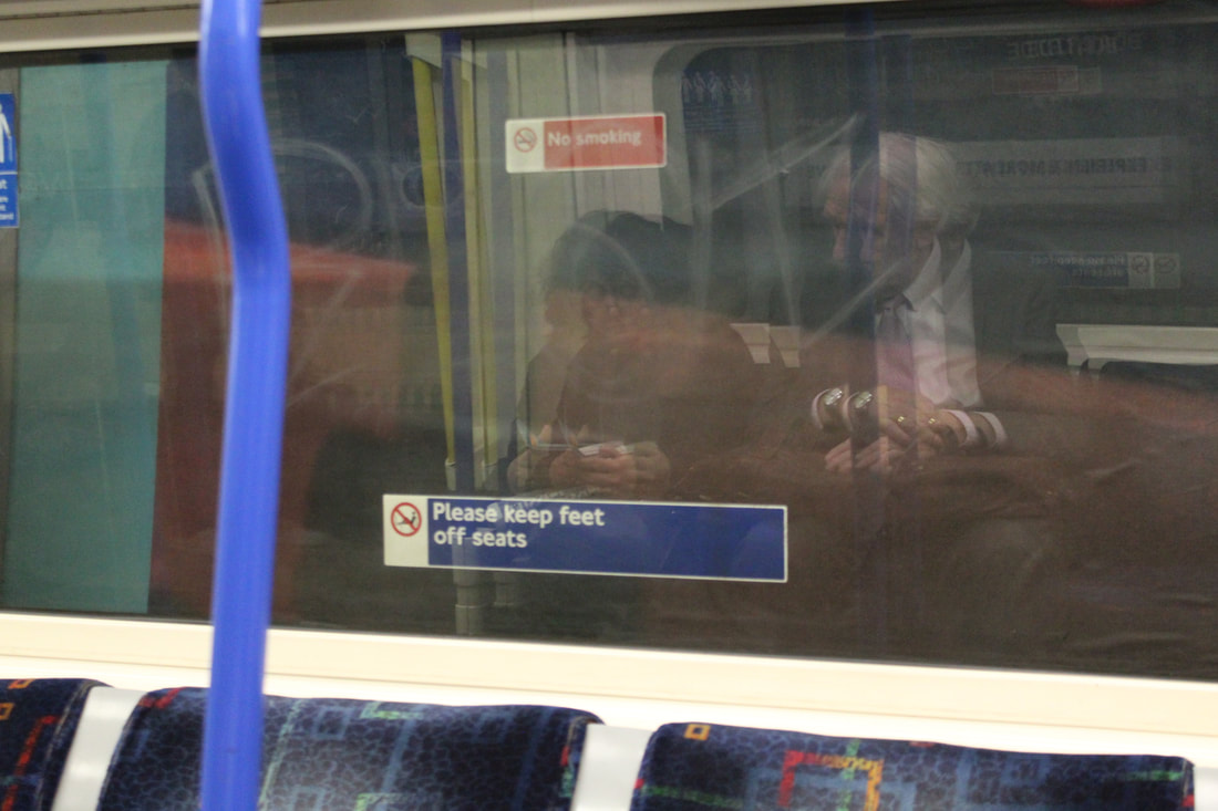
When recreating Leiters work I felt that his use of the mist of glass added mystery to his photographs additionally displayed the barrier between the photographer and the subject. Due to the glass of the tube being unclean a addition of mystery was given to the images yet the glass was clear enough for the subjects to be seen through the material . As well as this, the use of some of the subjects not being covered by the transparent barrier in the last image added both more depth and some clarity to subjects which others lacked. I felt that the combination of both textures within the image was effective as it displayed both the simplistic natural portrait whilst also including barriers from the photographer to the subject.
Photographers Gallery
4 Saints in 3 Acts: A snapshot of the American Avant-garde
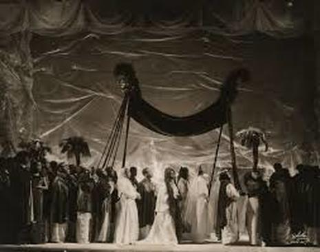
This exhibition presented for the first time photographs and ephemera from the experimental American opera Four Saints in Three Acts. Photography was central to the operas construction, recording and representation, and profoundly influenced its public and critical reception. Photographs depicted key scenes from the opera's unique performances, and portrayed members of the production and the famously all-African American cast, which comprised performers drawn from the choirs, churches, music halls and orchestras of the Harlem Renaissance. An unprecedented range of photographers recorder and contributed to the operas contested aesthetic and political intersections of race, class and gender. This exhibition presents many previously unexhibited photographs across different genres, including works by Lee Miller, Carl Van Vechten, George Platt Lynes, Thérèse Bonney, Peter A. Juley and the photographers of the White Studio. In many cases these photographers offer the only surviving visuals documentation of performances and cast members.
|
The first three images I am going to talk about where all placed together within the gallery, they were all images of ACT TWO within the performance. The focus of all of the images within the gallery surrounds the all-African American cast as this was written in 1927-8, this was unheard of and therefore something to document, making the performance more acclaimed. The first photograph captures the cast all dressed in white, as within this scene there is the 'Dance of the angels'. White is associated with light, goodness, innocence, purity, and virginity, and could potentially be a metaphor for the freedom and choice white individuals within society had at the time in contrast to the racism black individuals faced. Especially as this was the first break through act for black individuals. In contrast the simplistic black fabrics background has connotation with misery - this may be symbolic of the real life for such individuals as this is merely a performance and not reality. Therefore meaning black individuals will still face oppression even though this has allowed them more freedom.
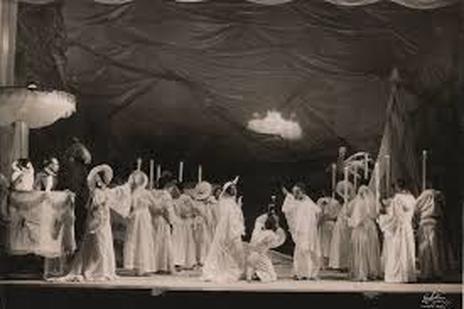
This image is captioned 'How many windows and doors and floors are there in it". Carrying on with the theme of freedom from oppression. The words within that caption symbolised to me the gateway out of the injustice African-Americans faced. In a lot of literature a window is a portal; allowing your thoughts to roam around freely. Doors symbolizes the transition and passageway from one place to another and floors may indicate the middle ground that society has had to meet due to the cruelty that many black individuals have had to face. This may be a way of portraying how the civil rights movement has changed life swell as the way this performance and literature will change the lives of many African-American people. Within the image there is an arch - potentially repressing the door mentioned in the caption, yet an arch often has positive symbolic associations including strength, sturdiness and the ability to carry enormous weight. Again this may be representing the strength the black commuting may have to keep fighting within the civil rights movement.
|
As the writing of the play and the performance went on during the African- American civil rights movement it was extremely prominent within the act. Between the 1920's and 1930's left-wing political activists in the labor movement made some progress, however, in bridging that gap a member of the Socialist Party in American, took the leadership of the 'unexperienced' Brotherhood of Sleeping Car Porters (the first labor organization led by African Americans to receive a charter in the American Federation of Labor). The union faced opposition not only from the Brotherhood Company, but from the press and churches within the black community, many of whom were the beneficiaries of financial support from the company. The union eventually won over many of its critics in the black community by wedding its organizing program with the larger goal of black empowerment. The image is captioned "How many saints are there in it. There are very many many saints in it." This speech within the performance, may have reference to how the 'saints' created the benefits of finical support for the black community. As if the Socialist Party of America, were the four saints for black lives within the 1920's and 30's, as they allowed them the freedom in which they deserved. 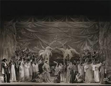
|
|
This image was taken by Carl Van Vechten in 1934 he was an American writer and artistic photographer who was a patron of the Harlem Renaissance. In its time it was very unusual to see a woman of colour displayed in this sort of way, as African-American women were seen to society as a 'white mans worker', to take care of their children and be the home maker of their homes. Although the 19th Amendment was still in effect, black women were still not allowed to vote. Only white women were allowed to have a voice within politics. This image is even more unusual as dressing feminine was against the social rules for black women. Vechten fought the social norms and values as he felt they breached human rights. The model to wears her natural hair, embraced her sexuality much like white women and is dressed in a glamorous style. I think that is image is extremely effective as it contrast with the social rules that society and white men had set for an entire social group, purely due to their gender and ethnicity - an ascribed status - something that they were born with, and have no choice about. The positioning of the model portrays how she may have 'turned her back' to the maltreatment of black women as she fights the norm and illustrates the discrimination they have had to face. |
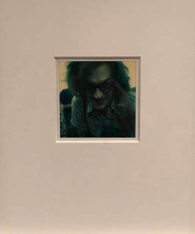
Instant Stories. Wim Wenders' Polaroids
This exhibition offers a rare opportunity to see the personal and previously unseen Polaroid work of Oscar-nominated filmmaker, Wim Wenders whom was born in 1945, in Germany and provides a singular insight into the artists though process, preoccupations and aesthetic inspirations. The is the first time Wenders has shown a selection of the thousands of Polaroid taken both on and off locations between the late 1960's and mid 1980's. Wenders fascination with the Polaroid stemmed from his early adoption of the format while he was learning the craft of film-making in the late 1960's.Polaroids operated as a visual notebook - a way of testing out frames and ideas - but more than that they offered him a kind of liminal space the intention and the outcome. Instant stories presents over 200 images encompassing portraits of cast and crew, friends and family, behind the sevens, still - lives, street photography and landscapes. The photographs are accompanied by mintages from Alice in the Cities (1974) which featured the prototype of the first SX70 instant Polaroid camera and the American Friend (1977).
"I used all sorts of Polaroid cameras over the years. In the beginning, you could only photograph in black and white, and the colour stock was produced as well. I would stick pictures under my armpit, to keep them warm while they were developing and I'd keep an eye on my watch. Holding them there for too long would produce dark pictures, too short a time would make them look pale and lacking contrast. I remember doing lots of things, like smoking, writing, driving or talking on the phone with both arms closely held to my body. Then depending on the type of film, you'd peel of the cover. There was always a certain surprise involved and a heart beat of suspense".
Within the exhibition polaroids were given a number as they were photographed in chronological order, with the addition of a short caption that allowed the reader to understand the context of the image, whilst also allowing them to make assumptions as it was not in that much depth.
|
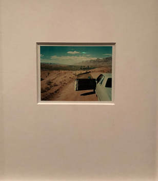
1) Introduction
This is the first image within the exhibition, it shows Wenders himself looking out of a car window. This is one of two images within the exhibition in black and white. This may be because monochrome photos let the subject speak for themselves. They are raw, stripped back, honest and they show the true person within the photograph. The photograph is titled 'Introduction' for potentially two reasons - simply is the first photograph in the gallery. Yet, it is also the introduction into his life surrounding photography. His introduction into the art form. This is exemplified by the way he is looking out of the window as if he is admiring another member of societies life, much like we are his. The use of his side profile within the picture, paints the idea that Weber is showing one side of his life style within the gallery, and that this may not be an accurate representation of his reality. On the other hand due to the use of black and white film within the photo this may be the more raw and realistic side to his life, which is less glamorised than his 'famous' life which is portrayed through the media - as he is a well known filmmaker, playwright and author. 4) Looking for America This image within the gallery, shows highly stacked Campbell's soup in what looks like a supermarket. Connecting the image to the caption, this is Wenders greeting into America as he was born in Germany. Not only is campbell soup an iconic and well known American brand, therefore being a symbol of americanism. American artist, director and producer Andy Warhol created an acclaimed image of the soup company. This being of significance due to the country of origin being America, where Wim Wenders journey begins but furthermore heavily connecting to his artistic journey as it resembles Warhol's work. Additionally, the image only contains the branded soup with nothing else within the photograph. This repetition grabs the attention of the audience and draws them into the image. Repeating the cylinder shape throughout the picture creates instant composition, as well as this the lining of the food all up creates a striped effect of red and white. This is the majority of the American flag and may be a metaphor for his finding of America as he has recreated the flag, which embodies hardiness and valour, through the red colours, and purity and innocence through the white. |
|
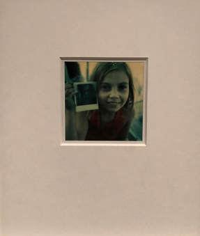
11) Alice in instant wonderland
These selection of images capture Wim Wenders' and whom I assumed to be his daughter on the top of the empire state building, the first photograph is Alice looking out on the skyline of New York City. Wim captures her taking a photograph. As this is the first photo within the collection that displays Alice it is almost as if she is entering into his photographic journey. This is amplified through her taking a photo as well as it being clear she took the portrait of Wenders in the second photo, as she holds it up proudly in the third. Again these images portray the artists journey as a photographer, as he allows more personal aspects of his lifestyle into his photography, such as his children. He is therefore displaying more meaning within his images, painting a picture, much like Alice is holding up.
Later I noticed, Wenders directed a film titled 'Alice in the cities' - Alice being the images in the photos below. Within the screen play a German journalist and a girl left in his care embark on a search for the child's grandparents. This further leads me to believe this may have been part of the filming process or potentially a form of method acting for Alice as this film is also in New York.
|
|
|
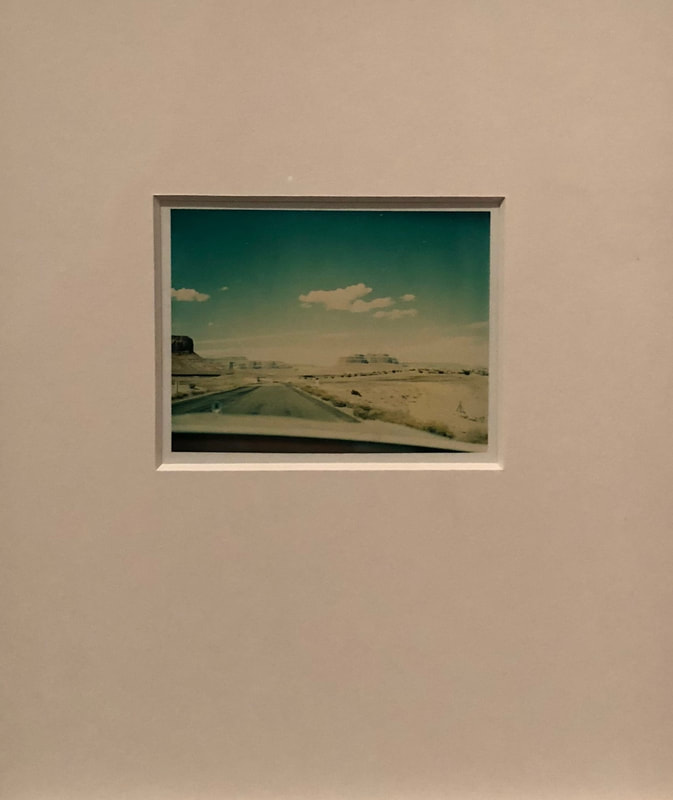
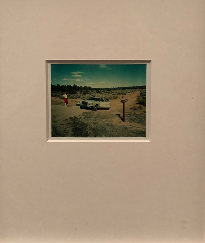
22) Overexposed
These images were taken in the Valley of the Gods in Utah in 1977 which is a scenic sandstone valley. In this year Wenders directed a film called The American Friend. Within the movie an American expatriate treats Hamburg, Germany, like it's the Wild West and makes a living by hawking art forgeries, but decides to take part in a murder plot for extra cash. The plot has small connections to Wenders life that we have been presented with through out the last images within the gallery, such as America and Germany the two locations he has been known to live. The three images show a scenery that replicates the Wild West, therefore giving an indication that the photographs were taken on set. The caption examines how the photographs are over exposed. This may me a method of how Wenders is literally exposing his life style and personal timeline to the media, and within this gallery. Potentially over exposing his life to the world. As the definition of over exposed is exposing too much, especially to the public eye or to risk. Yet, these image are additionally over exposed within photographic terms as too much light has hit the image, causing it to have a white wash.
These images were taken in the Valley of the Gods in Utah in 1977 which is a scenic sandstone valley. In this year Wenders directed a film called The American Friend. Within the movie an American expatriate treats Hamburg, Germany, like it's the Wild West and makes a living by hawking art forgeries, but decides to take part in a murder plot for extra cash. The plot has small connections to Wenders life that we have been presented with through out the last images within the gallery, such as America and Germany the two locations he has been known to live. The three images show a scenery that replicates the Wild West, therefore giving an indication that the photographs were taken on set. The caption examines how the photographs are over exposed. This may me a method of how Wenders is literally exposing his life style and personal timeline to the media, and within this gallery. Potentially over exposing his life to the world. As the definition of over exposed is exposing too much, especially to the public eye or to risk. Yet, these image are additionally over exposed within photographic terms as too much light has hit the image, causing it to have a white wash.
|
|
|
|
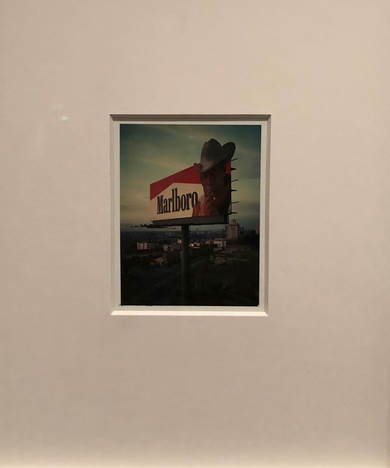
26) Dead man smoking
This image captures Marlboro cigarette advertisement. Indicating that this image was taken before the ad ban due to the understanding that they had the potential to cause cancer. Much like the images in the collection 'Overexposed' the photograph has a Wild West theme to it due to the cowboy within the advert. The American cowboy represented in this ad is arguably without a doubt the cornerstone of Marlboro’s marketing campaign to attract a male audience. The audience is presented with this image of a rugged cowboy who is to represent the common man. Above all, the American cowboy stands as symbol of masculinity and American tradition. Since, their first appearance in early 19th century, people have perceive the cowboy as a figure that represents masculinity. This is mainly attributed to the countless stories in books, films, and TV shows that depict their lifestyle as dangerous, reckless and tough in nature. This representation of their lifestyle is associated with the masculine characteristics that the public come to know them for. Notably they are perceived as great horseman, independent, hardworking and brave individuals |
|
who help build this country. As a result, the “Marlboro Man” campaigns adopted the cowboy as their figure to represent the “masculine” man. The addition of the caption - dead man smoking. Examines the change in societies view of how smoking used to be a symbol of power and masculinity yet the societal norm has changed to that of a deathly addiction.
|
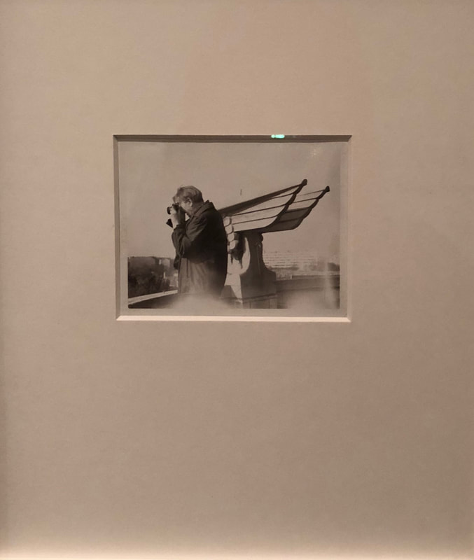
33) Directors of light and shadow
As Wenders himself is a director these images portrays the positives and negatives of his occupation. The light being the opportunity that his job has allowed him to gain - within the first image this can be shown through an individual taking a photograph. Almost an homage to the gallery in particular as he presents how becoming a director has allowed him to further his occupation into photography and has entered his work into The Photographers Gallery. Additionally working full circle with the first image as it |
|
|
is the only other photograph within the gallery thats in black and white. Presenting the raw realities of his job, leading into the last image within the gallery.
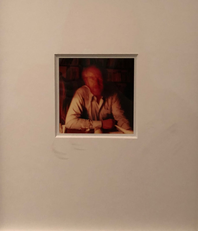
The final image is taken with a low shutter speed as the subjects features aren't clear and his movement within the photograph is captured. This section of the imagery portrays the shadows. This again presents the over exposed nature of his work, and can be compared to shadows as they are not the exciting aspects of his life style that are shined light on within the media. Due to the unclear features the assumption can be made the spotlight has created a heavy weight on his shoulder and has potentially led to madness or uncertainty within his mind. Furthermore, the central composition of the image can represent how he may feel restrained within his nine to five, as he has to follow some sort of order. Yet the shutter speed, change show his creation within the constrained.
The final image is taken with a low shutter speed as the subjects features aren't clear and his movement within the photograph is captured. This section of the imagery portrays the shadows. This again presents the over exposed nature of his work, and can be compared to shadows as they are not the exciting aspects of his life style that are shined light on within the media. Due to the unclear features the assumption can be made the spotlight has created a heavy weight on his shoulder and has potentially led to madness or uncertainty within his mind. Furthermore, the central composition of the image can represent how he may feel restrained within his nine to five, as he has to follow some sort of order. Yet the shutter speed, change show his creation within the constrained.
Movement
Philippe Halsmann
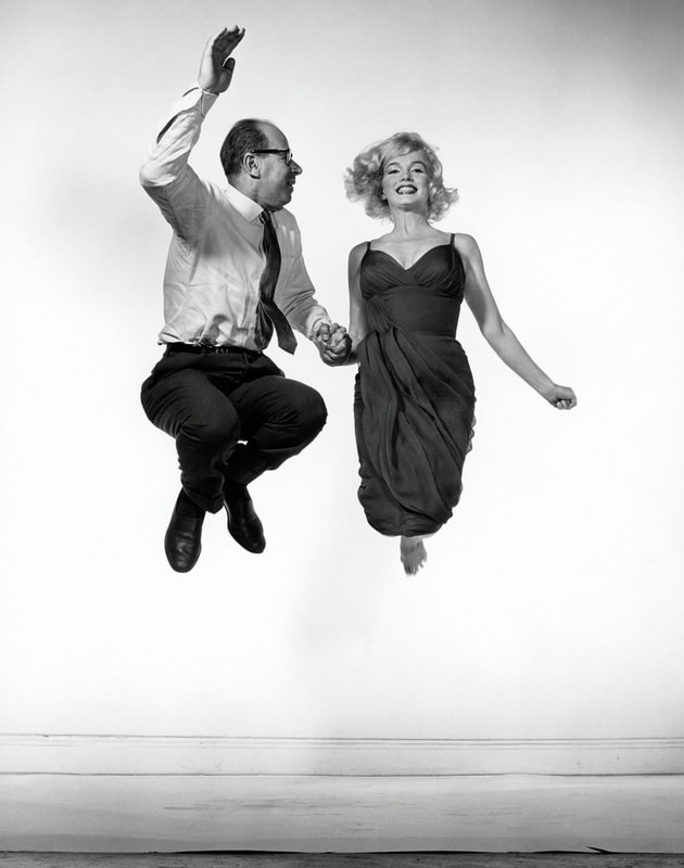
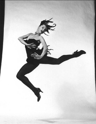
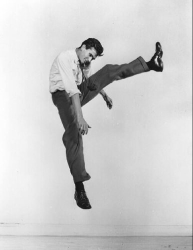
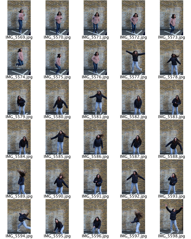
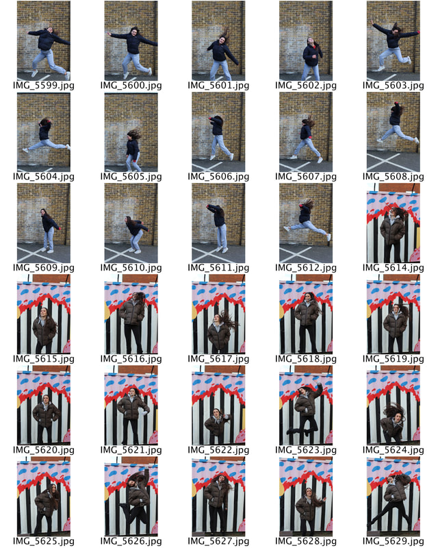
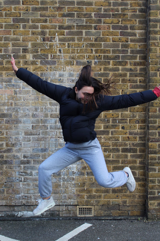
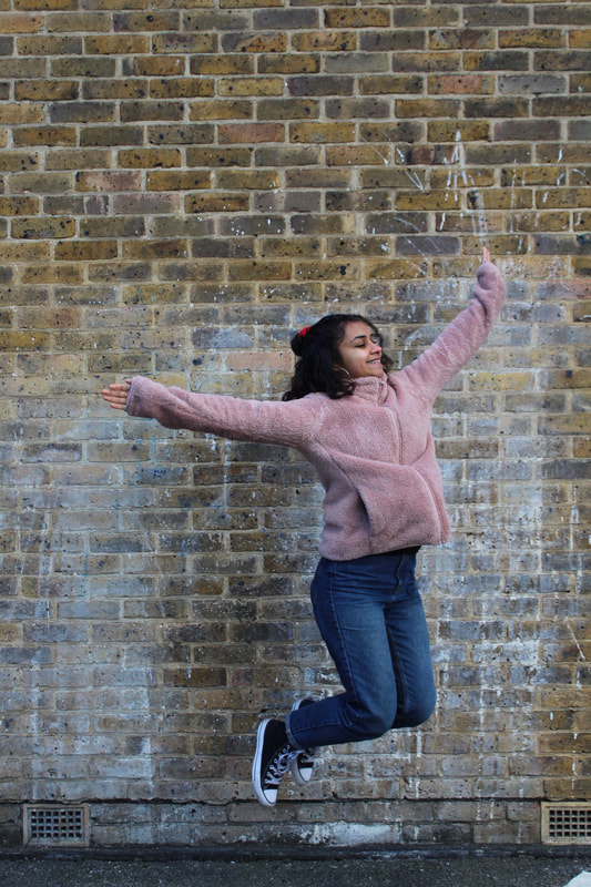
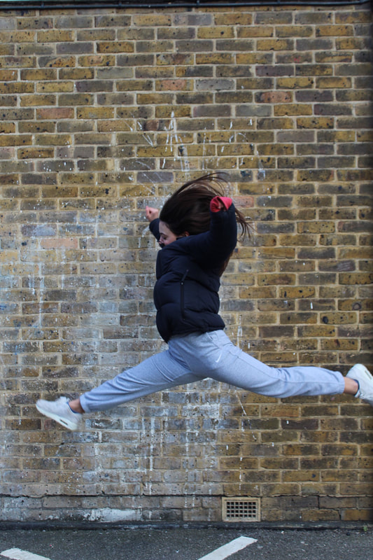
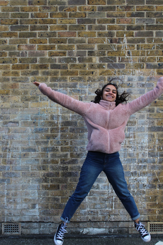
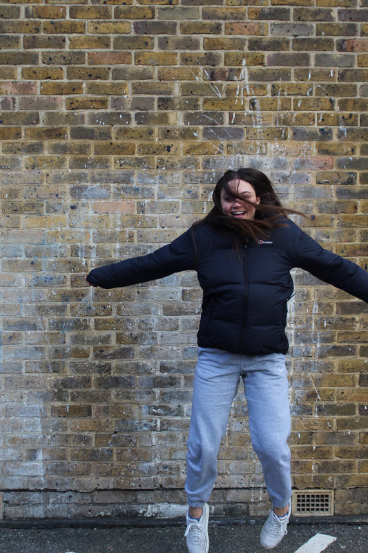
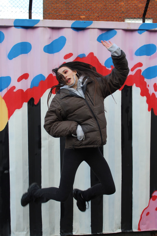
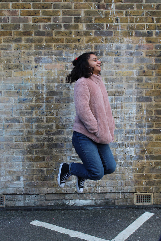
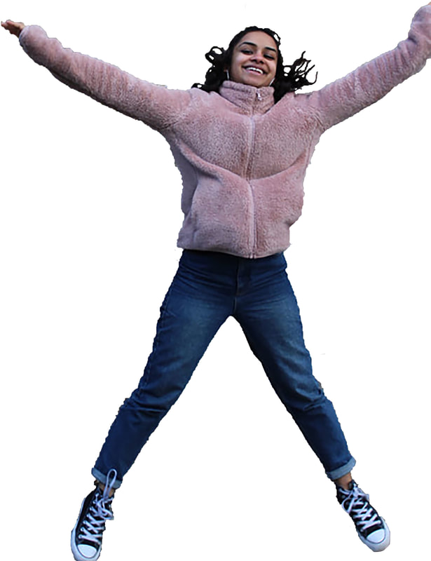
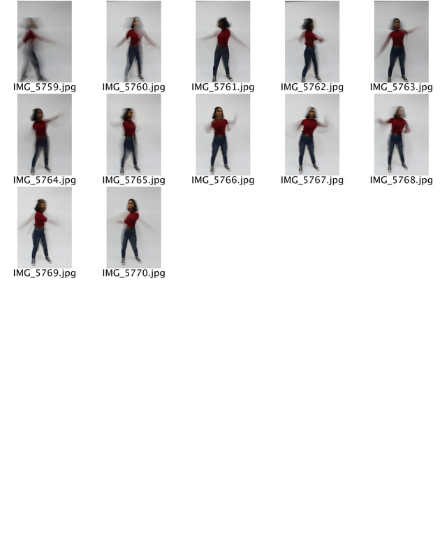
Philipe Halsman is Latvian photographer, born May 2nd in 1906. His photography journey began early, at the age of 15, when he discovered his father's old view camera and started photographing his family and friends. In 1924, he graduated high school and enrolled in electrical engineering at the Technische Hochschule in Dresden, Germany. Despite this, Halsman still had this growing interest in art and literature, and "felt the urge to take pictures, to experiment, to create." After tragic events that occurred during 1928-30 where Halsman was falsely accused for his father's death and consequently served 2 years in prison because of it, Philippe was released by the help of his sister, Liouba., and moved to Paris, France to join his family. After moving to Paris, Philippe began working as a photographer. During this period (1930-40) his work appeared in Vogue, VU, and Voila. Halsmann believed that people expressed their true selves when they jumped, "Starting in the early 1950s I asked every famous or important person I photographed to jump for me. I was motivated by a genuine curiosity. After all, life has taught us to control and disguise our facial expressions, but it has not taught us to control our jumps. I wanted to see famous people reveal in a jump their ambition or their lack of it, their self-importance or their insecurity, and many other traits." This connects to freedom and limitations as it the limit of the camera due to the shutter speed and the freedom within a jump.
|
|
|
The images being black and white and having no context between them, besides the individual and their jumps allows the subject to be the complete focus. As Halsmann states the true emotions of these normally 'perfect' celebrities alludes to a more relatable view of them. Personality traits and honesty is created within the photograph.
|
|
|
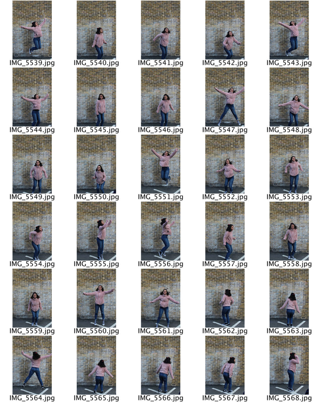
To recreate Halsmans famous images I went outside for natural lighting and photographed different people jumping in different positions and poses. I used a tripod so that the subject was in focus as much as possible, additionally I used a fast shutter speed so that the different movements were captured.
|
|
|
I chose these selected images as I felt that the variety in the way that the subjects jumped created a clear and stark difference within the type of people they are and especially their natural reaction to the camera and jumping. The backgrounds were not as effective as Halsmann as there is more of a context around them, creating less attention upon the subject. Yet the difference of using a plain brick wall and a painted garage added complexity to the photograph.
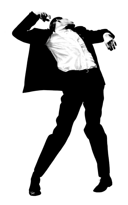
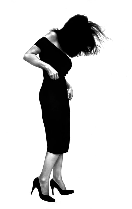
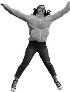
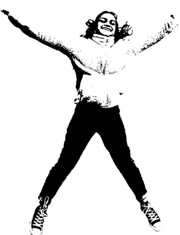
Robert Longo
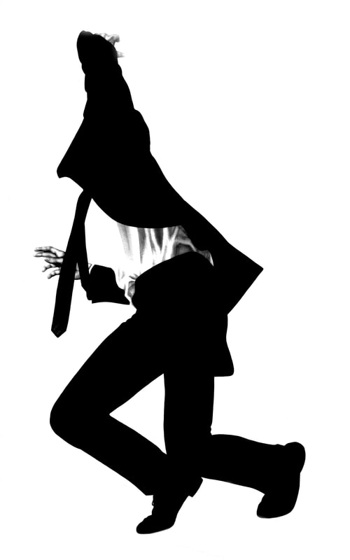
Robert Longo is an American painter and sculptor. Longo became a rising star in the 1980s for his "Men in the Cities" series, which depicted sharply dressed men and women writhing in contorted emotion. The project made Robert Longo famous in the 1980s as the larger-than-life drawings from photographs of sharply dressed business were photographed in a sort of death dance of the modern man, as if they had just been shot, yet there badly reaction is the only part that can be seen.
|
|
|
|
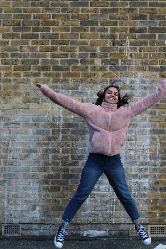
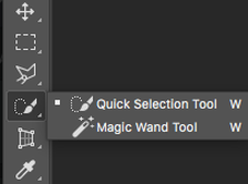
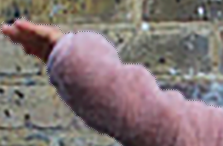
In order to recreate these images, I used the quick selection tool on photoshop and tried to capture the majority of the subjects body within the image as possible without adding in the background, this proved to be difficult as the edges didn't come out as smooth as hoped. Yet, I edited the photograph into black and white to make it more like Longo with the addition of a bright white background.
|
|
|
|
|
|
|
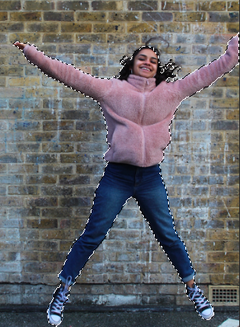
Due to me feeling that the first edit was not very effective I attempted to try and edit the image again with a slightly different technique and more precision.
|
|
|
|
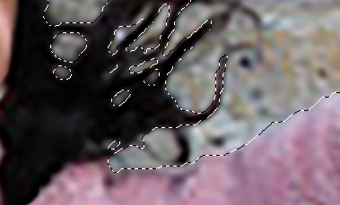
This time when editing and using the quick selection tool I zoomed in closer to the image and only included aspects of the image that included the subject. Next, when copy and pasting it onto a new document I didn't change the photo into black and white I changed the thresh hold of the photo therefore meaning that the only colours that were in the images where only black or white. This additionally made the images edges smoother fitting into the photograph more as it looked for fitting into the white background. Although I felt this was a improvement from my previous work I do still think that this could have been improved. If I was to recreate this edit again I would use a image where the subjects entire body is in shot as I feel that this would allow the image to excel further as I felt that a limitation within my work was that the subjects left hand was not in shot. Additionally, I think I would use a more impactful image, instead of a star jump potentially trying to recreat Longo's bullet movements. |
|
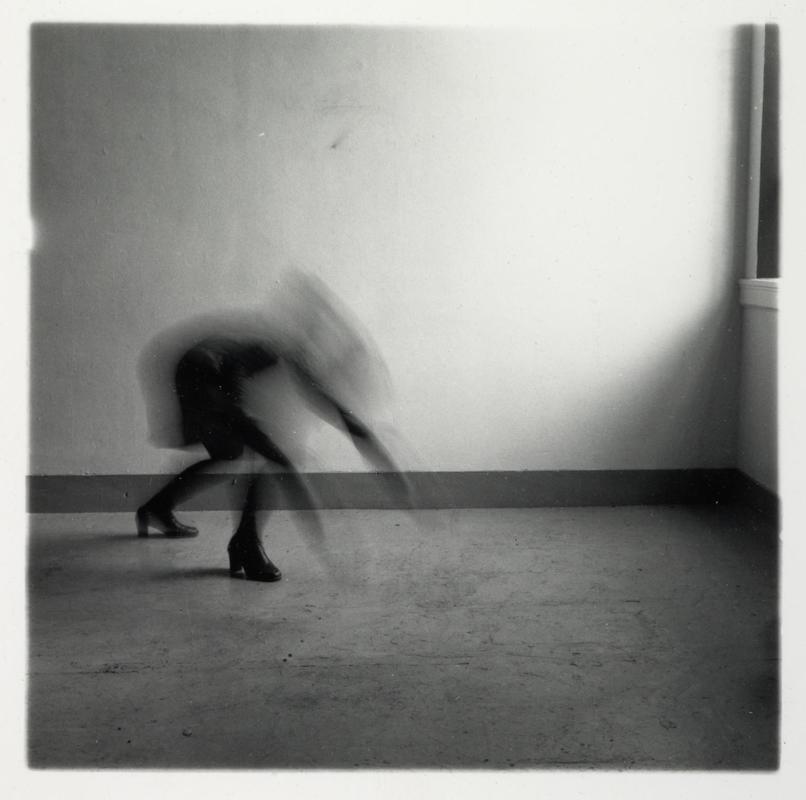
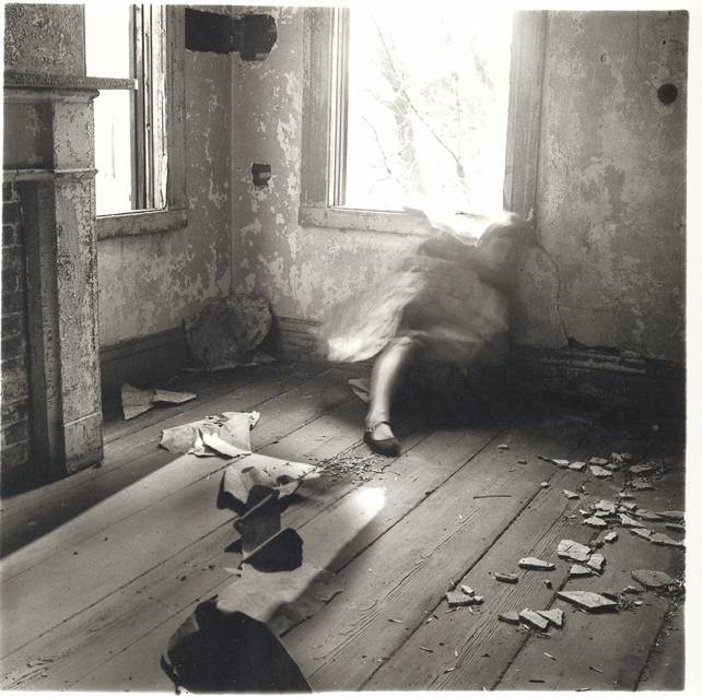
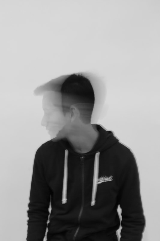
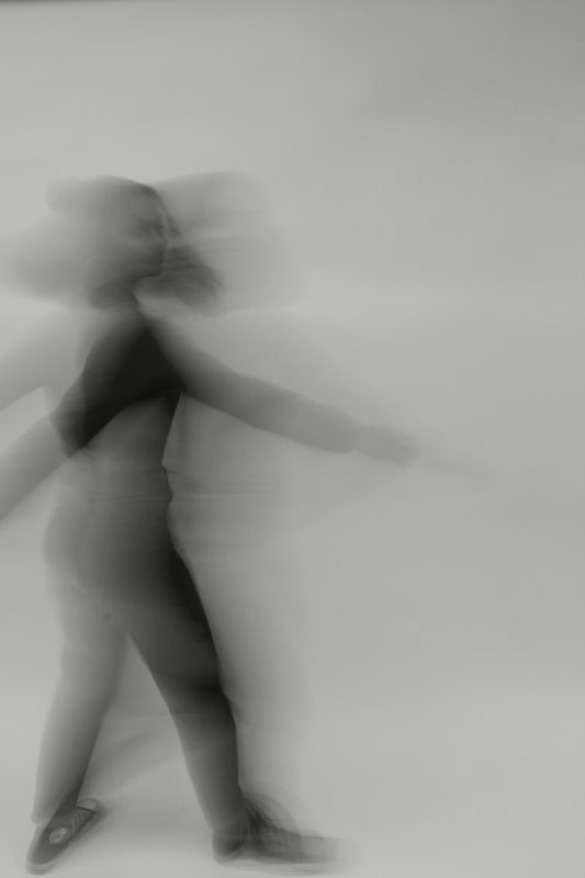
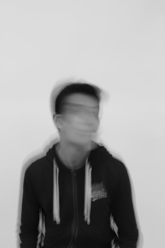
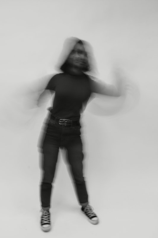
Francesca Woodman
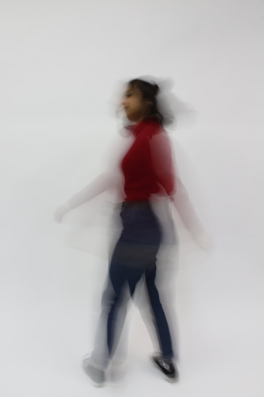
Francesca Woodman (born in 1958) was an American photographer best known for her black and white images that focus on movement, using a slow shutter speed. These images mainly feature females, including herself. The long exposure of her images makes the female subjects blurred. Woodman committed suicide in 1981, many critics consider her artwork to be an expression of her mental state. Most of her images were taken using a medium format camera and her parents kept the 10,000 negative prints that belonged to her.
|
|
|
These images connect to freedom and limitations again through a number of different processes. Firstly, the images show a female in a what looks like a abandoned room or house, the walls may be and expression of the limits whilst the movement portrays the freedom and individuals body. The room is limited to staying still, yet the body can move in a number of ways, the use of the slow shutter speed enhances the ways in which the body can move creating something abnormal looking to the human eye. Secondly, the images express the freedom and limitations within a camera itself through the different technical uses of photography, the process of capturing a image like hers are only through a slow shutter speed and fast movement. Finally, as previously noted Woodman took her own life in 1981 and many critics see her photograph as a expression of her mental state. As if the room in which the images have been taken is her skull and the moving body within the room is her brain, constantly moving hectically without having a time to rest - potentially leading to stress. Here her limitation is her mental illness as it is restricting her from life and possibly many activities but photography is her freedom as it is the only form in which she can express how she is feeling.
|
|
When photographing these images I started by having a slow shutter speed so that the movement of the subject could be photographed, blurring into one swift motion. At first I did this outside of the studio much like Woodman. Yet, I felt that inside of the studio due to the contrast of the white baking and the clothing go the chosen individuals the images looked better because all attention was focused on the individual and there chosen motion. I additionally used a tripod when taking these photographs in the studio. This was so my movement when taking the photo was not part of the motion visible to the viewer.
|
|
|
|
|
|
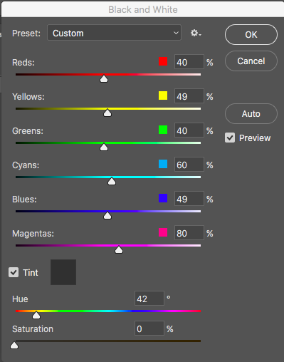
To edit these images, I simply converted them into black and white and then decided to change the tint of image to a grey so that they had a darker hue to them.
|
|
Frances Berry
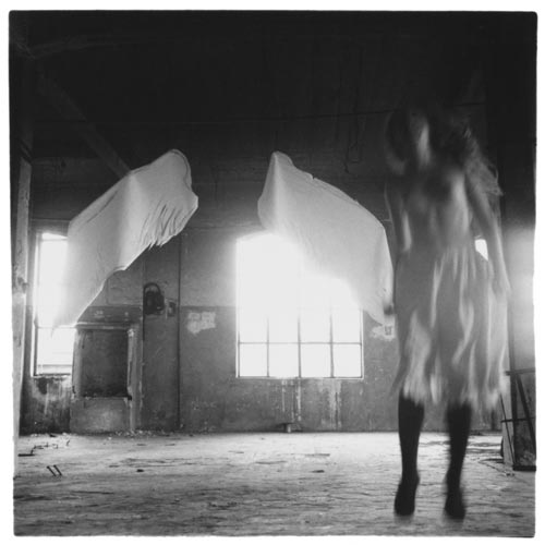
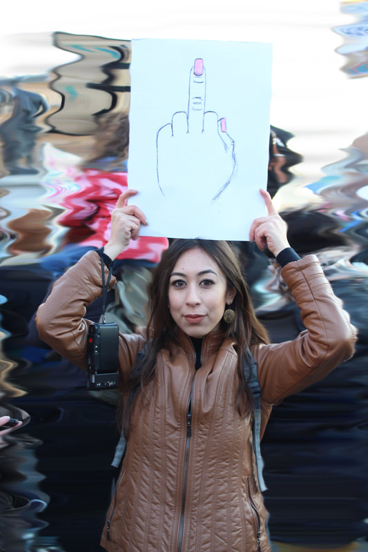
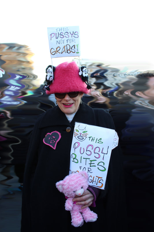
Francis Alys (Born in 1959) is a Mexican based photographer, who originates from Belgium. Alys moved to Mexico during the 1980's, a time of political unrest. His style is abstract and his diverse body of artwork shows this. His work tests spatial justice and urbanisation and ultimately records everyday life. He has also photographed the Israeli/Palestinian conflict, he used green paint and trailed it behind him to mark the division between the two. He works all around the world, including in Britain. Within the work below he captures females being the focus of the image with blurred buildings surrounding them. This abstract form of editing smudges the context around the individuals creates and empowering image as they are the main and only focus within the image for the subject and in terms of camera focus.
|
|
|
|
|
I chose to use photographs from the Woman's march as I felt that Berry's work empowered woman further. To edit the image I used the smudge tool in photoshop and dragged the background around, making it become unfocused. Therefore making the subject of the image and their protest sign the most significant and eye-catching part of the photograph. As it is if that the protest should distract society from all besides the purpose and message they are trying to enforce.
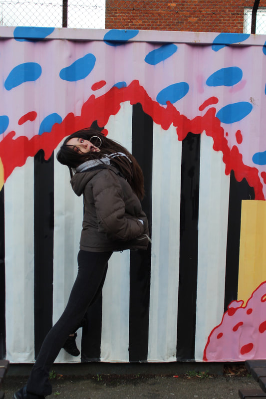
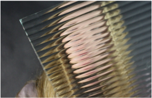
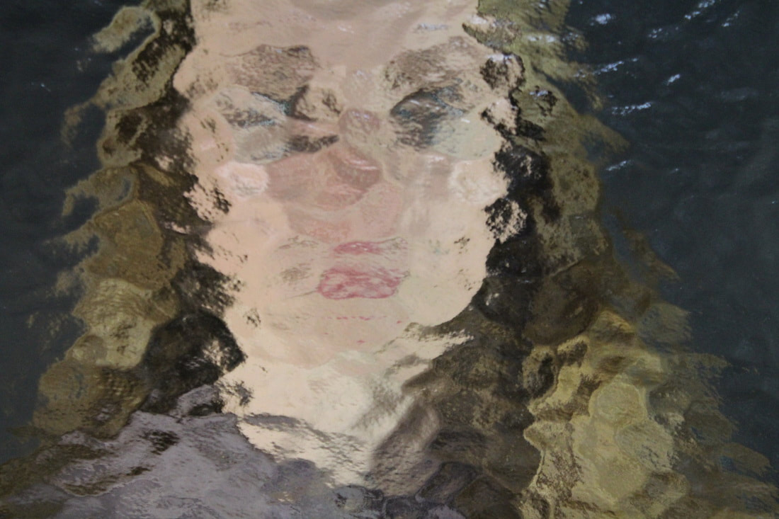
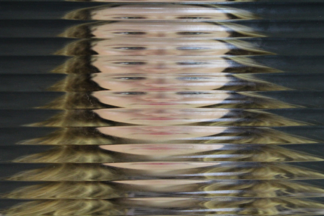
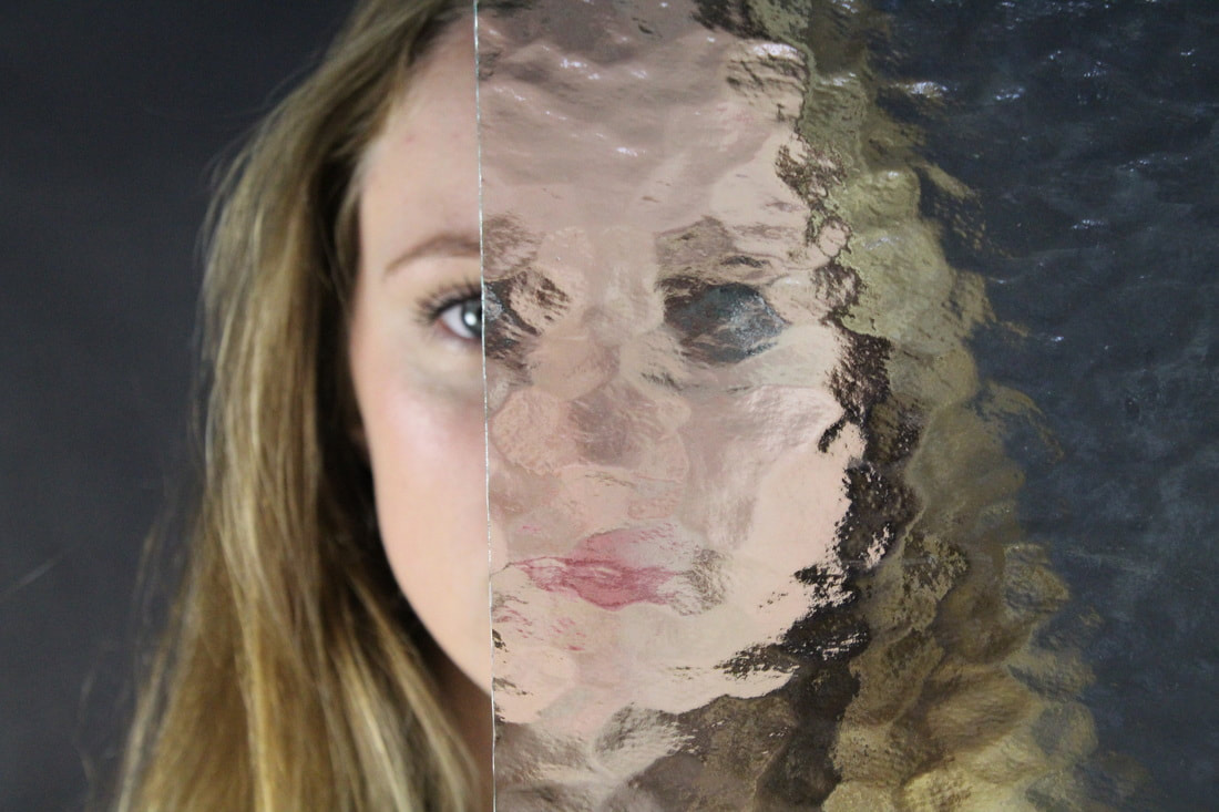
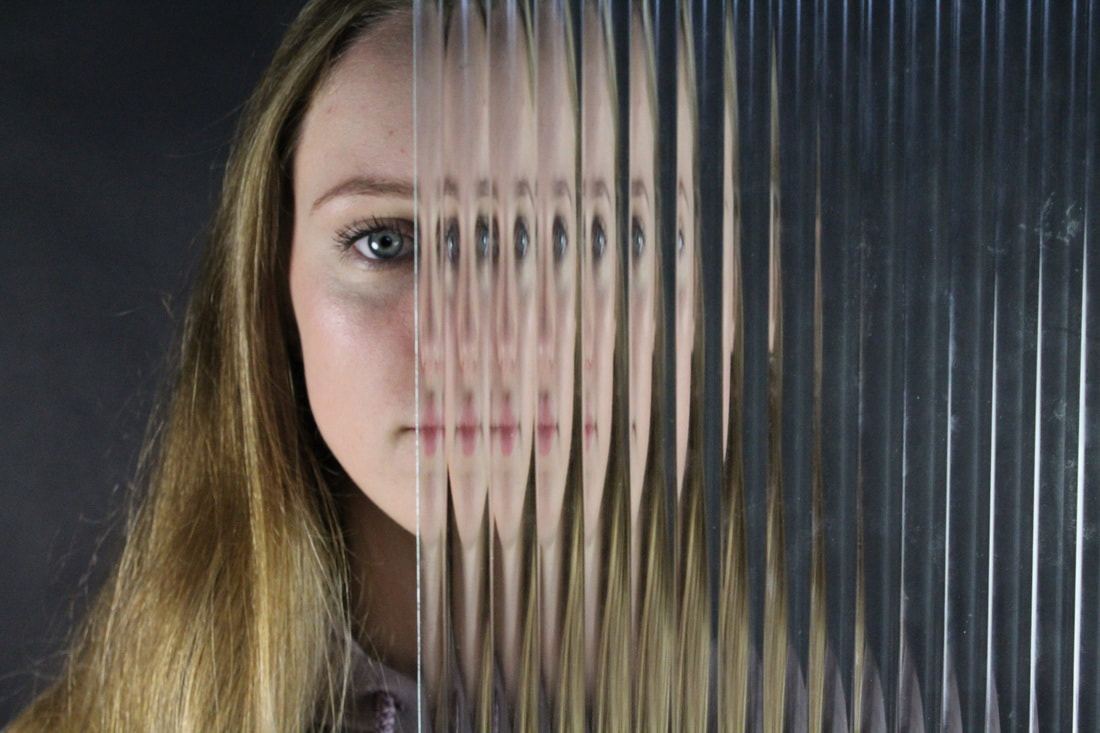
Erwin Blumenfeld
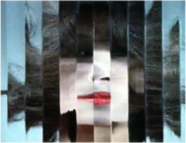
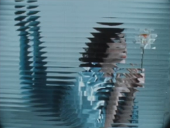
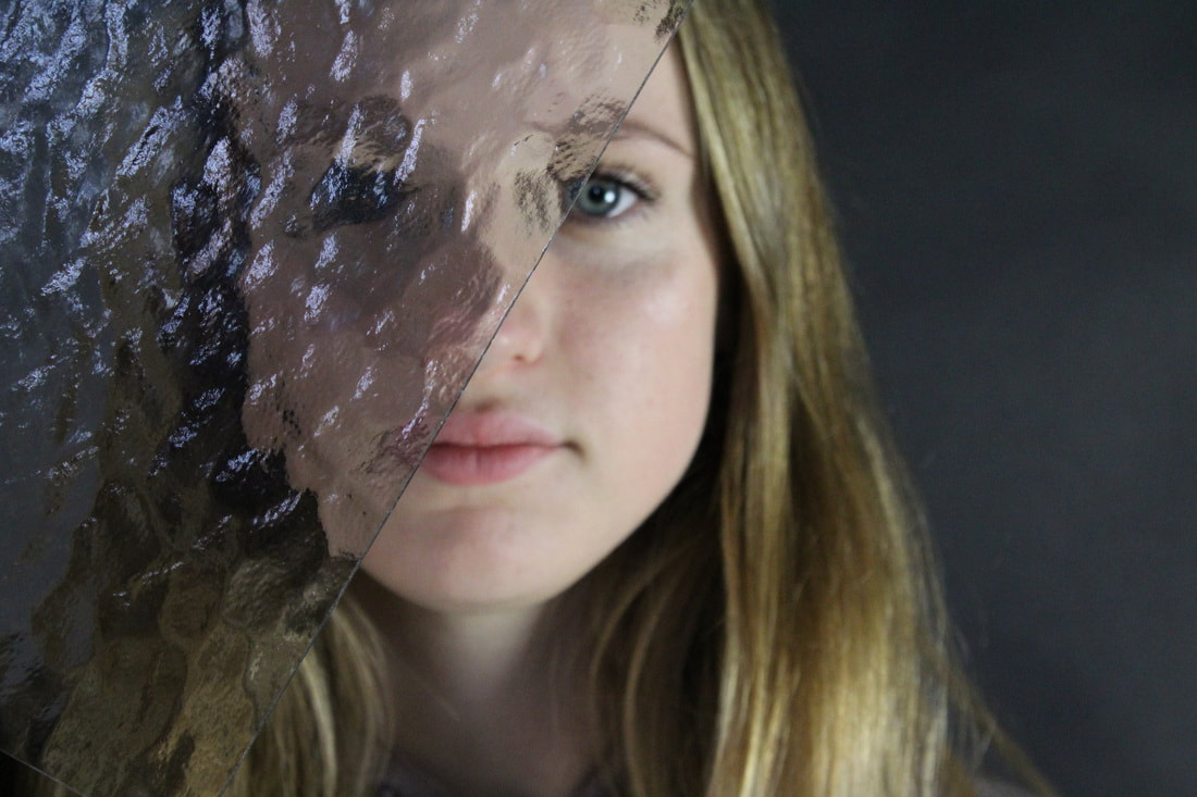
Erwin Blumenfeld is a fashion photographer and artist whom was born in Germany 1897. Before his death he's work was placed into magazines such as Vogue. In addition to this he also created a film named 'Beauty in motion', this used beautiful models from the 40's and 50's and made the images disorientated. He did this with mirrors, and glass so that parts of the models faces were out of place and disjointed. Transforming 'perfection'. In the first photograph, Blumenfeld has used darker colours to bring more mood and effect to the image. The subject of the composition is particularly dark, with deep colours such as black and crimson. This contrasts with the background which is a lighter, grey colour. This effect can be related to the subject, who appears to be serious and downcast which therefore manages to create a more dominant photograph. The lady in the photograph is positioned in the centre meaning that the viewers attention is drawn to her. As she has been broken up and distorted in vertical sections, we are unable to fully view the expression on her face and therefore we can only assume, from her positioning and the colours that Blumenfeld has selected, what she is feeling. The distortion taking place within this photograph makes it clear that Blumenfeld was interested in abstraction. The second of Blumenfelds images, has connotations with passion, desire and love because of the subjects vivid red lipstick. These connotations are particularly symbolic as the vibrant red stands out compared to the more dull brown. As brown represent nature and honestly it contradicts the unrealistic colour of the subjects lips. Yet due to the vertical splits within the image, the photograph begins to express the chaos that is within the beauty industry. The subject being in the entire frame of the image also depicts the ordered and simplistic lifestyle that may have been advertised for women in the 40's-50's. Additionally, the subject is in perfect focus, making her the only object to look at within the photograph, there is no intricate or hidden symbols elsewhere within the photo.
|
|
|
I decided to replicate this with fogged and blurred glass and then with glass that gave a repeated effect. In the six images below. With the first type of glass I took three photographs to display the different effects available. The first image I felt was effective because it gave a split effect. On one side of the subjects face you could see her facial features perfectly presenting a clean cut and slightly clinical image and the black background that left mystery for the viewer. In conjunction with the mysterious and faint facial features of the other side of her face, that were not as easily visible due to the glass. The location of the subject in the first image also alludes to more mystery because she is leaning towards the left side of the photograph with the mirror. In addition to this her blue eyes, contradict this mysterious effect given by the rest of the image as blue represents loyalty and trust. Although, I think that this photography would be more effective if the subject was more central within the image so that the black background was not such as large component in the photo as it does not allude to a lot.
|
|
|
In my methods to replicate Blumenfeld's 'Beauty in motion' I used two types patterned glass, one that gave a smudged and blended effect that seemed to blur the features of the subject and another that created sharp lines and repeated the same features of the subject that was behind the glass. This was effective as both types of glass had a large juxtaposition, so I got two very contrasting effect.
Limits of photography
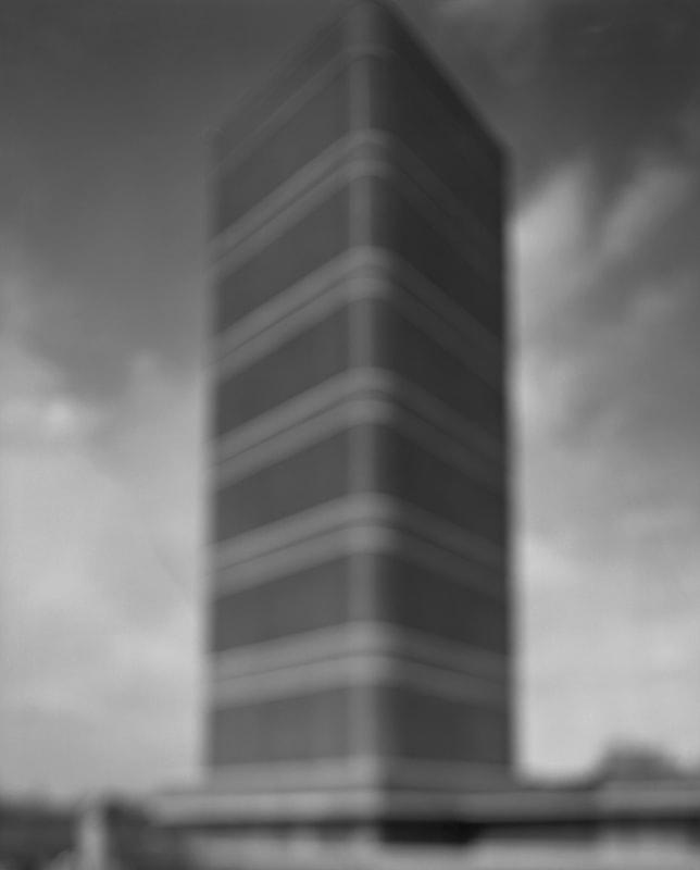
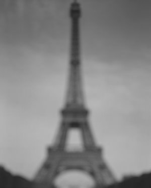
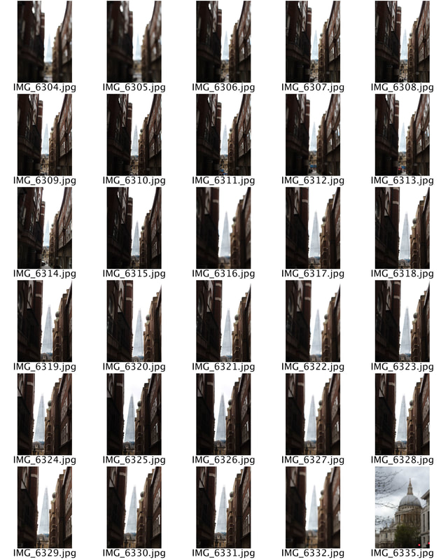
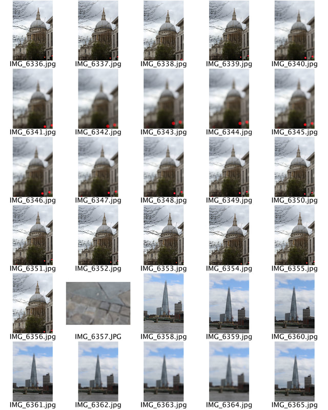
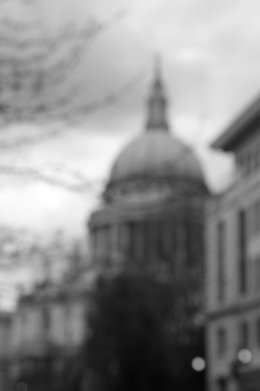
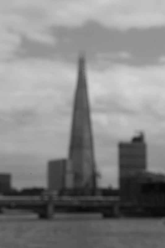
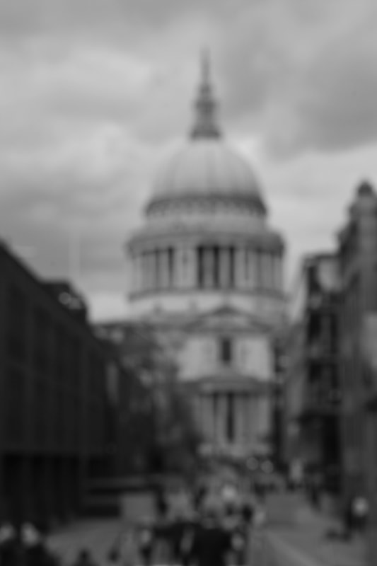
Hiroshi Sugimoto
Hiroshi Sugimoto was born on February 23, 1948, he is a Japanese photographer and architect and leads the Tokyo-based architectural firm New Material Research Laboratory. A photographer since the 1970s, his work deals with history and temporal existence by investigating themes of time, empiricism, and metaphysics. He photographs some of the worlds most famous landmarks, that many people can easily identify. Yet makes them slightly less recognisable as her photographs them blurred and unfocused. To craft his exquisite black-and-white images, Hiroshi Sugimoto uses a 19th-century-style, large-format camera, exploring his idea of photography as a method for preserving and modelling time. By defocusing the lens and thereby blurring the specific features of the buildings, Sugimoto distilled each structure to its core form in both light and shadow, highlighting the vision of the architect. These photos are evocative of the images or shapes that are left behind in your eyelids after looking at something meaningful for a long time and it’s almost as if you have seen the buildings up, close and personal.
|
|
|
To photograph these images I visited famous London landmarks, yet instead of using a auto focus I change the focus to a manual setting, whilst photographing each different landmark at different angles I changed the focus so that I would achieve a variety of images that included some aspects in focus as well as different degrees of how blurred the structures within the photographs were.
|
|
|
I choses these images because I felt that they were in focus enough for the viewer of the photograph to grasp what building was being photographed yet blur was still very visible showing the limitations of the photograph. I additionally edited the images in black and white much like Sugimoto so that factors such as blue skies and light from the busy city did not interrupt the focus on the buildings themselves.
Uta Barth
Uta Barth was born 1958 in Berlin, Germany and is a contemporary photographer who lives and works in Los Angeles, California. She examined photographic and visual perception—how the human eye sees differently from the camera lens and how the incidental and atmospheric can become subject matter in and of themselves. Within her images she photographs simplistic day to day scenarios yet from an angle that isn't conventional.
|
|
|
|
|
Whilst taking inspiration from Barth's image I decided to photograph simplistic objects within their fitted scenes, much like she did. Whilst additionally choosing to place the focus of the image out of the centre creating an on edge, sort of image. The object not only is deemed unfit within the photograph but it further allows the viewer to much like Barth's image, create a meaning and scenario around it. Additionally, I chose to cut out parts of the objects within the image as well as place them askew to further add an unawareness to the viewer of the subject matter within the photograph.
|
|
|
|
|
To start whilst editing these images, I decided to lower the brightness. This creates a more eery effect whilst also creating deeper colours within the image - these colours often have connotations with mystery which I felt connected to the purpose within the images as there is a level of uncertainty as the focus is not central. Additionally, I increased the contrast within the image. One reason behind this was because when the brightness is lowered the intricate details within the photo can be lost, the second reason behind this was that it further created differences within the colours as I would later edit the image into black and white. I did this as I felt this further connected to the aspect of mystery within the photograph.
Exposure
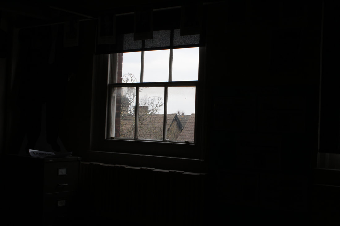
We are taught to pay attention to the light meter and adjust our exposure accordingly. Yet what happens if we manipulate the exposure to over and under expose our photographs. Here I changed the exposure to create images that are both under and over exposed to create different effects within my work, and to see the differences this can create.
|
|
Here I photographed bright areas with both a high and low exposure, whilst photographing I felt that when light was travelling through a shape with a low exposure an eery effect was achieved. This effect was created through the dark background of the image, as the only visibility within the photograph is through the window. Windows often represnt a portal; allowing your thoughts to roam around freely. This imagery is enhanced with the only light within the image being through the window. Light often has connotations with being revealing. Especially in biblical texts. Potentially alluding to God to revealing himself, through the symbolism of light or shining. Light cannot be hidden in darkness. When a light shines out, a person immediately sees it, and eyes are attracted to it. "God, make your face to shine on us, revealing yourself, so that I can see you and have direction." Here, light and truth signify the same idea.
Post production
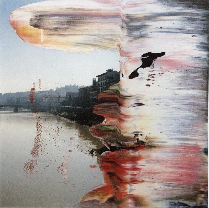
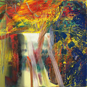
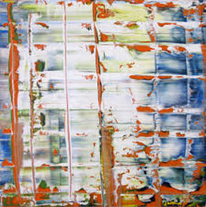
Gerhard Richter
Gerhard Richter is a German visual artist. Richter has produced abstract as well as photorealistic paintings, and also photographs and glass pieces. Since the mid 1980s Gerhard Richter has created more than 2,000 Overpainted Photographs – with new artworks continually being produced. This large body of work illustrates Richter’s wide range of creative achievement in this medium.
Richter has created a large number of Overpainted Photographs in his career and new works are still being produced. The images he has painted over range from portraits, rural and urban landscapes and museums visits. This connects to the freedom that the artist has within his art work / photographs as the painting process has allowed him to transfer his photograph into a image with added complexity and meaning.
Richter has created a large number of Overpainted Photographs in his career and new works are still being produced. The images he has painted over range from portraits, rural and urban landscapes and museums visits. This connects to the freedom that the artist has within his art work / photographs as the painting process has allowed him to transfer his photograph into a image with added complexity and meaning.
|
|
|
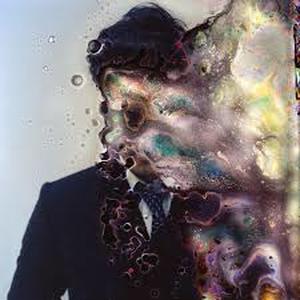
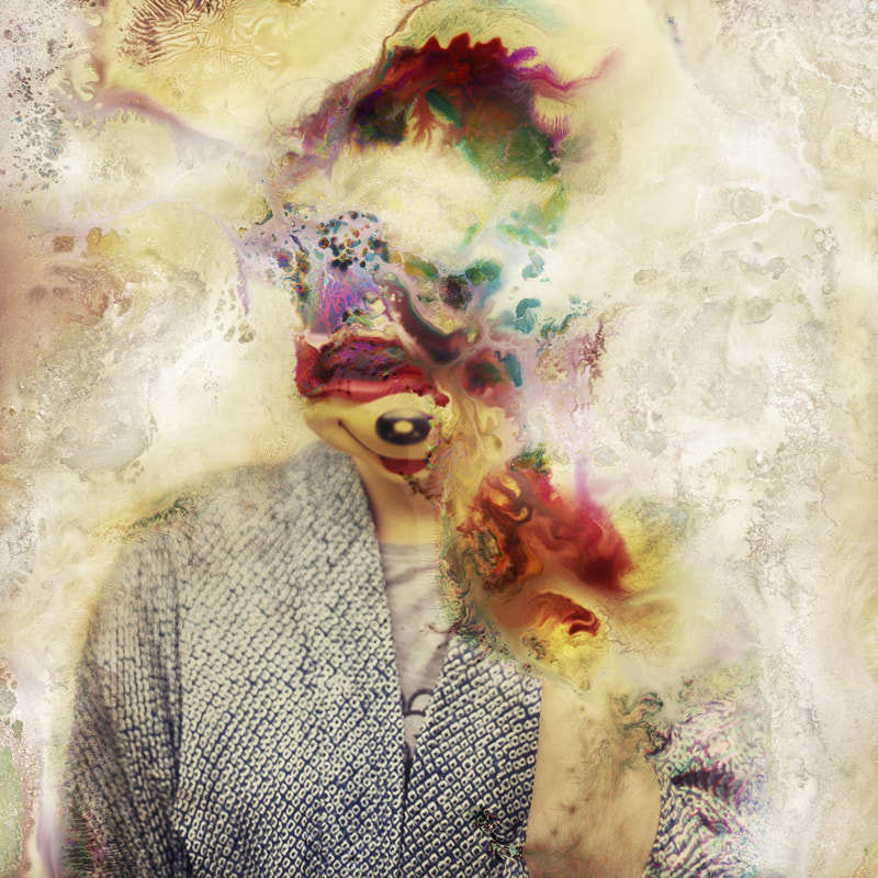
Seung-Hwan Oh
Using homegrown bacteria, photographer Seung-Hwan Oh warps and manipulates his photographs. His intention is to “explore the impermanence of matter as well as the material limitations of photography.” It brings the artist’s studio into the laboratory, marvellously blending the organic and the artificial. Seung-Hwan Oh brutalises and mistreats his images in order to make them sick, revealing not just the physicality of the photograph itself but the life of the artwork. He states: “I use this technique to share an idea that all the matter including all the life forms collapse in this spatial-temporal dimension we belong to.”
|
|
|
|
To create a different image within post production I used many different techniques to distort the images. The first image is the original photograph without any distortions added. I have put this here so that the change is more prevalent.
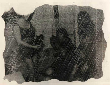
In the first image I used bleached around the corners of the photograph. The effect that bleach has on a image means that the image is completely removed, I focused the bleach around the edges so that it would create a slightly burned effect around the photo as I felt that it was more effective if the structural limitations of the straight lined classic image was removed. Yet the image was still visible and the viewer was able to understand the context around the photograph. The second image is a continuation from the first, here I scratched the photo. I did this all in one direction at |
first and then decided to add a cross hatching effect in the corner to add a different effect in some areas to allow the image to be more distorted.
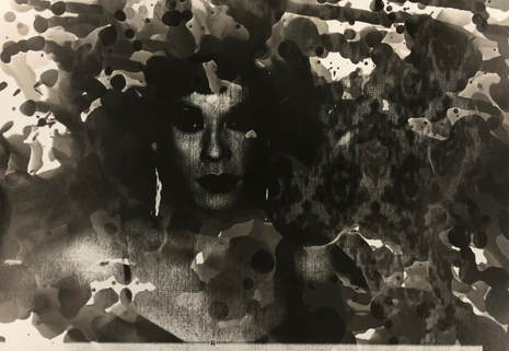
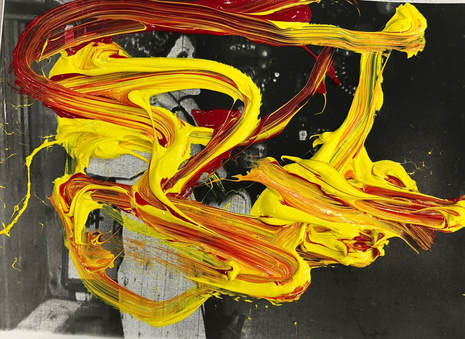
In the third image I was very much influenced by the work of Gerhard Richter as he paints over his photographs. Here I mixed both yellow and red paint. Unlike Richter I decided not to paint over the images in a particular direction as I felt this added a more abstract effect to the photograph. I additionally, allowed thick amounts of paint to lie on the image that would take longer to try to add dimension to the image.
In the fourth and final image I distorted the image in the development process. Instead of covering the whole image in the developer, I used a paint brush and applied it onto certain parts of the paper. I focused much of the developer onto where I knew the subjects face within the image as this allowed not only the key feature of the image to be visible but it additionally allows the viewer to have more context and understanding of the photograph. The rest of the photo was unclear as some elements had not been developed at all whilst other sections had a lot of time within the developer and some a brief moment before going into the fix. I felt this was a effective method as it added mystery to the image.
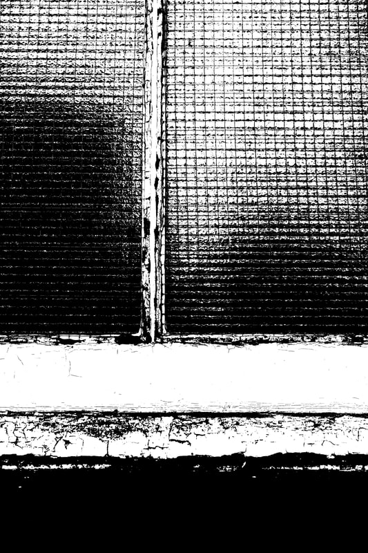
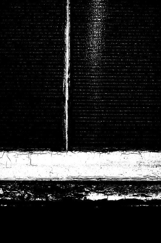
Keld Helmer Peterson
Keld Helmer-Peterson was a Danish photographer who was inspired by Albert Renger-Patzsch, the experiments at The Bauhaus in Germany and by Harry Callahan and Aaron Siskind at the Art Institute of Chicago. He achieved fame for his colour photographs but he also published several books of black and white images that explore dramatic contrasts of tone. In some, we are only presented with images that are black and white. All mid tones have been removed. He created and found these images, using both cameras and flat bed scanners to achieve the effects he was looking for. The books encourage us to consider the space around the image and the accompanying text as integral to the meaning of the work.
|
|
|
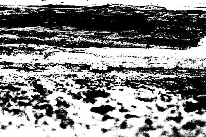
Inspired by Peterson's work I went around the school and photographed up close details both natural and manmade of the school buildings and surroundings. I felt that this would be an effective method as his images create abstract takes on a everyday, mundane object. Specifically I focused my work on mould or cracks within the schools infrastructure as well as plants as I felt the final image in the three I have chosen was the most interesting.
|
|
|
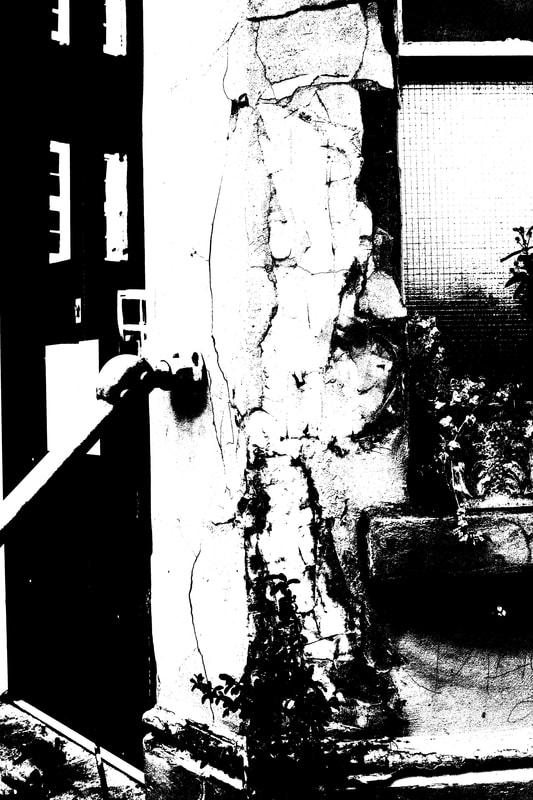
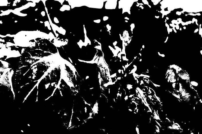
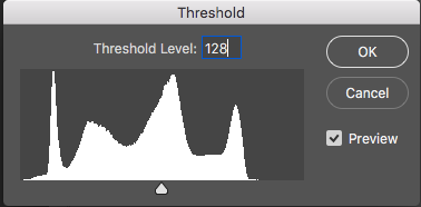
To edit these images I used photo shop to adjust the threshold level, the lower the numerical value for the threshold of the image the more white there will be within the photograph. Therefore, the higher the threshold the image will come out darker and with a higher frequency of black. This can be shown below by the differences within the photos compared to their threshold.
|
|
|
Limiting Space
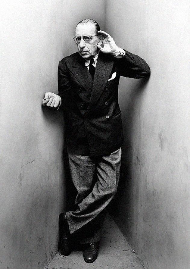
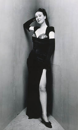
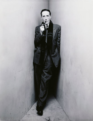
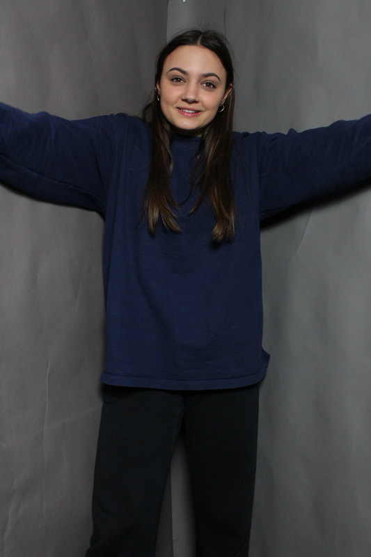
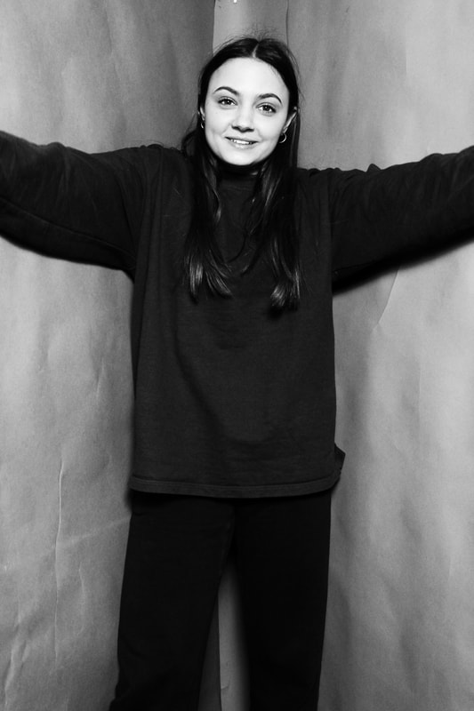
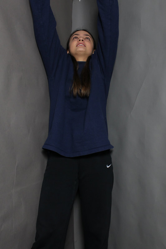
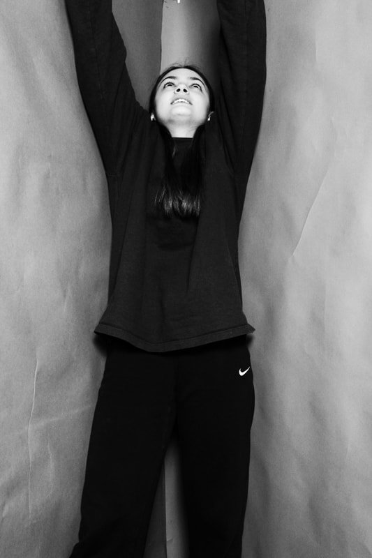
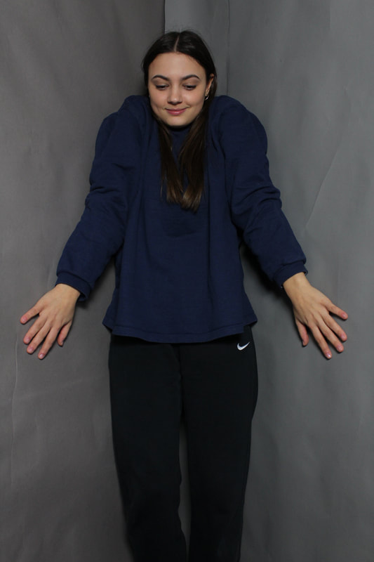
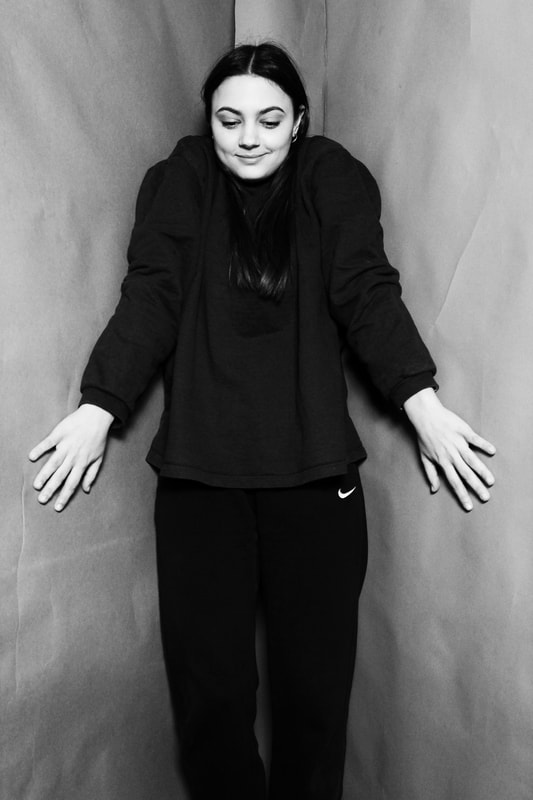
Irving Penn
Irving Penn was an American born photographer known for his fashion photography, portraits, and still lifes. Penn's career included work at Vogue magazine, and independent advertising work for clients including Issey Miyake and Clinique. The images below are part of his collection titled 'Corner Portraits'. These images captured the limits of photographic portraiture, which is one of the key reasons why he was so brilliant at it. The elements of that style are familiar now, but were radical when Penn began photographing in the mid 1940s: the starkness of the setting, the low-key lighting, the subtle choreography of pose and gesture that both hints at the interior life of the subject. Penn's studio was empty of everything but the basics, and almost downbeat in its ambience: grey walls, grey fabric for the backdrop, a grey floor that he seldom swept. The setting must surely have disconcerted those more suited to ostentation and comfort, just as Penn's legendary charm – a kind of polite matter-of-factness – helped reassure them that all was well.
|
|
|
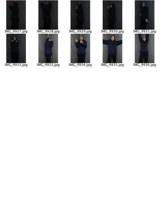
Much like Penn I decided to photograph my subject within grey walls yet, unlike his work I chose not to photograph the floor as the school studio didn't include a grey flooring therefore making the enclosed space look more set up than as if it was a space within a room. Whilst shooting I asked the subject to show the space given within different positioning. The first image makes the space look wide as her arms can open widely, the second makes the area look slightly smaller as her arms are up it as is if there is no other position that she can be within and lastly the final image out of the three allows the space given to look very small as her shoulders have raised due to her arms positing. If I was to photograph these images again I would use different levels as this would show not only the width of the space but additionally the length.
|
|
|
I edited these image in black and white, much like Penn. I felt this was effective as the focus that was previously on the subjects blue top and this was turned away through the editing process therefore the shape of the room in conjunction with her positioning became the focus of the image. Additionally, I felt that Penn edited his images in this way to draw more attention to the unusual shape of the room and the different subjects choice of positioning.
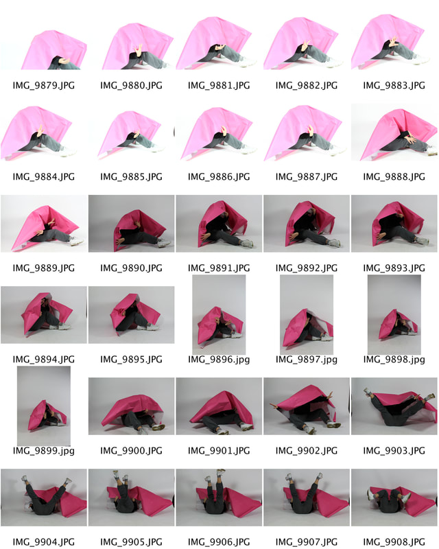
Restricting the viewer through paper
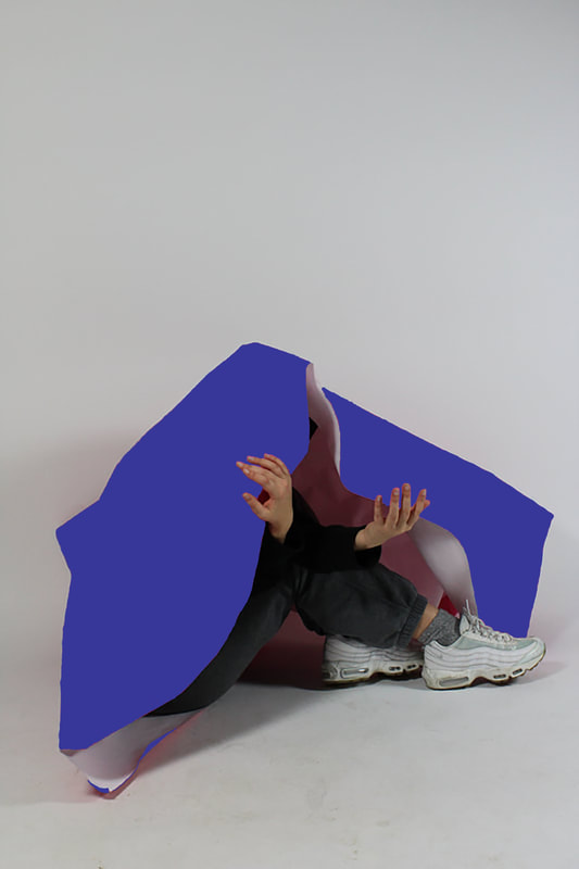
Another way to achieve Irwing Penn’s version of “limitation” of the subject is through limiting the amount of space in a frame through blocking it off using paper and shapes. These series of photos are inspired by the Photopedagogy exhibition at the Tate Exchange. Within this studio response to limited space I displayed the idea much differently to the previous response. I used a large piece of block coloured paper and asked the subject to demonstrate limitation in a highly visual, obvious way. Here, the subject is restricted by the paper through the poses that they can portray and, additionally, by the way they can move. This task worked well in that I think it was better than the previous as the subject looks much more obviously restricted. As well as the high colour contrast to the blank white background added more dimension to the images.
|
|
Whilst photographing these images I felt it was more effective if the subject facial features were not present within the photo. I did this because not only did I feel this added more illusion to the images as a key aspect of the human body was missing but I felt it additionally allowed the viewer of the photographs to create their own ideas of the type of person underneath the paper, simply through their positioning movement and clothing as this is all that was available to the eye. This further worked with the subjects as I asked them both to completely decide what they wanted to do with the paper therefore portraying their personalities and choices.
|
I feel that these images are effective in comparison to my recreation of Penns work due to the subjects being in a much closer proximity to the restrictive object - the paper. As well as this although I edited the corner portraits in black and white I further feel the block colours in the images below are more effective due to their ability to contrast the studio, the paper and the subject differentiating all three aspects of the photograph and even though they are very much intertwined.
|
|

|
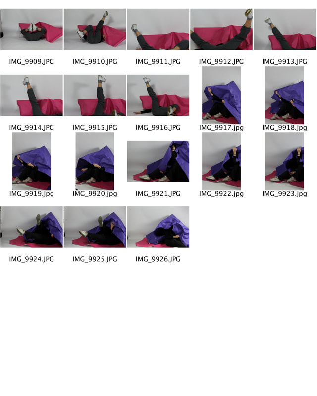
Next, I decided to manipulate the colours within the image I changed the colour of the paper from pink to purlple. To do this I used the paint brush tool on photoshop and zoomed into the image outlining the paper and then filling it in. I think that the final
|
outcome was effective as it did look as if the paper was now originally purple, but it could have been even better if I didn't just use one shade of purple as the image looks 2D now, as there were shadows where the image folded making the pink paper darker.In addition to this some of the lines where not as neat as I hoped.
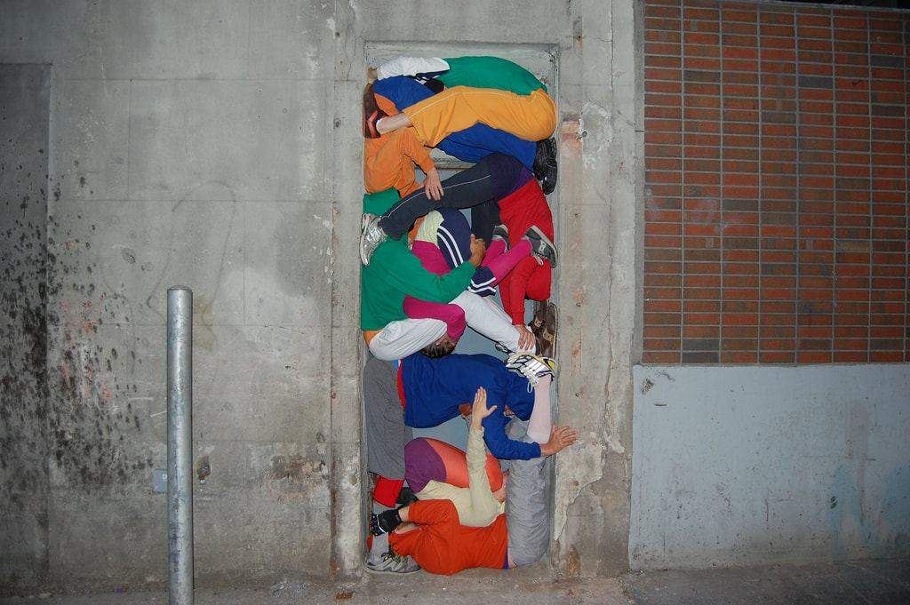
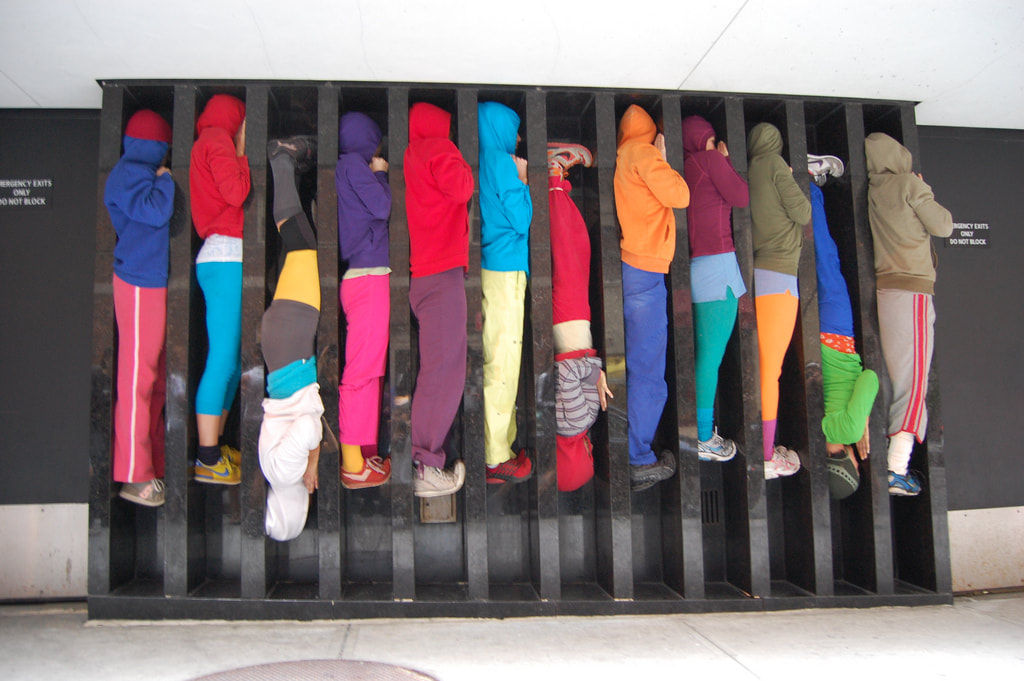
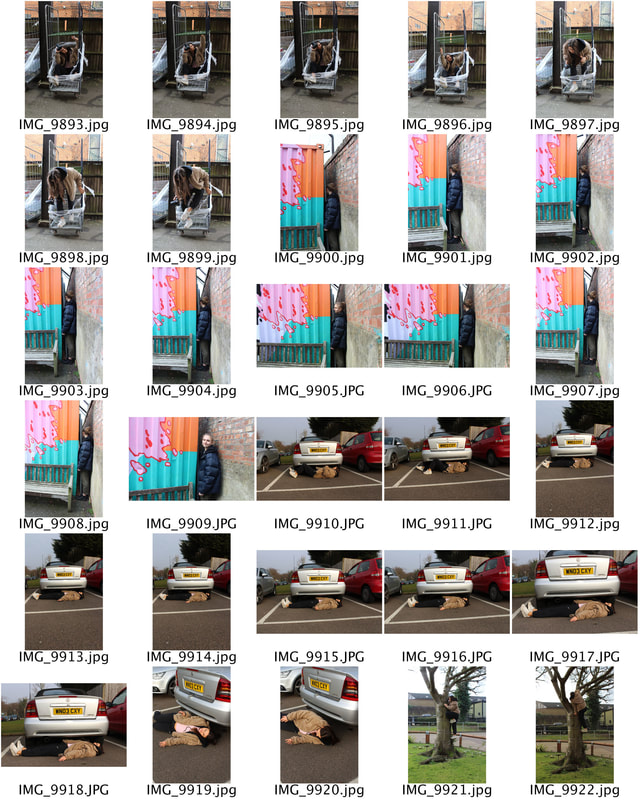
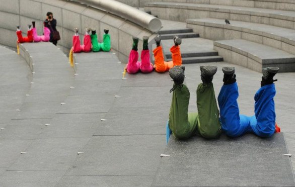
Will Dorner - Bodies in Urban Spaces
Willi Dorner is an Austrian artist, born 1959 in Baden bei Wien. Below are various images from his bodies in urban spaces series, which comprimises human bodies as the focus, squeezed into nooks and crannies of many different urban environments. This results in unique results, particularly with the subjects wearing such bright contrasting colours, which juxtapose the urban grey aesthetic of the city. It is almost as though Dorner is making a comment on our society and how we have structured our modern lives; around these concrete facades. This group of subjects have run through busy high streets and crammed themselves into doorways, alcoves and any gap they can find in public buildings. During a tour of Austria, England, France, Norway, Sweden, Finland and the US, Willi Dorner and his cohorts have drawn attention for local police who have stopped several perfomances for fear they were burglars or vandals.
|
|
|
For my response, I decided to capture my images both inside and out around my school. This resulted in the subjects attempting to utilise uncomfortable spaces, that are deemed unusual for human placement. I aimed to make these images odd and slightly alarming as the positioning and situations that the subjects are within contrast heavily with daily life.
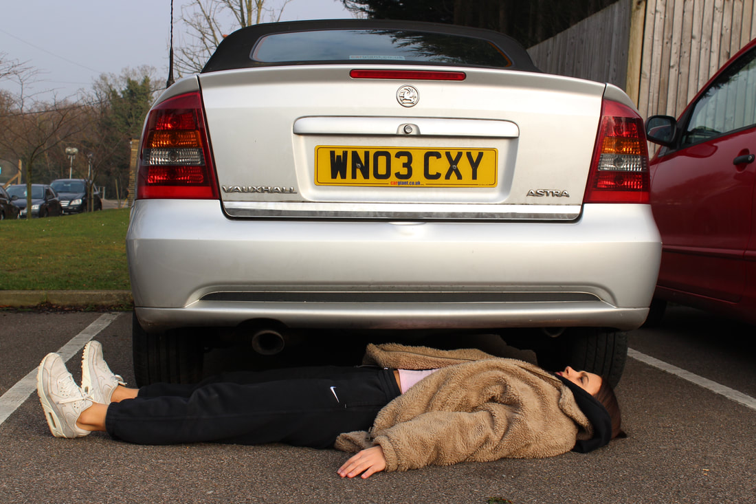
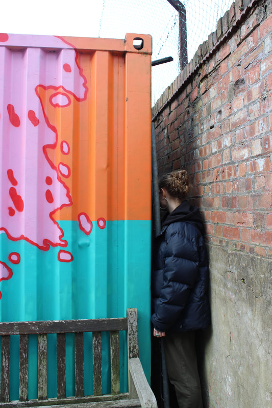
|
|
In order to express an obvious feeling of limited space, the subject's I photographed squeezed into many different places that we found around the school cite. I think these images worked well in that we ended up finding some good places to present a feeling restricted spcace, however I did no photograph multiple subjects at one moment in time like Dorner and in addition to this the subjects I photographed were not wearing block colours - this aspect of Dorners work was very effective in my eyes as it created not only a bolder more obvious presentation of the people in unusual spaces but further created a order and pattern in a city which is often seen as very chaotic.
Barbican - Another Kind of Life: Photography on the Margins
Mary Ellen Mark - Tiny Streetwise Revisited
|
Mary Ellen Mark passed away in New York City at the age of 75 on May 25, 2015. But her legacy and work not only left an enormous impact on the world of photography, but they changed the way people on the fringes of society are often perceived. She grew up in Philadelphia and graduated from the University of Philadelphia in 1962 she then started to document local people and developed an intimate style of photography with her subjects. The images I will be focusing upon are from the book Tiny: Streetwise Revisited that was published by Aperture in October 2015.
|
|
|
In 1983 Mary Ellen and her husband met a 13 year old prostitute named Aaron Charles who went by the name Tiny. Tiny was living on the streets of down town Seattle. The images of Tiny were significant for a number of reasons such as their placement in magazines and award winning books, but specifically because Mary Ellen would often continue her relationships with her subjects. She revisited Tiny several times following up on her life - this became quite common with all of her subjects. In her words "I love them and I care about them, I want to know how they are doing, I want to photograph them again". In 1987 she explained in a interview "Much of life is luck, no one can choose wether he's born into a wealthy privileged home or born into extreme poverty. I guess I'm interested in people who haven't had as much of a chance, because they reach out more, they need more, they touch me. I do a lot of other work to support myself but those kinds of projects are the reasons I became a photographer." I think that its clear that a relationship between the photographer and the subject has been built not only by the different places and days the images have been photographed but the comfortably within the images grows throughout the book - the images become less posed and more realistic as if it was a image taken from a day out rather than a day out based around taking photos. Additionally, I think Mary Ellen grew fond of such individuals because she saw first hand the struggles that they went through - not just as a story the subjects told but by seeing their lifestyles and enviroment.
|
Dayanita Singh - Third Sex
Dayanita Singh is a photographer whose primary format is the book. She has published twelve books. Singh’s art reflects and expands on the ways in which people relate to photographic images. Third sex correlates to a transgender woman - now named Mona whom lived in India. She struggled with her identity for a long period of time but finally felt more comfortable when her wish of child emerged due to the sad passing of her friend during childbirth. Mona would organize lavish birthday parties for her little Ayesha - her new daughter, “I was asked to be the photographer on these occasions,” recalls Singh, who first met Mona in 1989 on a routine assignment to photograph hijras in India for a British newspaper. When Mona learned the images were for a London daily, she asked Singh to not use them, afraid of offending her extended family who lived there. “I saw her take the roll from me and throw it in the garbage,” Singh recalls, “It was as if she had chucked my entire career along with it.” But because of Singh’s selfless gesture, Mona’s trust in her grew, and the two became fast friends.
I think that there is a clear indication that the the photographer knows the subject well within the image for a number of reasons. Mona was extremely unconfident around new people due to her transition into a female - she often felt judged and unworthy. Yet, the image above shows her in a extremely confident state with others surrounding her admiring her strength and happiness instead of judging her decision. This is one indication that a friendship has been built between the two. Another factor that shows her comfortably implying the photographer and subject know each other is the space that the subject is within. Due to the photograph being taken in a home environment it shows there is trust between Singh and the subjects at they have let het into their home. Finally, simply the expression upon the subjects face allow the viewer to determine that not only is Mona comfortable with Singh but also happy she is there.
Paz Errázuriz - Adam’s Apple
Driven by motivations both personal and political, many of the photographers in Another Kind of Life sought to provide an authentic representation of disenfranchised communities often conspiring with them to construct their own identity through the camera lens. The beautifully arresting series of photographs, Adam’s Apple (1982-87), by Chilean photographer Paz Errázuriz are of a community of transgender sex-workers working in an underground brothel in Chile in the 1980s. Taken during the military dictatorship of General Augusto Pinochet when gender non-conforming people were regularly subjected to persecutions and police brutality, the photographs are a collaborative and defiant act of political resistance.
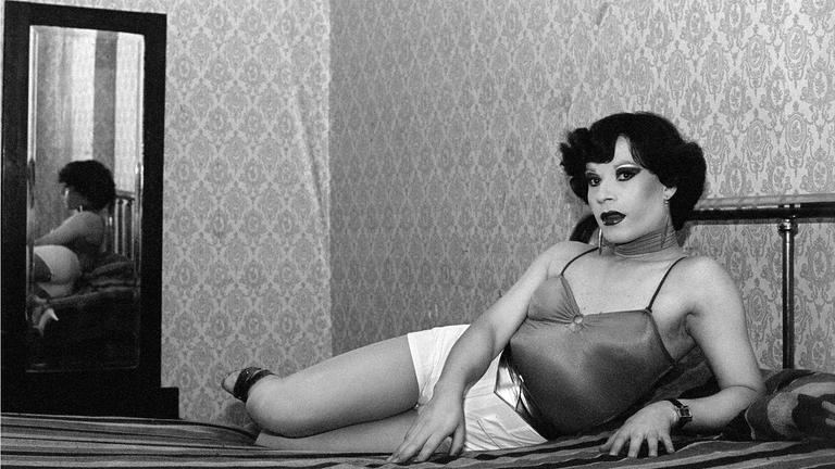
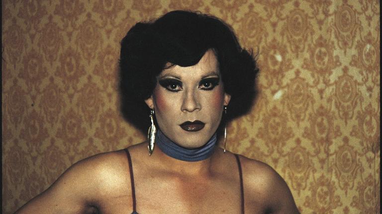
Errázuirz placement of the sex-workers within the brothel is effective in the representing how this group my be trapped within their environments due to societies negative outlook on their way of life. This aspect of his photography creates a enclosed and separated from the rest of the world take on such individuals - the rooms are simplistic and have little furniture this creates a heavier focus on the subject and their way of dress. There is a large juxtaposition between how decorated the room the subject is situated within compared to how glamorous he has presented himself, perhaps meaning that behind closed doors his life style is far less glamorised than previously perceived. Paz has used other techniques within his photography such as the use of the mirror within the first image. This may be a way of portraying the double life that these members whom live on the peripherals of society lead. By this I mean the alternative identity the subject may have to portray to society in day to day life due to negative opinions of other as he doesn't follow the traditional norms and values of Chilean society. Making them not only outcasts but also an easy target for those with opposing views to mentally and physical inflict pain upon.
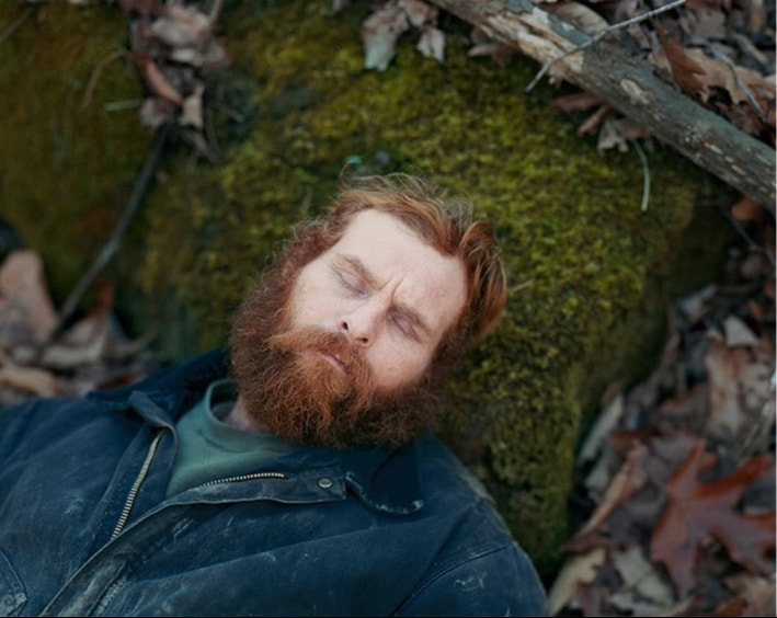
Alec Both - Broken Manual
Minneapolis-born and based, Alec Soth is renowned for his “large-scale American projects” which usually include photography work captured on the road. His photographs contain an inherent feel of a cinematic atmosphere, stained with elements of folklore. Each piece tends to tell, or at least hint at a story behind the image it portrays. Loners, dreamers, babies, animals and strangers are the subjects behind Soth’s lens. His work has been compared to the likes of Walker Evans and Stephen Shore. Here Soth documents men living off the grid. His atmospheric images, both colour and black and white, are of monks, survivalists, hermits and runaways who all have in common the need to disappear in America.
|
This photograph has a blurred background within the image with the only focus being the subject -In photography this is known as bokeh. This draws more of our attention to the man in the image and by allows the viewer to see that the subject is alone and at one with nature as that is all he is surrounded by. This exemplifies how he is disenfranchised and disconnected from society as he is isolated from the rest of the world and modernity within the image, he doesn't portray a modern man and perhaps is against post modern society. The blurred background additionally manipulates the viewers response to the image as there is a theme of mystery added to the photo due to there not being a clear focus of the subjects surroundings, this create a question of weather this individual is a runaway trying to hide his whereabouts. This idea is reinforced because of closed eyes. Eyes are often the most important symbolic sensory organ. They can represent a gateway into the soul, and therefore with them.being closed it adds to the mystery of the image whilst also adding to the idea that this individual does not want to be found.
|
Broken Manual from Little Brown Mushroom on Vimeo.
Igor Palmin - The Enchanted Wanderer
This work features Soviet Hippies in their bell-bottoms and flower power hair bands, playing guitars in opium filled trailers or standing alone on desolate lands.
|
The hippie movement that captivated hundreds of thousands of young people in the West had a profound impact on the other side of the Iron Curtain. Within the Soviet system, a colorful crowd of artists, musicians, freaks, vagabonds and other long-haired drop-outs created their own system, which connected those who believed in peace, love, and freedom for their bodies and souls. The images in 'The Enchanted Wanderer' capture these individuals in a documentary style. Palmin has used devices such as over exposure in this image in particular. To me this may have two meanings. One way I think Igor Palmin has used this device is to manipulate the viewers take on the photograph his over exposed photograph could be a simplistic way of stating that his images within this collection are a exposed, raw and realistic take on these
|
|
peoples lives and it isn't a glamourised take on such individuals - they were out casts whom didn't fit into the Soviet norm at the time. The second perception I think can be taken from his use of his slight over exposure is linked to the previous suggestion. Because the hippies were out casts the manipulative device of making the image overly bright may be a way of highlighting that they are subject to different experiences to the rest of society because they were always seen as 'unusual' therefore Palmin makes the images 'unusual' through the manipulation.
Pieter Hugo - The Hyena and Other Men
Pieter Hugo first learned of Nigeria’s Gadawan Kura, or hyena handlers, in 2003 when he received an image taken on a cell phone camera depicting several of these men with their beasts in the streets of Lagos. A newspaper in Hugo’s native South Africa published a similar image and identified the men as debt collectors, drug dealers, and thieves who enlisted hyenas as muscle in support of their criminal activities. With the help of friends in Nigeria, Hugo found the group in a shantytown outside of the capital, Abuja. They were not necessarily criminals, but rather what Hugo describes in an artist’s statement as “itinerant minstrels... a group of men, a little girl, three hyenas, four monkeys and a few rock pythons,” who subsist by staging performances and selling traditional medicine. Hugo traveled with the group for weeks at a time over the course of two years, taking a series of portraits of the men posing with their animals.
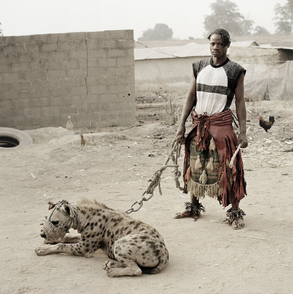
The images from this counter culture portrays the subject and his cultural heritage as very distant and different from western society where the images are situated in the gallery. Many factors create this from the control of the wild animal, his way of dress and the the streets he is photographed on. It is very clear through the images without any additional information that his living situations norms, values and culture is starkly different from ours. This leads us to many different reactions from the photograph although it is clear that the life he lives in unusual in comparison to the 9 til' 5 jobs that we relate to it intrigues us due to the complexity of his life style. His obedience over the animal is one of the striking elements within the image - one reason for this is the danger that the animal has the potential to cause yet in the top right image there is not even a guard covering the hyenas mouth, this examines the amount of control that the subject has over the animal whilst also showing how different this particular individuals norms are within the culture he lives in are, it is almost implying that this radically dangerous animal that has the potential to kill its owner is t he household pet that western society would associate with cats and dogs. Another aspect of these images that grabbed my attention
|
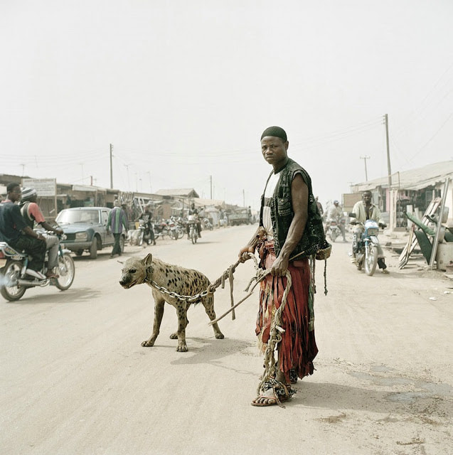
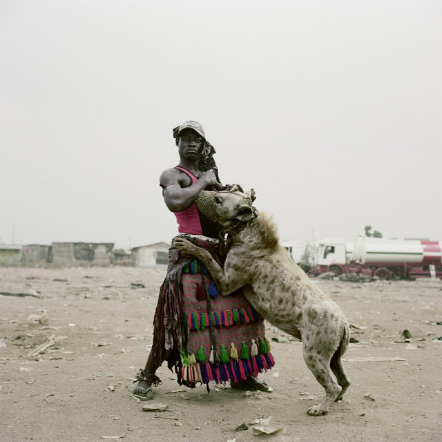
|
was the dress of the subject, although it does not seem expensive the elaborate nature and colours used in his clothing add colour to a otherwise sepia toned image. In addition to the bright colours contrasting with the rest of the scenario the man additionally wears a skirt like piece of clothing emphasis further the difference between this culture and the more simplistic western society. The images create a question within the viewers mind of how the subject may react to seeing traditional British or American society seeing as our interpretation of this lifestyle is shocked and confused, it places the thought of what would he think of us?
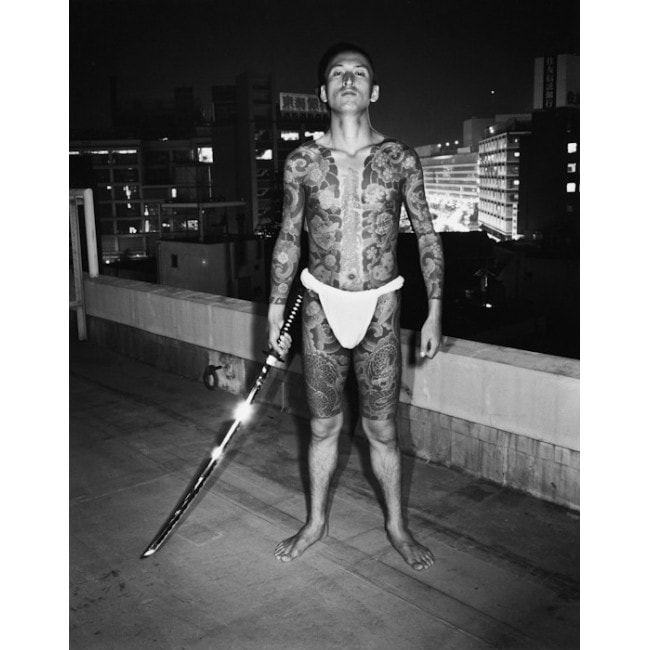
Seiji Kurata - Flash Up
Flash Up was photographed in from 1975 to 1979 depicting the seedy, often violent underbelly of gang culture in the notorious Ikebukuro and Shinjuku districts of Tokyo. Kurata, a natural who began his photographing career doing workshops with revered greats such as Daido Moriyama and Araki Nobuyoshi, takes us on a journey through the nightclub scene of Ikebukuro and Shinjuku, he shows us glimpses of the cocky, tattooed yakuza underworld and of violent Bosozoku street fights, contrasts car crash victims with portraits of nightclub hostesses and the horny salarymen groping them for money, documents ultra-right wingers in Meiji Jingu and on tour in the countryside.
|
This image additionally shows a counter culture, yet due to the weapon and western societies connotations with tattoo's and danger, this image poses as more concerning and intimidating. As stated before the striking factors within the image are both the weapon and the large scale body ink on the subject. Contrasting with British society due to his revealing dress showing his heavily tattooed body, for some in western culture tattoos are seen as a taboo but in Tokyo tattoo's are actually seen as a very specific form of art this helps us to create a understanding of why the individual is stood so proudly within his positioning as his body is a piece of art he is proud of. In addition to this tattoo's are also a way to narrate a story in conjunction with portraying power through previous pain - due to this individuals gang culture this is another powerful symbol for the subject as it is a symbol for him that he has been though physical pain. This again alludes to the viewer not only being potentially threatened by the subject but also intrigued by the story that this man has in comparison to the more simplistic and mundane yet safe life of their own.
|
Bruce Davidson - Brooklyn Gang
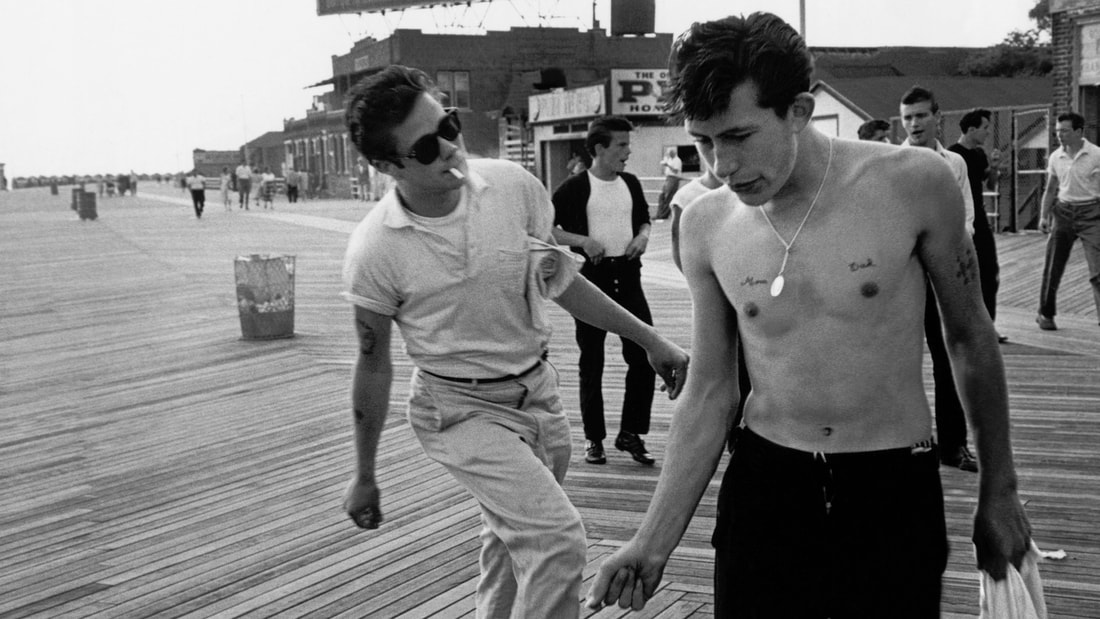
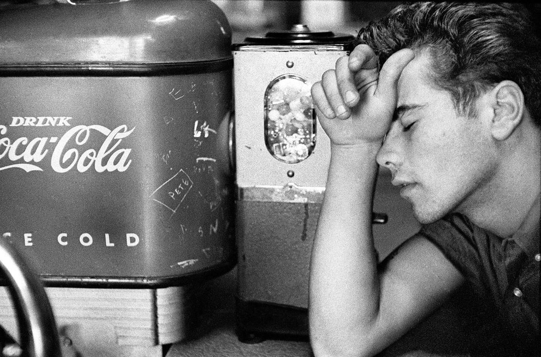
During the summer of 1959, Bruce Davidson followed a loosely knit "gang" of teenagers around Brooklyn, New York. His camera captured these children of the James Dean generation in both private and public moments at the soda fountain, the tattoo parlor, Coney Island, and late-night basement dance parties. The beautiful adolescents that fill the pages of this book exude a cool sensuality which came by way of the young Brando and Dean, and traveled from American shores around the world. Davidson has created an exquisite photographic elegy for a time when, in retrospect, we all seemed young.
|
|
These images show the style and era that these individual were born into due to their time of there adolescence. The photos capture the way that the young adults lived whilst adding thrill due to this particular group not being extremely well know within this period of time due to their both secretive and scandalous nature. The images document this movement like nothing else due to heir realistic and raw nature in addition to the editing process of them being in black and white focussing the viewers attention simply upon the subjects and their actions rather than there surroundings. The photos look as if they have been taken as if he was completing a covert observation of the group as nothing seems posed - truly creating a snapshot of their natural lives.
Chris Steele-Perkins - The Teds
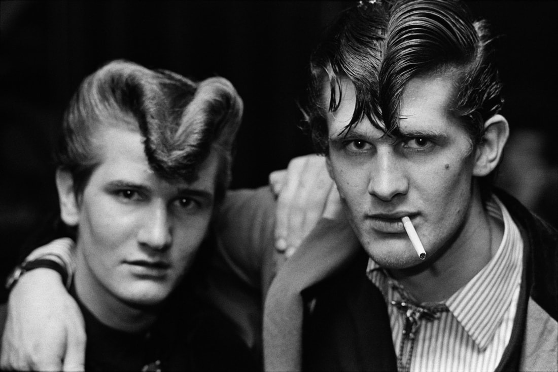
The invention of the ‘teenager’ in the 1950s was a global, almost simultaneous phenomenon. Defined by groups of youths rebelling against the expectations of their parents and wider society in their behaviour, attitudes and clothing, movements sprang up in America, Australia, Japan and beyond. Identifiable by their clothes and the music they’d play, these youths revelled in a post-war freedom not enjoyed by the previous generation. In the United Kingdom, one facet of this newly emerging youth culture was working class youngsters adopting the formal and flamboyant tailoring of Edwardian dress. Known as the ‘Teds’ (nodding to the Edwardian era their look was borrowed from) their jackets – often sumptuous velvets – had wide notched lapels accessorized with a skinny tie or bootlace, and they wore brothel creeper shoes on their feet. “The Ted swaggered with it all out front, male sexuality overt,” wrote journalist Richard Smith. As well as a way of dress and a style of music, owing to several high-profile incidents, the Teds were also associated with wayward and yobbish behaviour and public fights that led them to being banned from some venues.
|
The image to the left perfectly captures how these individuals are on the peripheries of society - there hair is extreamly individualistic from the rest of society yet similar between the pair signifying that they are part of a subculture. The intense look that the subjects give into the camera additionally adds a slight aspect of danger to the image, they are seen as both edgy and unconventional to societies traditional norms and values making them an intriguing subject matter to photograph. Again much like Davidson the use of black and white film within this image captures a more raw and hard-hitting image allowing the viewing to focus heavily on the subjects facial features and expression. The most significant object within the image besides from the subjects is the unlit cigarette in the right individuals mouth again this add to the complexity of the image and a further sense of danger to this
|
subculture. Finally, one aspect of the image that I felt was especially significant was Steele-Perkins use of focus, the individual on the left has a slight blur to his facial features and is less in focus than the subject next to him, this may symbolic of how this individual could be the leader of of the gang or he simply plays a more important role than his counterpart.
Talk by Nadav Kander
|
Acclaimed photographer Nadav Kander came into school and spoke about how he came about photographing particular scenarios as well as stories that went with his trips around the world to capture different societies and environments. Kander was born on December 1st in 1961 in Tel Aviv Israel, he moved to Johannesburg, South Africa in 1964 and is now London based. He told us that his interest in photography grew when he was 13 though taking pictures on a Pentax camera that he had bought thanks to his Bar Mitzvah. Around then, he began to look deeply at the work of Strand, Stieglitz, Weston and Atget, all of which resonated the feeling that each artist was exploring their respective lives. "They made work about both their outer surroundings and their inner landscapes and their art clearly showed their individual and consistent authorship. Weston for instance made portraits that had similarities to his drift wood series of years later, he photographed a toilet bowl that looked like his shells and nudes that looked like his contorted peppers. This subconsciously informed me that nothing should be considered “out of bounds” to my art practice. This has been fundamental to me" .He is known for his photography of famous faces and landscapes and spoke to us about four of his projects from his time as a photographer;
|
|
Half life - Chernobyl
|
Reactor No.4 at Chernobyl’s Nuclear Power Station exploded in 1986 leaving the surrounding area uninhabitable for many hundreds of years to come. When Kander visited it happened to be the 20th Anniversary since the explosion. Allowing him to photograph the deserted spaces in what was once a model Soviet City, due to the less reactive air. The area was home to more than 40,000 people, with apartments, schools and hospitals that were left completely derelict following the evacuation which left a disturbing sense of uneasiness that he described as "unexperienced." He additionally stated that there was a great beauty in a very real way the poignancy of human suffering hung in the air. Finding himself with a familiar feeling; best described as "the feeling when walking through an overgrown cemetery on a drizzly day, but what I was looking at was far from familiar."
To me his images examine both the disturbing and ominousness. |
of his surroundings with whilst additionally adding a beauty within destruction. Through his editing process I think that these additions were made by turning down the saturation dulling all of the colours within the images making the area seem more grey toned to give the photographs a more melancholy and eerie atmosphere. Another technique within his photography was his use of a wide angel lens the images show a lot of empty space again demonstrating how isolated this area now is. No one is within the images, just there past lives. I think this links to his title - Half life as it shows half of the life of individuals as their previous activities such as class rooms are demonstrated within the images yet, they are so deteriorated that the photographs only show half of their complex lifestyles.
Dust - Russia
Kander explained that whilst he was researching large cities in Russia for a photographic project, he came across two smaller towns that had been kept secret: Kurchatov and Priozersk (formerly known as Moscow 10). These places on the Russian-Kazakhstan border never appeared on any maps until Google Earth ‘discovered’ them. He was told that these towns were mostly destroyed. As with many of the secrets within its life, this inspired his wish to know more, and he was propelled by that desire as well as an interest in the aesthetics of destruction - much like shown in Half life. He additionally explained that the places seemed empty and silent, and he was photographing destroyed landscapes without any clue as to how inhospitable they were to man—apart from the white overalls he had to wear.
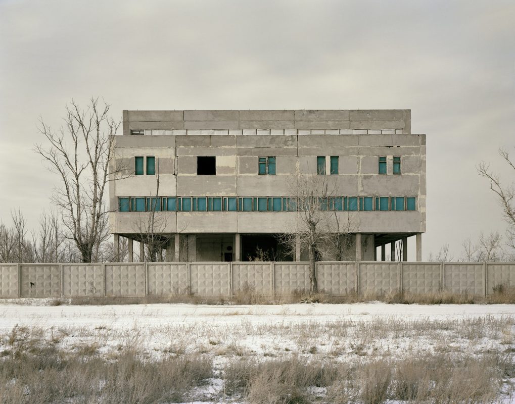
"I was reminded of Albert Speer’s notion of ‘ruin value’, the idea that buildings should be designed to eventually fall into aesthetically pleasing ruins, demonstrating to future onlookers the might of previous generations. When Sir John Soane designed the Bank of England, he presented the governors with three oil sketches, the third of which showed how beautiful the building would look in ruins—a thousand years onward. I wonder how the ruins we see here on these pages will speak to future generations."
Within these images I feel that Kander use of space is extremely well executed he has allowed a vast amount of the landscape into the photographs allowing both the buildings and there surrounding environments to be seen. In the latter two images the camera sees past the walls of the construction allowing a deeper scope into the architecture - perhaps additionally this is a metaphor for Russia excluding the world from these locations, whilst Kanders expand world knowledge on this breadth of the world, unknown before these images. |
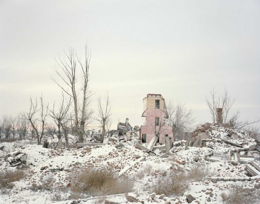
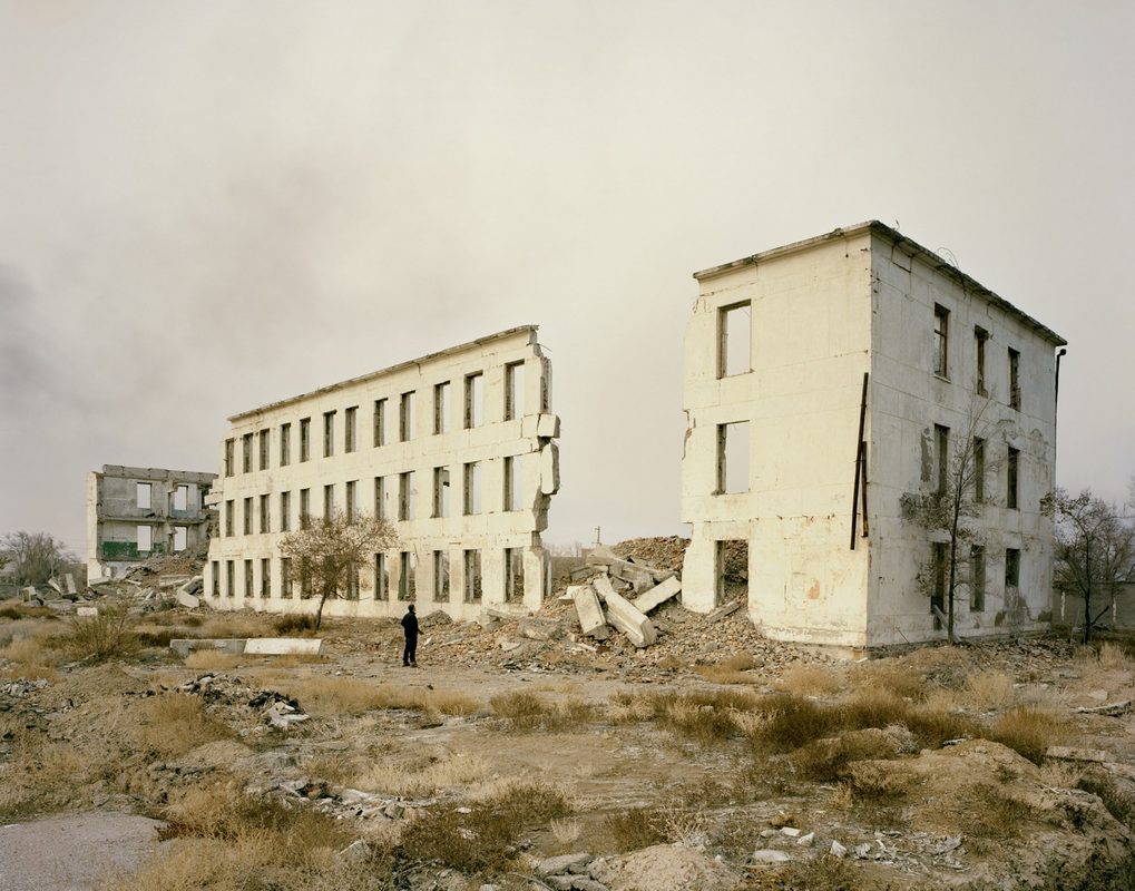
|
The long river - China
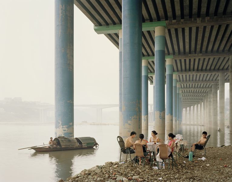
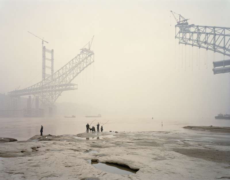
|
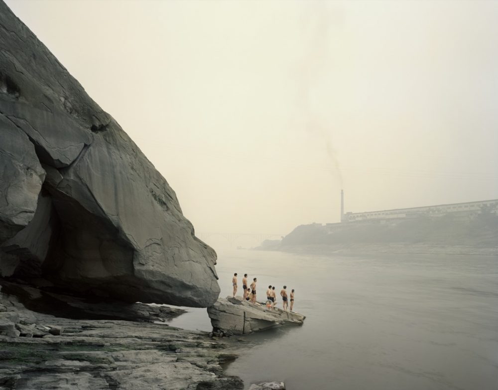
Nadav explained that the Yangtze River, formed the basis of his body of work. It is the main artery that flows China, traveling from Qinghai Province in the west to Shanghai in the east. The river plays an essential role in both the spiritual and physical life of the people. Through this he used the river as a metaphor for constant change, photographing the landscape and people along its banks from mouth to source.When he went to China, he wanted to respond to what he found and felt with his camera lens allowing him to do so. After several trips to different parts of the river, it became clear to him that his pictures were a image of the "formalness and unease of the country that feels both at the beginning of a new era and at odds with itself."
The images examine that “Nothing is the same. We can’t revisit where we came from because it no longer exists.” Due to the rapid industrialisation of this new super power economy the landscape |
is changing daily. These are photographs that can never be taken again, due to the movement of China into becoming a world economy.
The final image of the three I have looked at examines what Kander said to me the most, the half built bridge shows how change is happening in a very simplistic sense of literal building. But in addition to this China's increasing link between other countries as the area becomes more globalised the bridge could be seen a s a metaphor for the bridge the country with the rest of the world especially due to it previously communist nation - now the area is thriving more than any other due to the western influences of capitalism. Furthermore, his editing processes within these images alludes to the positives and negatives that this change has caused. It is know that China's classes are heavily divided with the wealthy becoming extremely powerful. Yet the poor struggling more than ever. The use of the lowered saturation of the mages creates again much like Half times images a eerie and dismissive emotion to the photos - examining how for many this change in environment, social and economic change can cause downsides.
The final image of the three I have looked at examines what Kander said to me the most, the half built bridge shows how change is happening in a very simplistic sense of literal building. But in addition to this China's increasing link between other countries as the area becomes more globalised the bridge could be seen a s a metaphor for the bridge the country with the rest of the world especially due to it previously communist nation - now the area is thriving more than any other due to the western influences of capitalism. Furthermore, his editing processes within these images alludes to the positives and negatives that this change has caused. It is know that China's classes are heavily divided with the wealthy becoming extremely powerful. Yet the poor struggling more than ever. The use of the lowered saturation of the mages creates again much like Half times images a eerie and dismissive emotion to the photos - examining how for many this change in environment, social and economic change can cause downsides.
Dark line - Thames
"When alone, there is nowhere I'd rather be than beside large bodies of slow moving water. I feel myself, quiet and alive as emotions come and go. Travelling to the estuary in the dark, often alone, and returning home at nightfall has affected how I see this place - not as a geographical landscape, but as a mystical space, somehow otherworldly and full on intrigue."
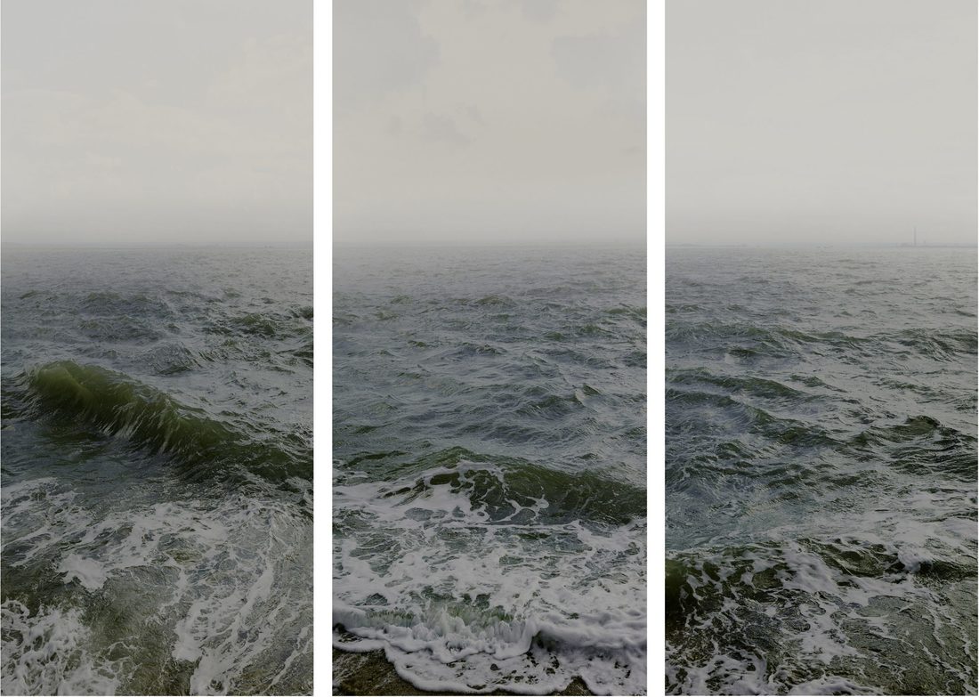
The three images located next to each other are symbolic of the movement that occurs within water. I think what Kander is trying to examine within these images is how these images can never be created again as the movement is ever changing and each wave will be different from the next. To Londoners the Thames is not seen as a natural construction of beauty but more a man made mode of transport, these images show a more abstract side of the river Thames and the use of his unfocused blurred distance creates a mystique into a landscape that is known to be heavily understood and acclaimed.
STRANDS
Strand 1:
Bodies - Ernestine Ruben
Ernestine Ruben lives and works in New York City and is an internationally known artist, who grew up surrounded by art and artists. She received degrees in the History of Art and Art Education, and has taught art to all ages for many years as well as creating a mentor group and has participated in many critiques. She has photographed the human body with great emphasis on the human hand and applies her love of life to landscapes and architecture. Of great importance to her is the reference to human life and it’s interaction with our complexity of environments. She has devoted her career to applying photographic concepts to other art forms with extensive experimentation and variety. After beginning with body images in silver, she expanded to fusing photography with dance performances, sculpture, glass, architectural mobiles, fashion, and papermaking. She also worked in old processes often combining them with new digital technology. Ruben continues to seek new directions and is currently studying the relationships between architectural construction, space, sound, and the visual image.
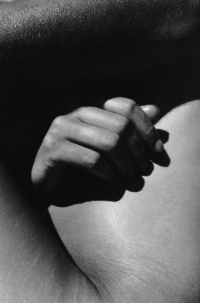
|
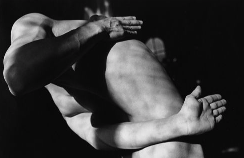
|
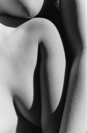
|
I photographed the small intricate details of my subjects body and positioned her in ways much like Ruben to create an abstract image, as they are unclose details and ways of sitting that are more unusual for viewers to normally see. These images not only shined light on the body in a way an different way but additionally in some images it created other pictures - that didn't directly relate to the human body at first.
|
|
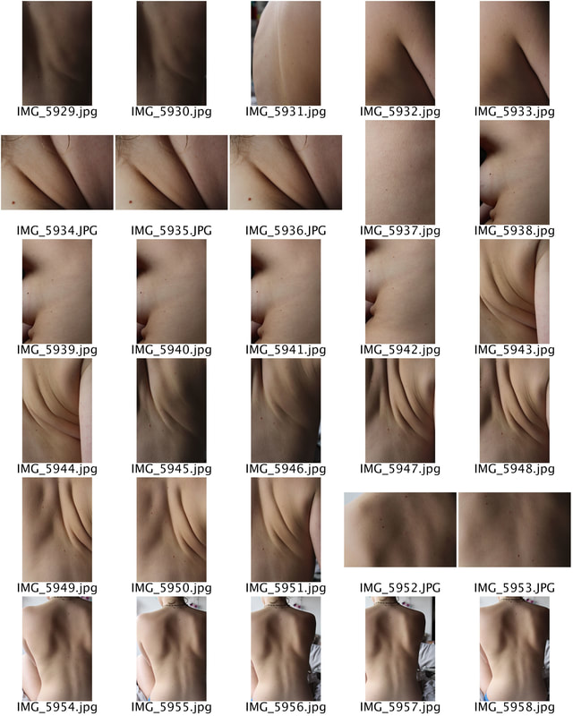
|
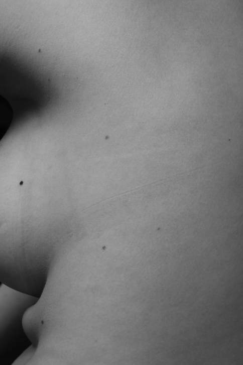
|
|
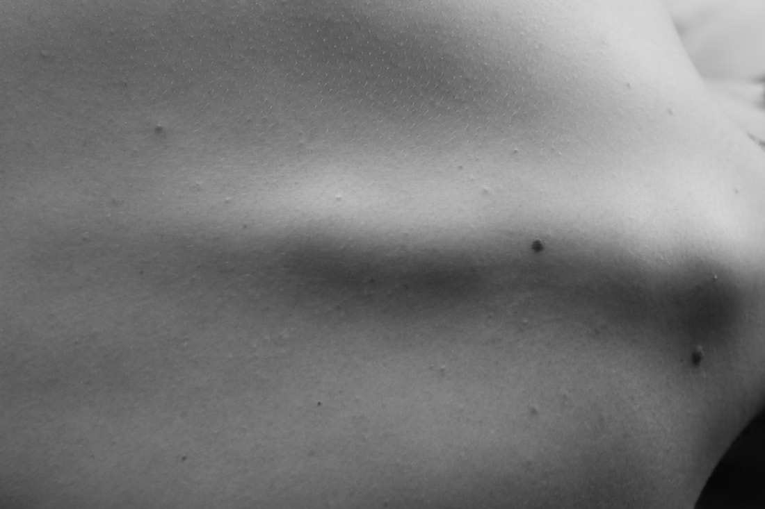
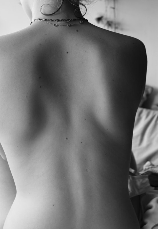
|
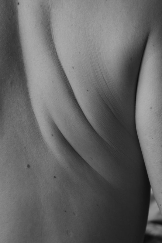
|
I felt that Rubens use of black and white was effective within her photography as it allowed the images to become more abstract as what body parts she was photographing became less clear. I felt when I edited my images in a similar way the same affect occurred. Without the colourings and shadings given by creases within the skin it became less clear what parts of the subjects physique I was taking photos off, allowing the images to create their own unclear meaning. Additionally, the black and white colouring of the images allowed marks upon the body to become more clear such as chicken pox scars and moles I felt that this made the images more meaningful as they examine marks that make someone very much an individual yet can only be noticed by the model themselves as they are intricate details one would only notice if upon your body.
Although I also felt that these images may have performed better in a studio due to the background being slightly distracting as it removed total focus away from the subjects body. This is why I felt that the first images were better than the latter ones I selected because the total focus and image was on the body parts.
Although I also felt that these images may have performed better in a studio due to the background being slightly distracting as it removed total focus away from the subjects body. This is why I felt that the first images were better than the latter ones I selected because the total focus and image was on the body parts.
Strand 2:
Brutalism - Simon Phipps
The photographs by Simon Phillips present each of the featured buildings in all their stark splendour. Quite incredible to think that, in years gone by, these structures were dismissed as eyesores by so many people. Sometimes it takes perspective to appreciate greatness. Phillips uses the modernist architecture and allows the harsh and angular shapes of the buildings to have a comparison with the natural landscape of the surrounding them, such as the sky and the plants. The images are additionally edited in black and white so that the structure of the construction photographs is the main focus for the viewers.
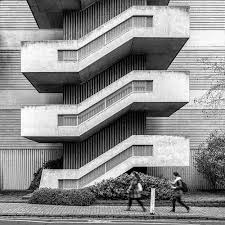
|
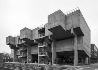
|
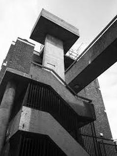
|
Within these images I visited the Barbican and photographed the Brutalist structure of many the building and many of the structures around it. Brutalist architecture flourished from the 1950s to the mid-1970s, descending from the modernist architectural movement of the early 20th century.
|
|
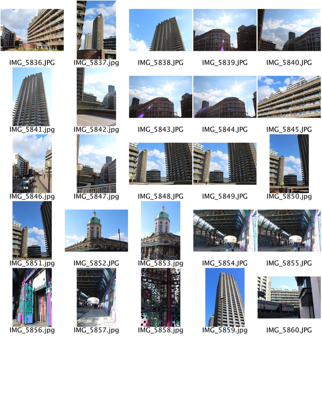
|

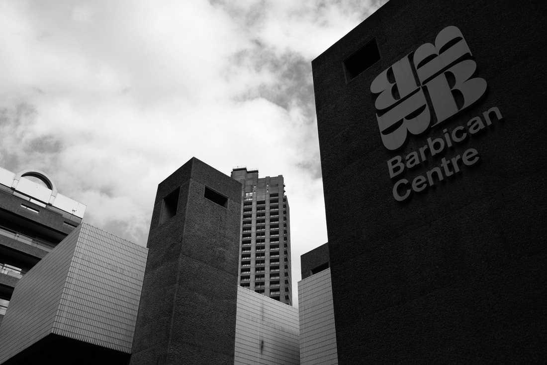
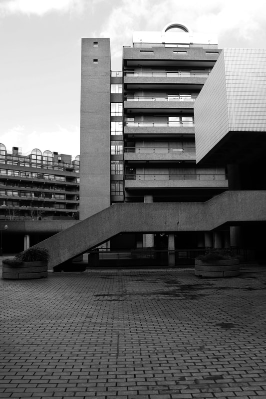
|
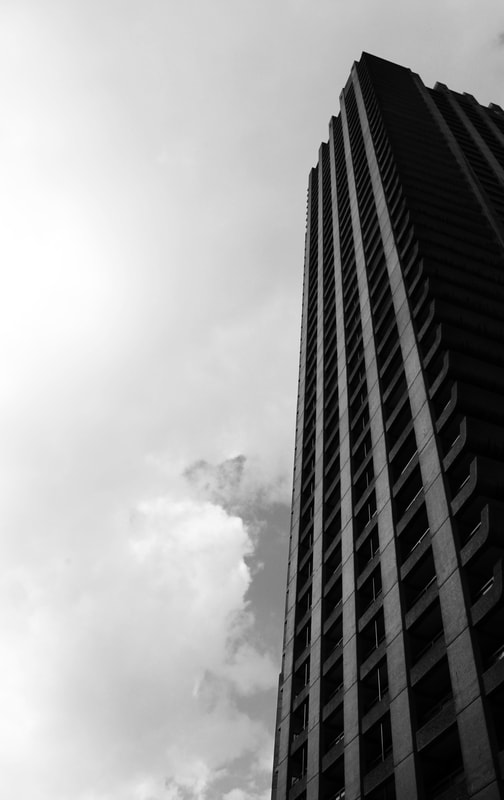
|
I think that these images as the effective as they show the capacity of the buildings due the wide angle lens - displaying the buildings at a huge scale. In addition to this because of there height the buildings are segregated from all other objects apart from the sky which sets a perfect scene as there is a stark comparison from the manmade and natural. The edit of black and white is effective as there are strong colour contrasts within the images allowing the shades to be brought out within the monotone effect. As well as this the structure of brutalist buildings has lines within its architecture showing the limitations of construction.
Yet, I felt that these images were not very substation and although they are strong within there building construction I feel that they are weak in a photographic element. Therefore being g stronger if I edited the image using screen printing to create an animated like effect.
Yet, I felt that these images were not very substation and although they are strong within there building construction I feel that they are weak in a photographic element. Therefore being g stronger if I edited the image using screen printing to create an animated like effect.
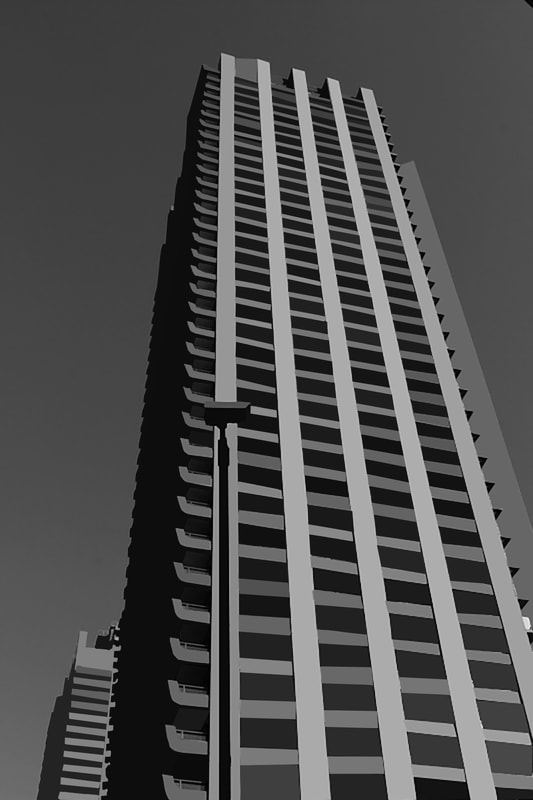
|
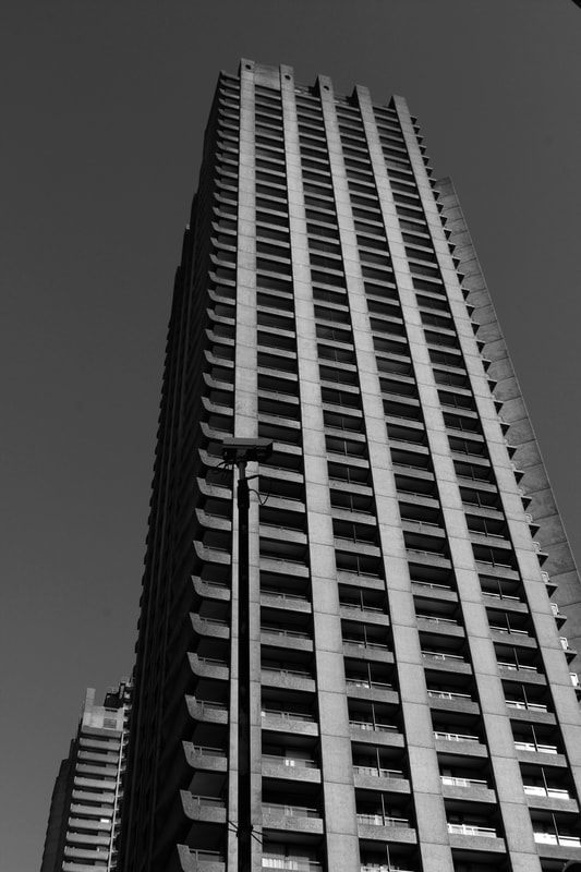
|
|
|
The technique used below is called screen printing. The effect changes area's of different colours into a singular block colour giving a slightly animated effect. The method for this technique is quite simple. Using the polygonal lasso tool on photoshop, you select the area that you would like to average the colour of (the are needs to start and finish at the same point and cannot be open). Next, you open the filter tab, go to blur and finally select average. This will then make the area selected the average colour within the space. Continue this four steps until non of
|
the original photo's colours are visible. The area can be as large or small as one chooses depending how accurate you would like the final result
I think that this result was effective as it demonstrated the freedom that software such as photoshop can give to a photographer as well as showing the limitations of structural buildings as they have to be well calculated in order to exits. If I was to expand this strand further I would use different colours instead of the average colours within the image as I feel this would make the photographs more intriguing to the viewer as well as displaying more of the freedoms within editing processes.
Next I decided to expand this strand further by doing as stated above, to do this I followed the steps stated above yet when choosing the colour selected layer, then new fill layer and then solid colour changing the block colour for each individual aspect of the building.
|
|
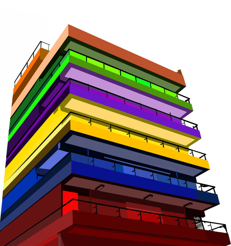
I think that this was successful because it delved into both freedoms and limitations. The freedom aspect of this image comes from the editing process - the way I have been able to incorporate many different colours and shades into the photograph shows the freedom I have with colour and manipulation in photoshop. As well as this I additionally feel that the image also displays limitations. Due to the lines within the building my image does have some constrains to where the colours can be located in addition to this I have removed all surrounding buildings from the original photograph displaying isolation and therefore a limit to external space.
Strand 3:
Homelessness - Warren Richardson
Warren Richardson is a freelance photojournalist currently working in Eastern Europe. Born in Australia in 1968, he is a self-taught photojournalist who undertakes long-term projects dealing with human and environmental issues, as well as assignments for newspapers, magazines and companies. He has lived in Asia, the USA and Europe and the Middle East, and during a period in the UK and US he worked in celebrity photography. While working on the Serbian-Hungarian border in 2015, he was one of a group of journalists covering the refugee crisis who was beaten by police. His next project will see him walk to the Arctic Circle, to continue his refugee stories, then explore the effects of human-induced climate change on the world. He lives by the proverb that says: "We have not inherited the land from our fathers, we have borrowed it from our children."
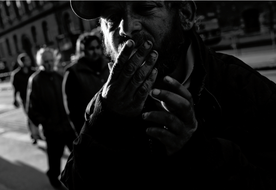
|
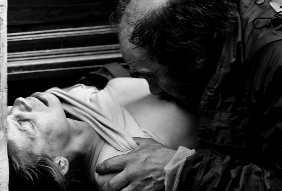
|
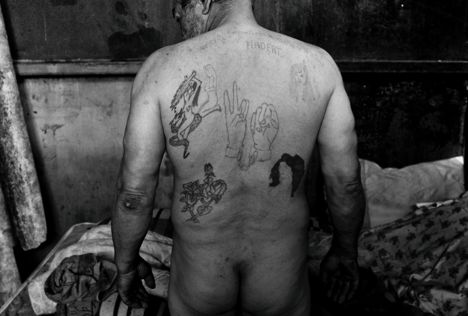
|
Richardson titles the middle image 'A homeless couple making love in the streets of Budapest.'
"I had just taken around photographic students for the day, we where on our way back helping one of my students find there hostel when we came across this couple, I put my bag down and pulled out my 500mm lens and aimed my lens at this couple from across the road, still taking pictures I looked to see what my students where doing, some photographing me, others watching what i am doing, one of the students said to me, that is discussing, for some it is hard to ecology that somethings maybe different, I said to her, Madam they look extremely comfortable, they don't look offended, they are simply in their own moment, ask yourself madam what makes you so offended by what you have seen, its real, its happening wright as i speak to you. She told me that she felt offended more shocked that this would happen on the streets here in Budapest, she asked me to take her around for another day to show her more of this under world of Budapest, the resolute after her spending 3 more days was that it made her feel stronger, more adapted, taking nothing for granted, seeing the self in the moment and reacting to it in peace."
"I had just taken around photographic students for the day, we where on our way back helping one of my students find there hostel when we came across this couple, I put my bag down and pulled out my 500mm lens and aimed my lens at this couple from across the road, still taking pictures I looked to see what my students where doing, some photographing me, others watching what i am doing, one of the students said to me, that is discussing, for some it is hard to ecology that somethings maybe different, I said to her, Madam they look extremely comfortable, they don't look offended, they are simply in their own moment, ask yourself madam what makes you so offended by what you have seen, its real, its happening wright as i speak to you. She told me that she felt offended more shocked that this would happen on the streets here in Budapest, she asked me to take her around for another day to show her more of this under world of Budapest, the resolute after her spending 3 more days was that it made her feel stronger, more adapted, taking nothing for granted, seeing the self in the moment and reacting to it in peace."
|
|
I went around London to different areas photographing different aspects of poverty from complete homelessness, street jobs and cheap housing and material goods. I achieved a range of images but felt that my most effective where of those living on the streets.
Although i did find this subject matter very difficult to photograph as I felt that it was perhaps rude or disrespectful to photograph such individuals. Because of this they were less interactive and less able to have a conversation with in order to photograph. I also emailed a homeless shelter but they didn't respond. |
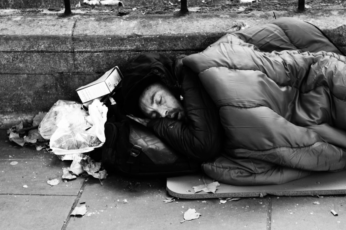
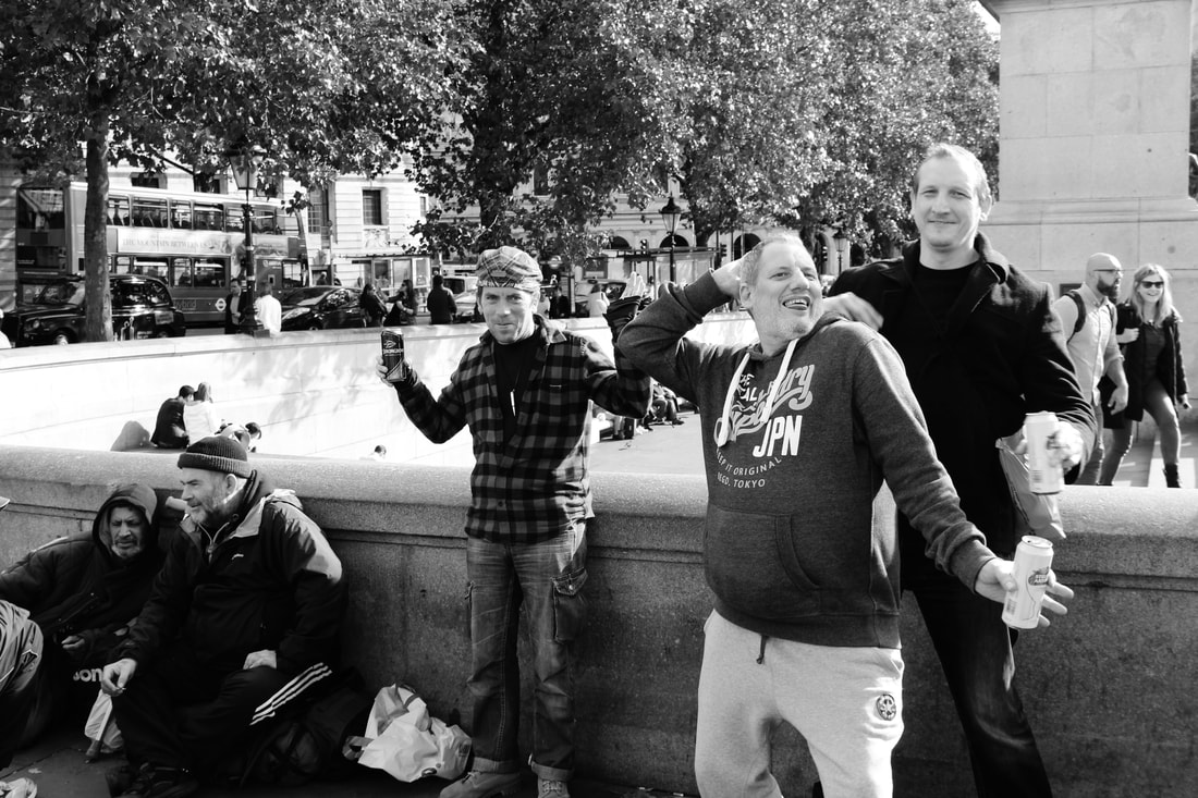
When editing these images I made them black and white and increased both the contrast and brightness, I think this was very effective as it added both depth and a sort of uncleanliness due to the contrast increase picking up little images of the photograph that wouldn't be noticeable otherwise. I do think some of the photographs such as first image where effective yet this type of photography was very time consuming and found to be difficult to capture a effective and powerful image.
Strand 4:
Meat Market – Daniele Pintore
Daniele Pintore is a documentary photographer based in Paris. After his studies in photography and visual arts in London, he started working in one of the biggest studio in France. His photography stretches from Fine Art, with more personal and intense projects, to Documentary Photography where he opens his ideas and his camera to the world. Always willing to spot what is different and unusual, he exposes himself to society with interest, curiosity, and with a desire to know and absorb a new culture. A new culture: different habits, languages, customs, often living in the same place but also finding cities and countries where diversity of language, ethnicity, and culture live together. The base of his projects is the research of experimenting different aspects of society, along with challenging stereotypes and standards imposed by society. Using photography as method to drive away his demons, most of his projects are extremely linked with his personal condition, group class or family. As member of society he believes that something can be done to change or stop what mass media force us to believe, if minorities can express themselves differently or be depicted in another way.
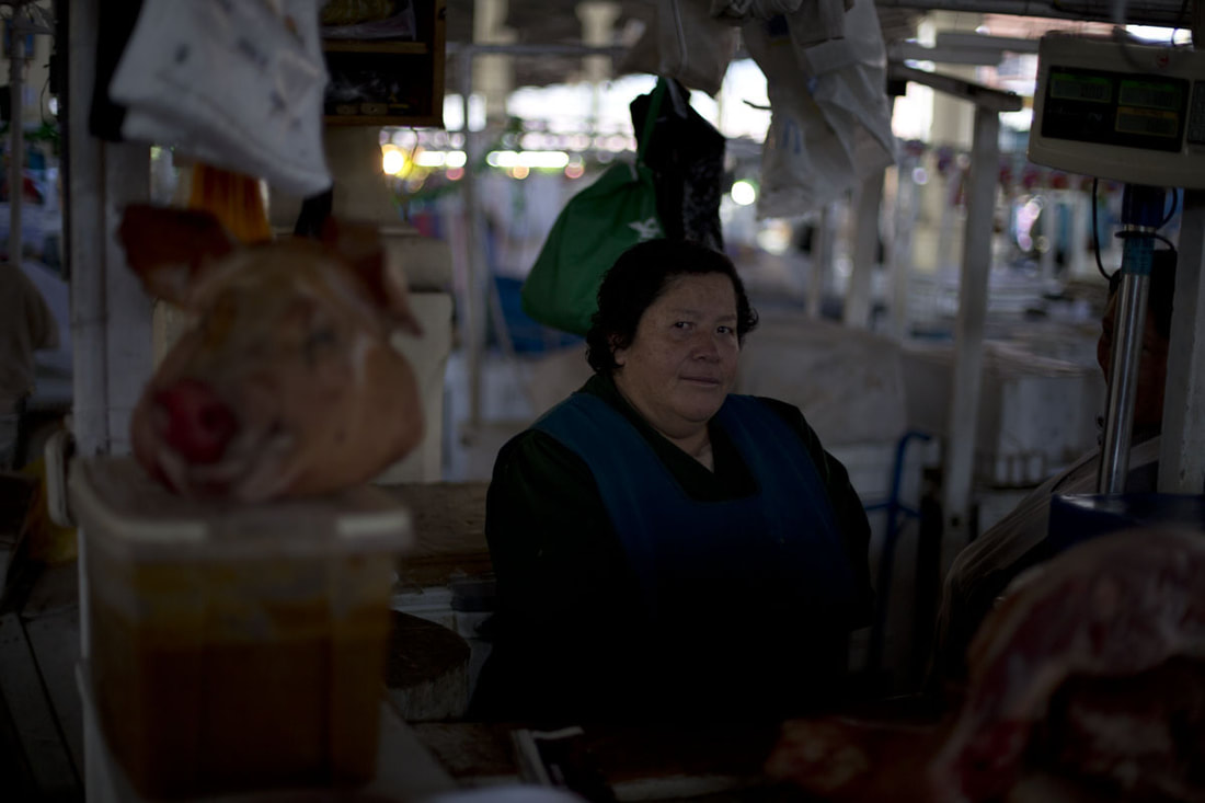
|
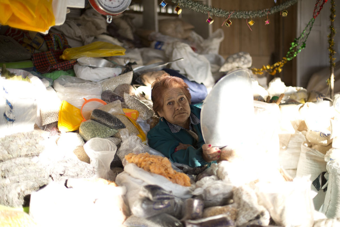
|
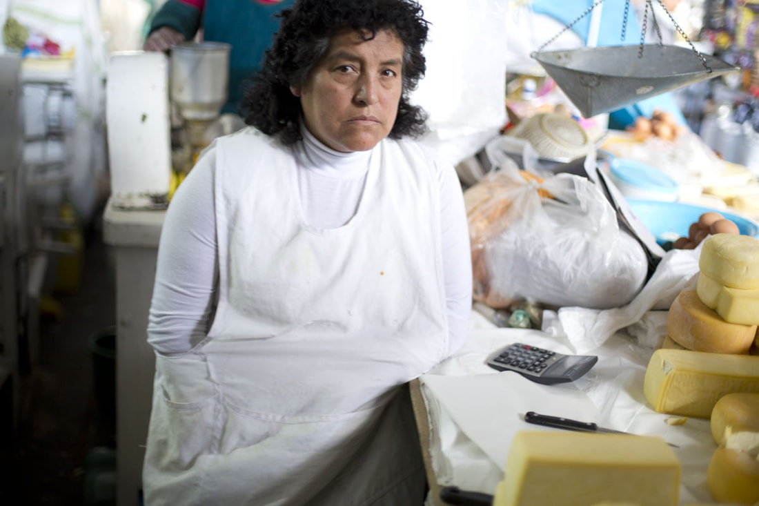
|
|
|
|
I photographed a food market in Spitalifields serving food from a variety of cultures. I didn't ask the individuals I was taking photos of if I could as this added a more documentary style to the image as they didn't change their everyday actions in order to look 'good' or different for the camera. I felt that these images represented the freedom and limitations within London culture as there is so much diversity and choice within the city but additionally racism is still prevalent and therefore a limitation for ethnic minorities.
|
|
|
|
To edit these images I increased the contrast of the image whilst also lowering the brightness so that the images were not overly saturated. I did this so the colours of food as well as steam and facial expressions were more clear within the images. I felt that these images were
Chosen strand: Markets
I chose to develop the meat market images as I felt that these photographs had both a lot potential developments due to the variations of markets within London, they can sell produce from a variety of cultures as well as a variety of produce from food, clothing and house hold ornaments. I additionally felt that the people selling different types of products can be quite symbolic for the type of people the are, allowing the viewer to make assumptions about the freedom and limitations they have faced in their lifestyle from potential immigration as well as their class structures potentially leading them into their occupation.
First Development - Columbia Road Flower Market
For my first development I visited Columbia Road Flower Market, this is a Sunday market that is open from 8 til around 3. It sells a variety of flowers and plants and works in a very traditionl market style of shouting out prices. It is located in Hackney which is an area that has been recently gentrified - this is the process of renovating and improving a house or district so that it conforms to middle-class taste. For an originally working class area this has reshaped the area in conjunction with the market as prices have been raised so the sellers have been able to make more money whilst it is causing the original residents a limitation as they are unable to live I the area with rising prices.
|
|
|
|
|
|
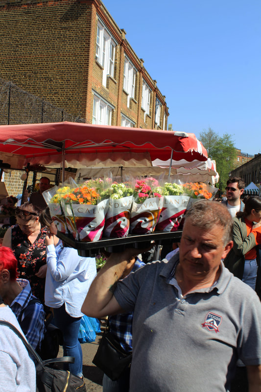
|
|
|
|
|
|
|
When photographing this area I focused on the individuals whom sold the produce mainly as I felt that there was a similar theme of them being middle aged, white men. In addition to photographing the market sellers I also took the images whilst they were within their natural environment of selling and so each individual was not posed for the photograph allowing the images to be more realistic and raw - documenting the life styles of such people.
Second Development - Smithfield Market
|
|
This market is the largest wholesale meat market in the UK and one of the largest of its kind in Europe. It is located near the Barbican and is open from 2AM till 8AM to sell meat to other industries to sell on. I visited at 6AM as I felt this would be the prime time for both the sellers and the buyers yet the market was coming to close when I visited so I photographed the butchers and the left over meat - which there was luckily quite a lot of left. Additionally, when photographing the butchers in contrast to Columbia Road Flower Market I asked them when I took photographs of them to create a different effect whilst also allowing a more face on image.
|
|
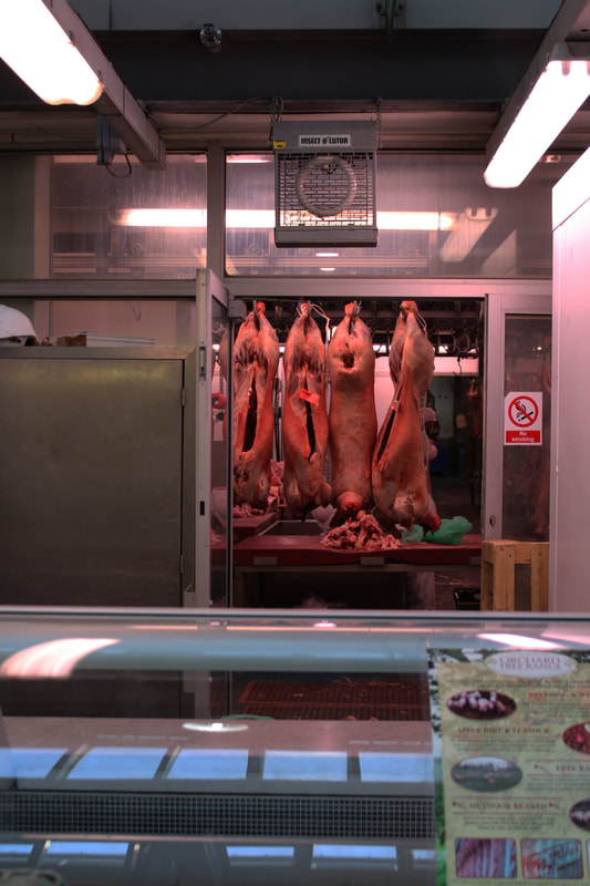
|
|
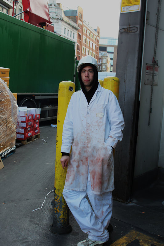
|
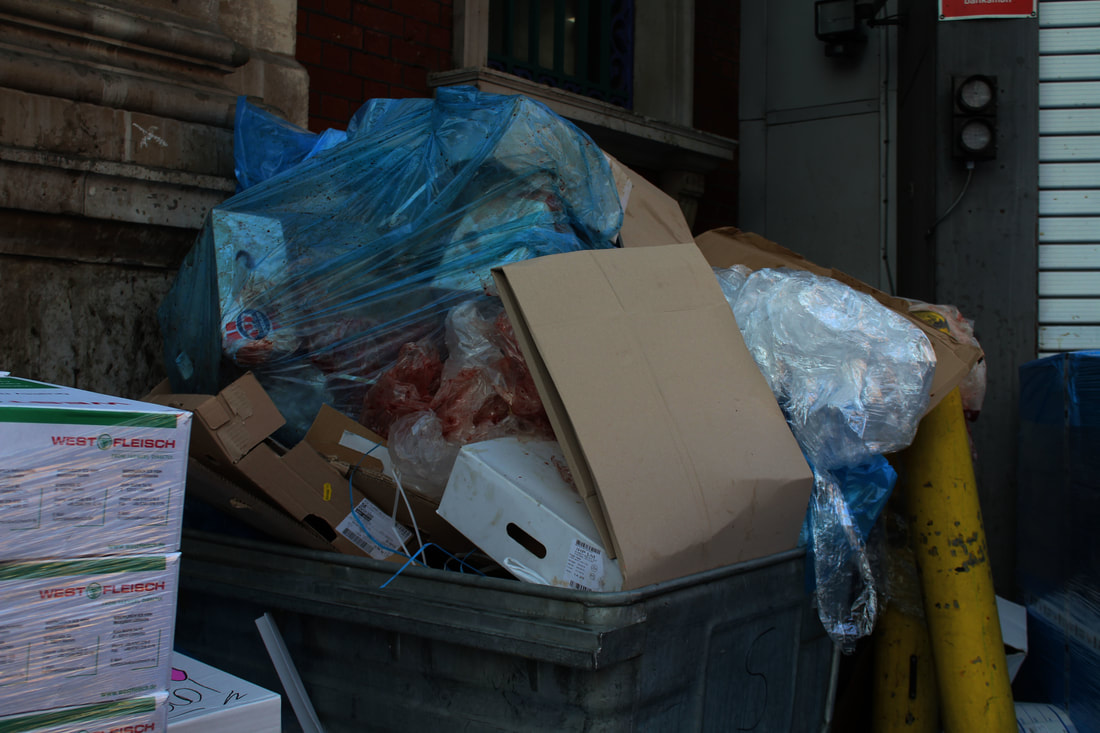
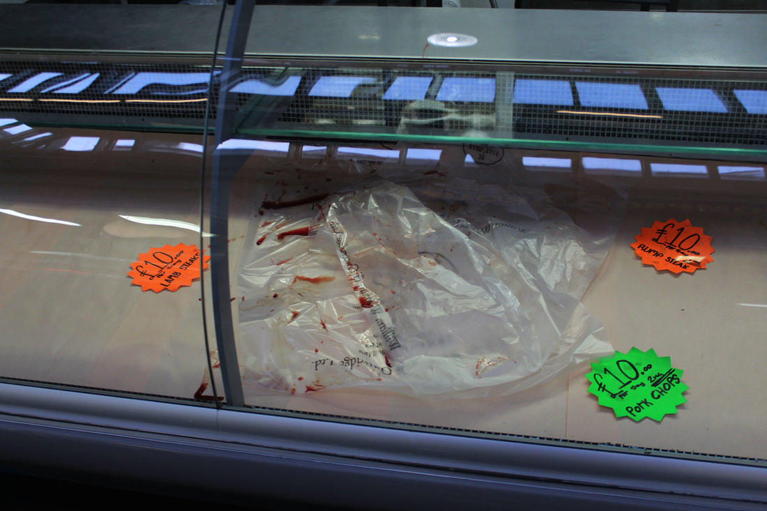
When editing these images I felt that the blood of the meat was a strong component of all of the images in order to make this a key element of the images I increased the contrast of the images so that the blood became more present within the photographs such as on the butchers clothes and the plastic the meat had previsouly been within. Although the editing process of these image is quite similar to those of the flower market, the outcome of the images is starkly different due to what the photos are of.
Third Development - Farmers Market Exactitudes
|
|
Next I visited Alexandra Palace Farmers Market and photographed each of the food sellers in documentary style, yet this time aiming to create and exactitude images of them with what they sell. I decided to change the edit of photography of the markets instead of just simply documenting what they were selling . Allowing these images to show the freedom of choice within the job market but in addition to this the limitations that may be created through class or other barriers such as items not being able to be fresh or home grown due to the environment.
|
These are the images that I later used to create the exactitudes;
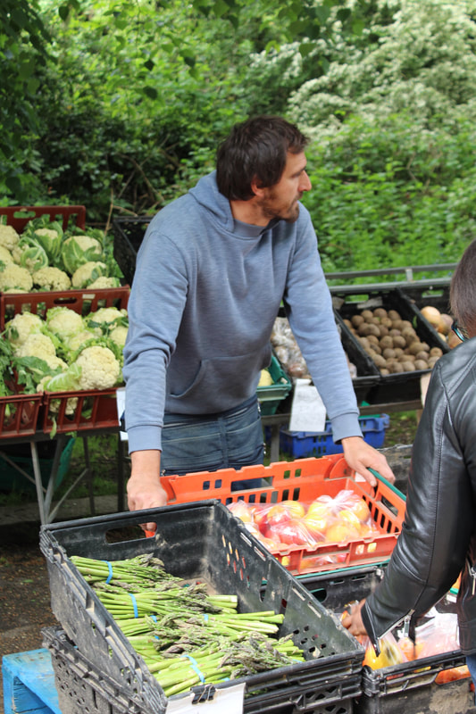

|
|
|
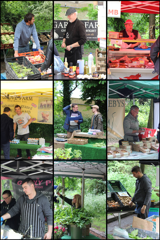
Although I felt that this edit was effective and created a different effect to my market images I additonally thought that the images may be more effective if I mirrored Ari Versluis and Ellie Uyttenbroek technique of placing the subject in the same position, having one aspect of there style similar to one and other and also by having no context within the photos by placing a white backdrop upon a wall. Therefore moving me onto my next development.
Exactitudes - Ari Versluis & Ellie Uyttenbroek
Photographer Ari Versluis and profiler Ellie Uyttenbroek have worked together since October 1994. Inspired by a shared interest in the striking dress codes of various social groups, they have systematically documented numerous identities over the last 21 years. Rotterdam’s heterogeneous, multicultural street scene remains a major source of inspiration for Ari Versluis and Ellie Uyttenbroek, although since 1998 they have also worked in many cities abroad.
They call their series Exactitudes: a contraction of exact and attitude. By registering their subjects in an identical framework, with similar poses and a strictly observed dress code, Versluis and Uyttenbroek provide an almost scientific, anthropological record of people’s attempts to distinguish themselves from others by assuming a group identity. The apparent contradiction between individuality and uniformity is, however, taken to such extremes in their arresting objective-looking photographic viewpoint and stylistic analysis that the artistic aspect clearly dominates the purely documentary element.
They call their series Exactitudes: a contraction of exact and attitude. By registering their subjects in an identical framework, with similar poses and a strictly observed dress code, Versluis and Uyttenbroek provide an almost scientific, anthropological record of people’s attempts to distinguish themselves from others by assuming a group identity. The apparent contradiction between individuality and uniformity is, however, taken to such extremes in their arresting objective-looking photographic viewpoint and stylistic analysis that the artistic aspect clearly dominates the purely documentary element.
|
|
|
Fourth Development - Exactitidues
Continuing from the individuals at the farmers market I decided to extend on with the images of the similarities within individuals and making them into a contact sheet like format - yet this time to remove the behind context of the area the subjects were within so that the focus of the photographs were simply from the style and clothing of the subject alongside there positioning. I did this by placing white wall paper onto walls around London and asking passers by if I could photograph them if they fit into particular categories. I noticed that some styles or ways of acting were more common than others, alongside some individuals not wanting their photographs taken. This placed my method at a disadvantage as it made the process of collecting images a lot longer than I originally thought. Additionally some individuals in different locations were more comfortable with having their photo taken such as Alexandra Palace were more happy to be photographed than those in Camden whom all said no.
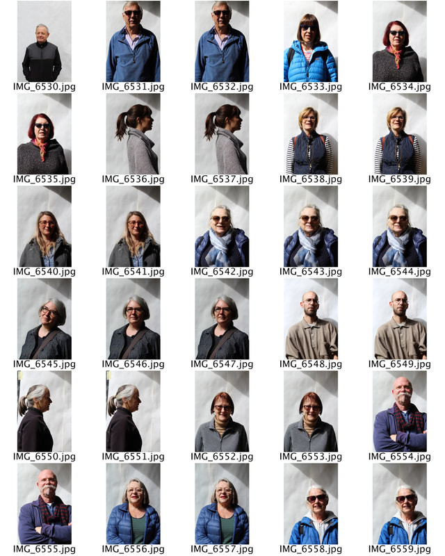
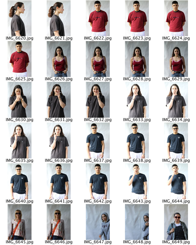
|
|
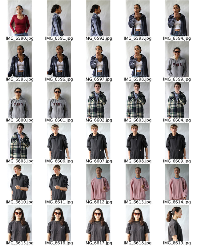
|
The group that I had the most success with, was women in glasses, as I had twelve different people all fitting into this category, I additionally photographed individuals wearing red, men with beards and women with pony tails. I had a variety of images for each group but edited them all so I became better with the editing process and to see a variety of numbers for the final collage like image.
|
|
|
Although I was not extreamly pleased with the outcome of these images it did allow me to grasp an idea of the amount of images is the most effective. In addition to this it allowed me to play with different shapes such as squares and thing rectangular strips instead of just the original 3X3 or 3X4 grid. Although I created a range of different shapes I did feel that the most effective images came from those with as many people as possible.
Fifth Development - Bowling Exactitudes
|
Next I chose to develop the exactitutde images further by finding a group of people whom follow the same activities as this would allow me to photograph a similar group of individuals all at once as well as it meaning that if one person said yes more were more likely to be comfortable with their photograph being taken. I visited Barnet Park and placed the same white backdrop up against a wall and ask the individuals playing bowels if I could photograph them.
They each stood in the same location and held the bowl they were playing with - that being the similarity within each photo. Although the obvious containing theme within the photo was the bowl I also noted other similarities between the members of the group such as them all being of a mature age and of a white ethnicity, many of them wearing light colours such as white, wearing hats and being very comfortable with their photo being taken unlike many other members of the public, this allowed me to create a further interest within these individuals as they were happy to be in front of the camera. |
|
|
|
For the editing process of these images I first had to decided how many photographs I would incorporate into the image, I had twelve different individuals from the bowels club but one individual was not holding a bowl and as this was the signature object within each image I decided to incorporate nine images instead. I re-sized the images to have a width of 21.01cm and a heigh of 31.48cm whilst making the resolution of all of the photographs 200. Next, I opened a new document and created a blank plain white image with a width of 63.03cm and a height of 94.44cm this was three times the size of the individual photos allowing them to fit into the 3X3 grid. I then used the ruler tool and decided the blank document up into nine sections so that there would be clear lines to place each individual photo. Later, I dragged the images from one tab on photoshop onto the new document adding layers to the document allowing the collage of images to form. Once I had aligned all of the images together I edited the photos individually to make the background colours as similar as possible - I did this later in the process so that whilst editing the photographs I could compare it with the other images in order for them all to have the same colour scheme. Once I felt that all the images had the same brightness and contrasts in conjunction with one and other I moved onto separating the photos through a grid like format. To do this I used a 4cm solid black line and followed the ruler lines that had been previously been made. I additionally created a slightly thinner border using the same line tool technique but halved the thickness of the line as it was no separating the images from one and other.
Sixth Development - Bowling
Due to my interest within the particular subject matter, I decided to go back towards the more documentary style that I started with of the meat markets, yet focus the images on the bowlers as I thought they were individuals whom lived on the peripherals of society due to their age yet had been within society for such a vast amount of time that they had knowledge and understanding that others did not. In addition to this this group of individuals really enjoyed having there photographs taken allowing me to feel comfortable photographing them and not intruding on their activities.
|
|
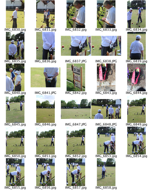
|
Whilst taking these images I aimed to simply document exactly what they were doing - I didn't want the fact that I was there photographing to change or obstruct their activity. Luckily due to the nature of their game I think that they were more focused on the sport than my photography.
|
|
|
|
|
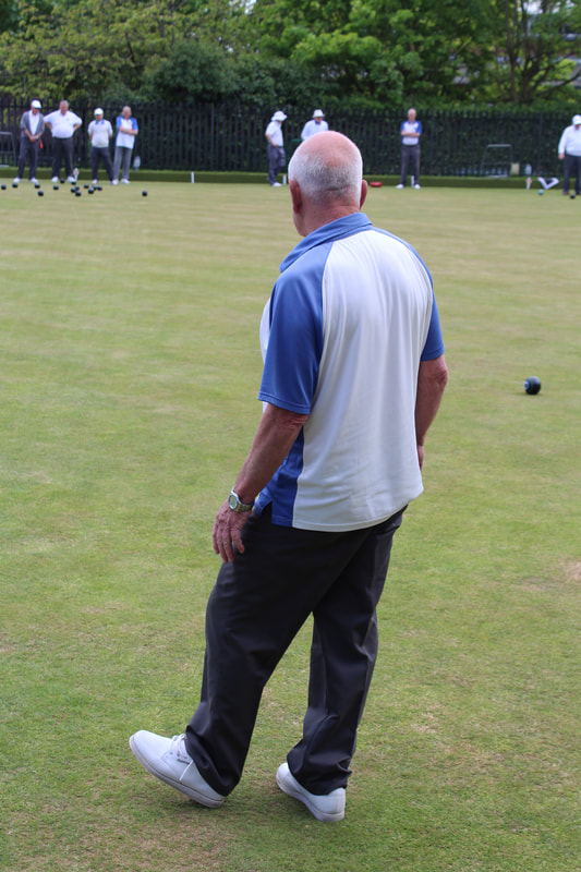
|
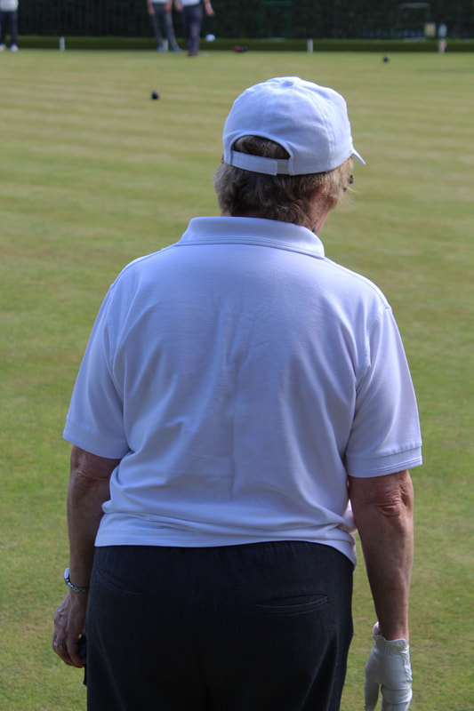
|
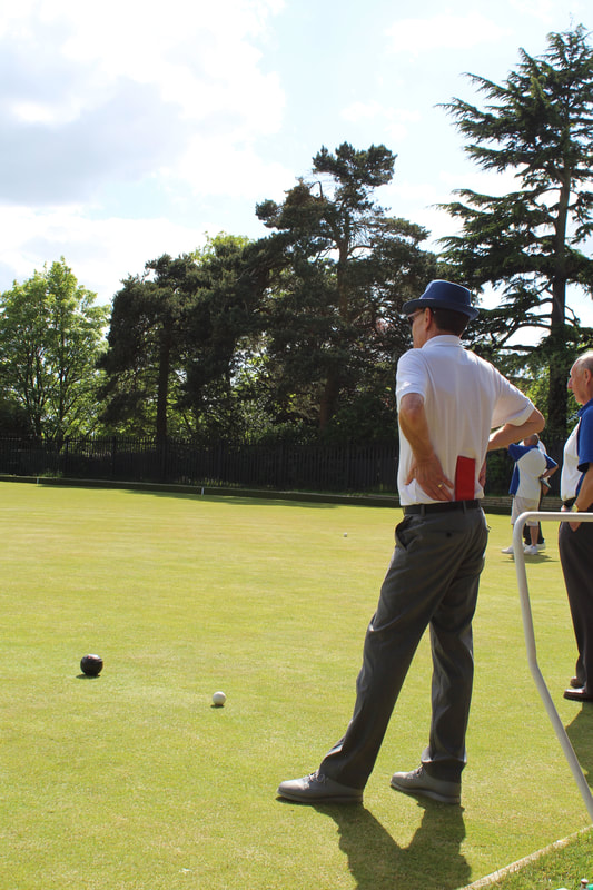
|
|
|
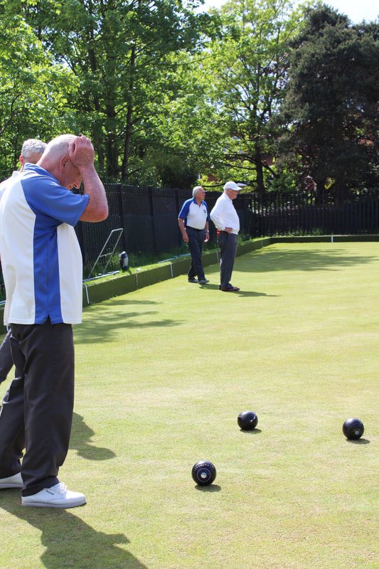
|
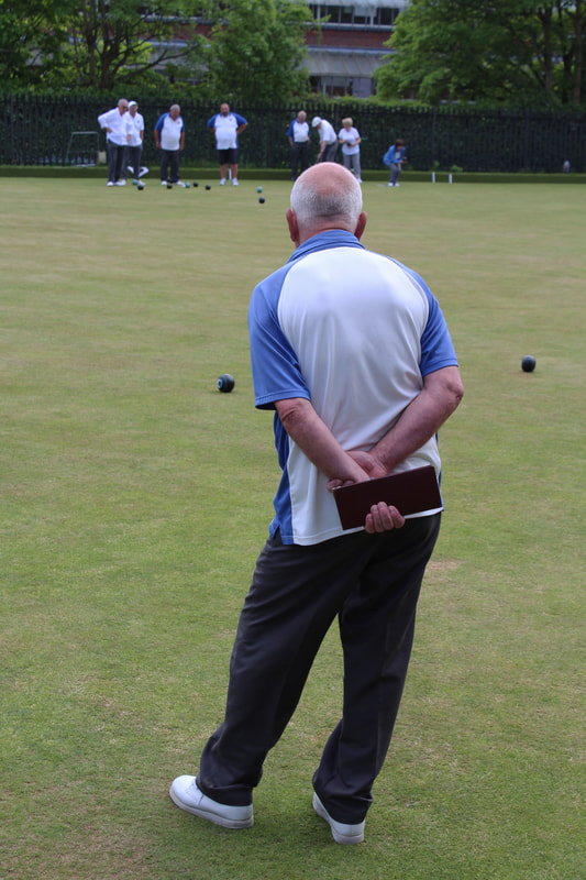
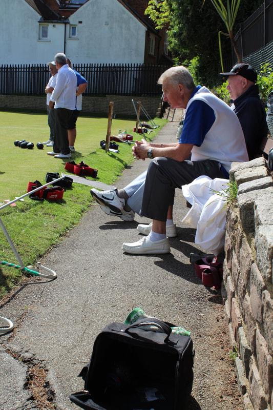
|
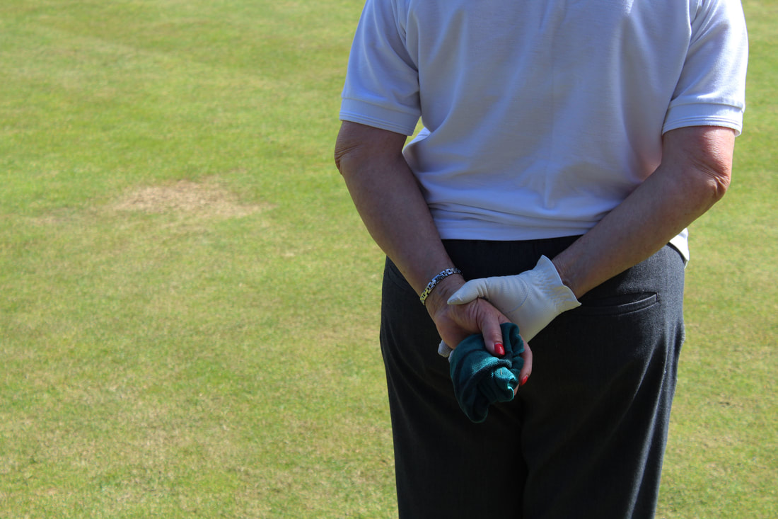
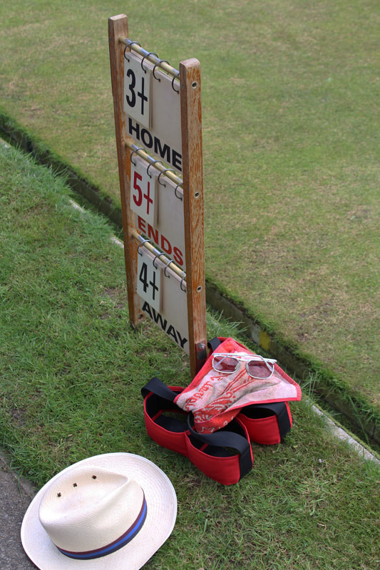
|
|
|
|
|
When editing these images, I didn't do that much I changed the brightness and contrasts within the photos so that they all looked some what uniform but felt that they would be more of a true documentation if I left them as simplistic and natural as possible.
Martin Parr
Later within my project I noticed that renound photographer Martin Parr had also photographed the sport. His images where both a documentation but in addition to this had a slightly more abstract style to them as he photographed the more minimal aslepcts of the sports such as lower backs and details within the individuals stance. I feel that these images are effective as they show a different side to the sport by not simply showing the sport and how to play it but additionally simple mannerisms that go along side the sports such as the leaning back and intense looking whilst the sport is taking place as well as the norms whilst playing such as the clothing that is commonly worn when playing. Parr also allowed to see that there was a specific group that played within the sport - the white elderly, often males. This was additionally common within my photography.
|
|
|
Seventh Development - Arnos, Bishops Wood, Friary Park, Barnet and Temple Fortune Bowling Match
Seeing Parr's take on the image I decided to go to another match of the bowlers and take more images yet this time in a more detailed style focusing on small aspects of the sport that are not perhaps in the rule book but are symbolic and simplistic values that these individuals take part in when playing.
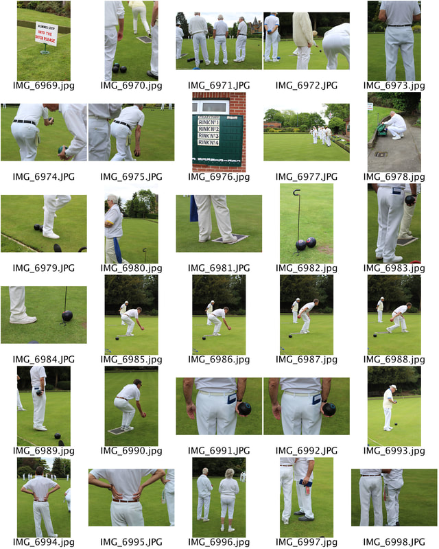
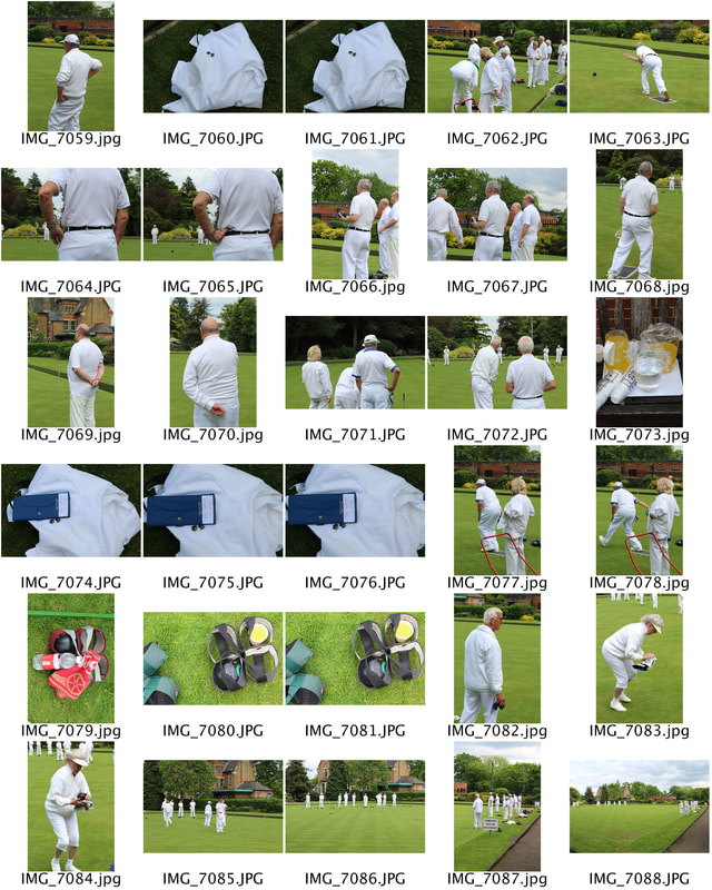
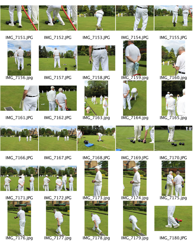
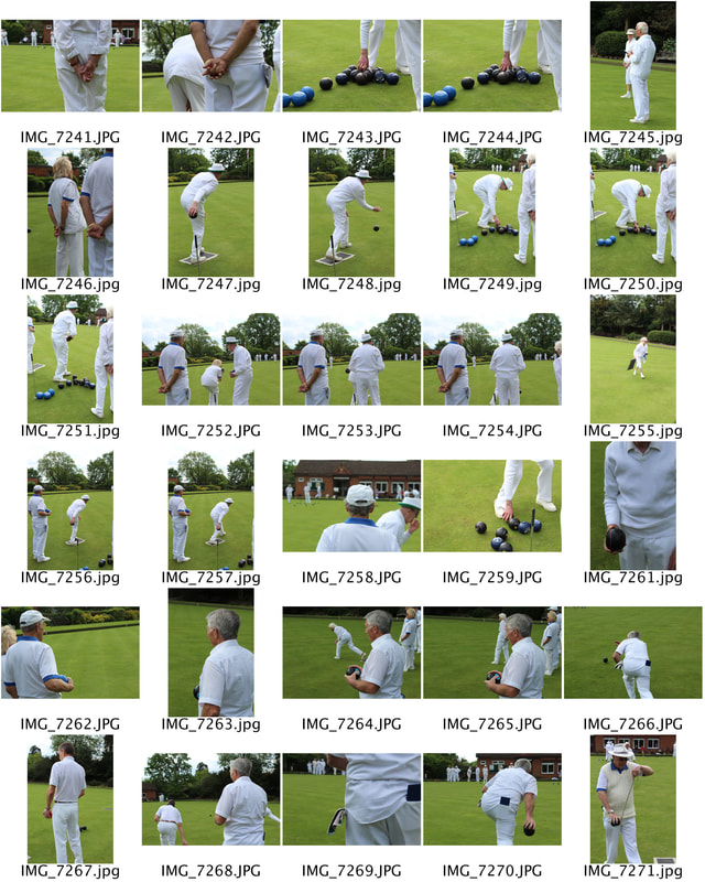
|
|
|
I again edited these images slightly so that they became unified making sure they all looked similar, yet again felt that they were stronger in their natural state as the sun light reflecting of their white clothing and the green grounds formed the correct tone for the photos.
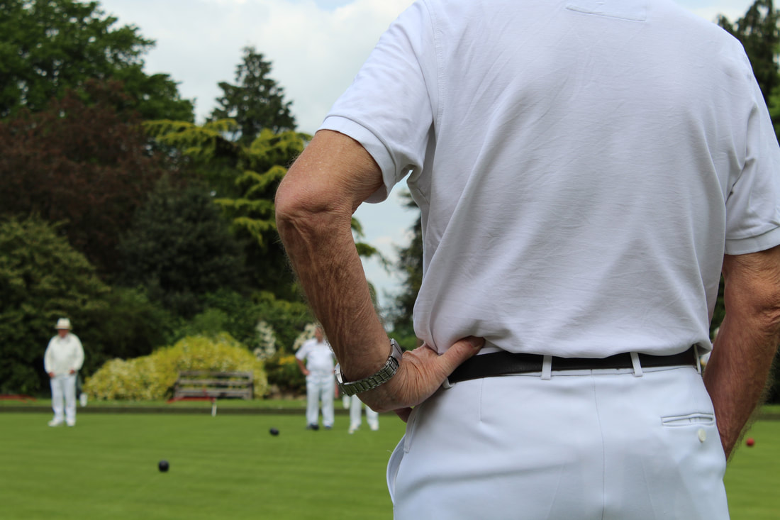
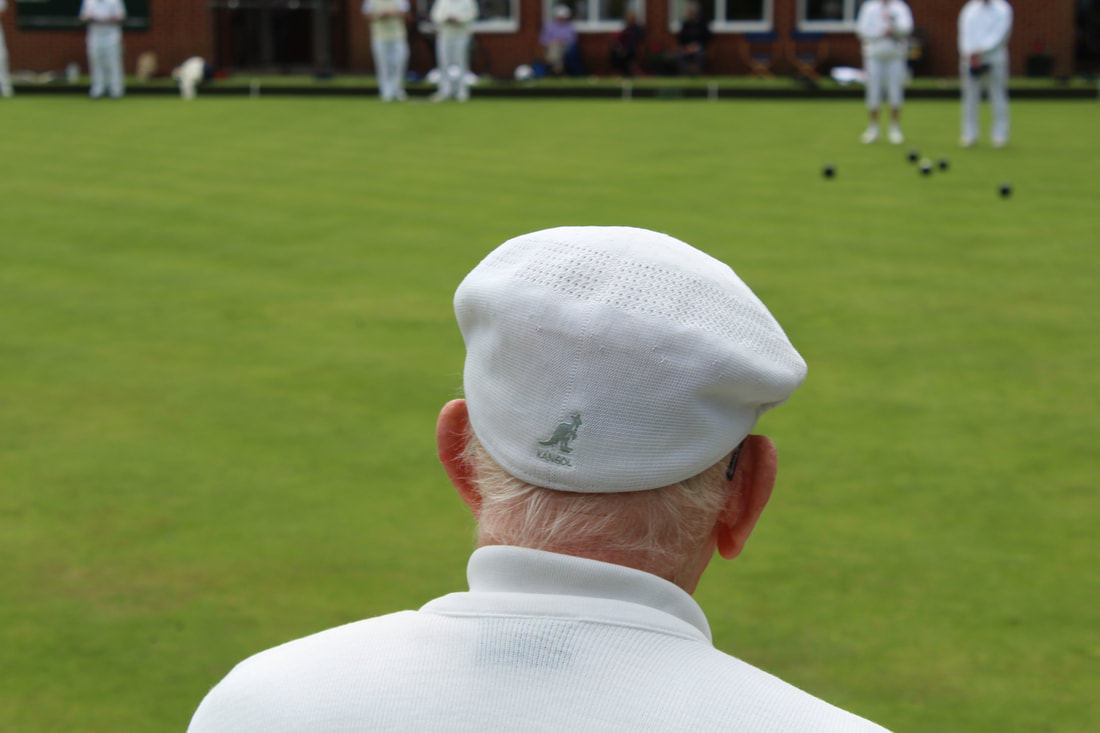
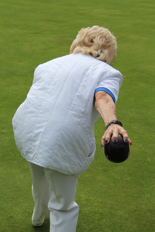
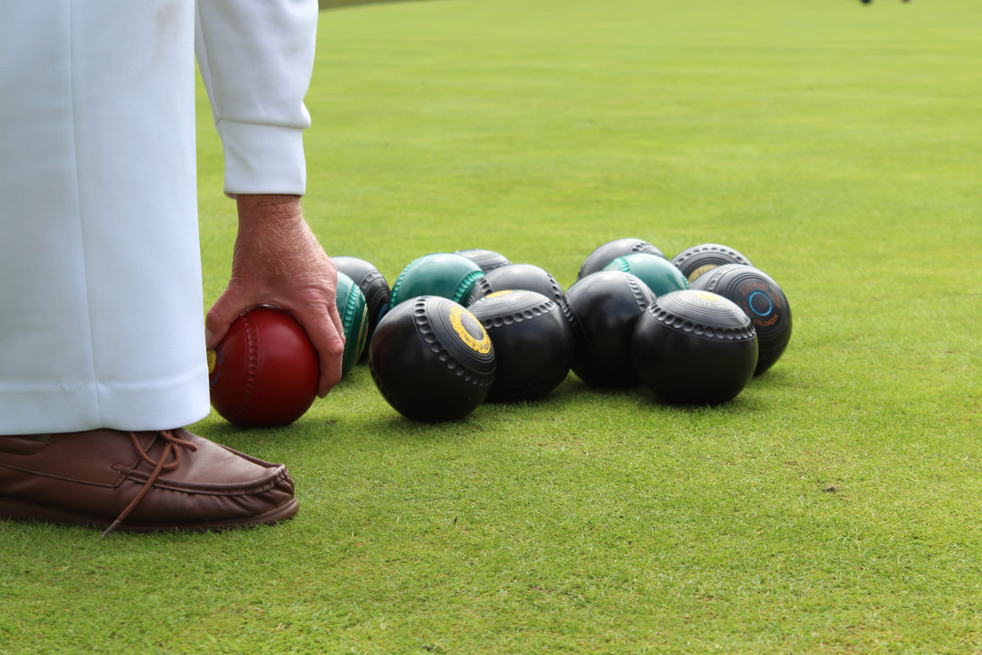
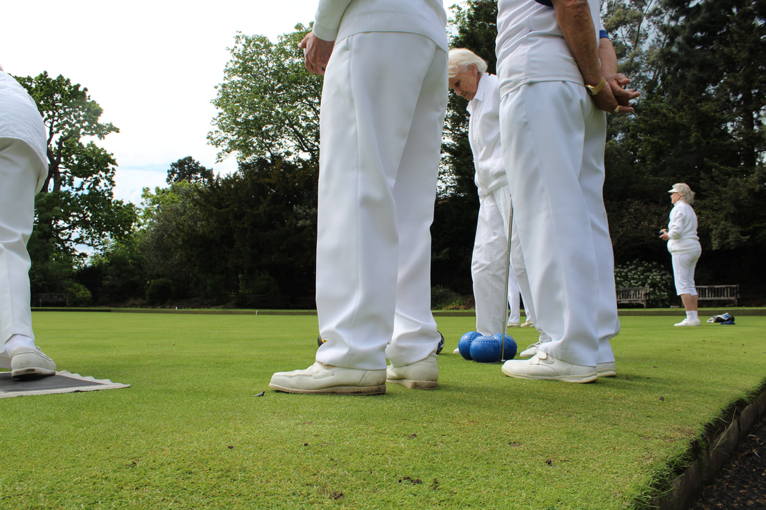
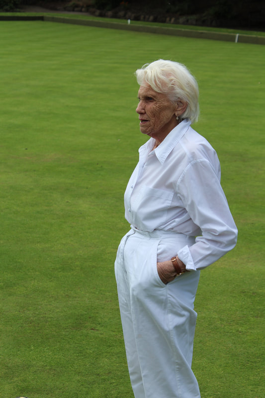
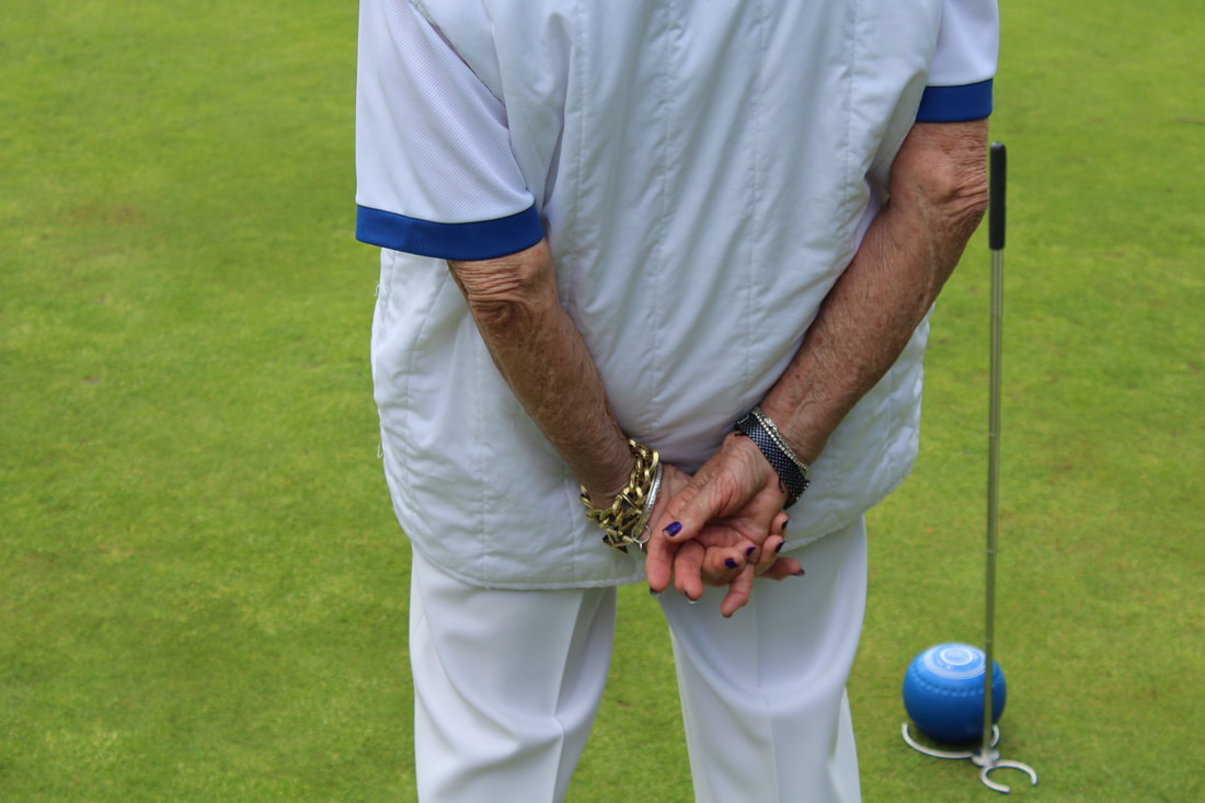
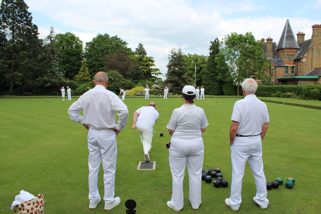
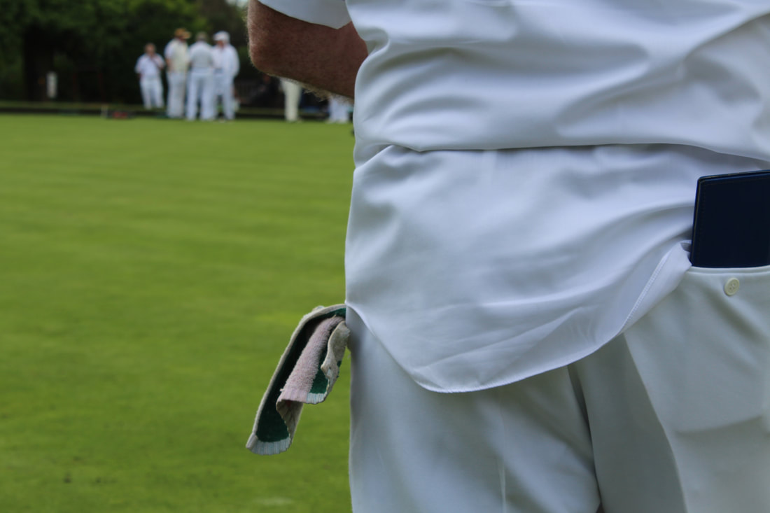
I think that these images are effective as they both document the activities that are taken place within the sport, but also the more intricate details that may not be noticed if just looking at the game, such as the pose that many of the players take when watching their team mates bowel - placing their hands behind their back, the similarities within their clothing even down to their shoes or even the cloth inside of their pockets that they clean their bowels with after each round. As these are not written rules within the game I thought that they would be effective images to photograph. Additionally I think that these photos are effective due to to the different levels that the images are taken from, when photographing some images I lay flat on the ground aiming to capture aspects from floor such as the bowels moving themselves as well as their similarity in footwear, whilst others capture their standard hand on hip pose, some including a side profile or entire body and others just simply their heads, this range alongside the range of the number of people within each photograph and the variation of compositions allowing variety into my images allowing them to further excel. Yet finally, every image within my chosen photographs contains white and green as these were the two main bold colours within the sport from clothing and the grass, this created a theme within my photos allowing them to come together as one, so that they were not too disfigured.
Although I feel that these images could have potentially been stronger if I included front on images of the individuals as these photographs did not capture whom the subjects were just simply what they were doing. This problem moved me onto my next development.
Although I feel that these images could have potentially been stronger if I included front on images of the individuals as these photographs did not capture whom the subjects were just simply what they were doing. This problem moved me onto my next development.
Eighth Development - Bowling Portraits
|
Here I decided to photograph the individuals bowling again in a different style, I wanted there to be surroundings and not a white blank background like the exactitudes but additionally I also wanted the photographs to be portraits of them not playing there activity so that there would be a combination of both photographs of them playing the sport in addition to the individuals as if the images were showing them and what they did in the context of their activities.
Much like the previous images edited the images very slightly so that they that they included stronger tones but in addition to this kept them much the same so that the remained raw and much like there original state as this was a documentation of their lifestyles. I didn't ask the subjects to stand in a particular way or have a particular pose because I wanted these images to form more of a idea of who they are and part of this was there reaction to the camera. Due to factors such as this some of the images contained multiple people like the bottom right image. |
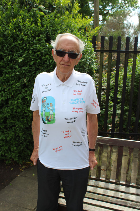
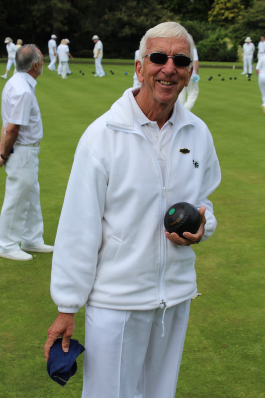
|
|
I think that these images are effective because all of the individuals are wearing white showing them as a uniform group. Yet, I felt that although these portrait style images did add more context of the bowling club that those against a white background because they had more of a scenery there was less focus on whom the individual was, because attention from others in the background were drawing attention away from the subjects. In addition to this although they did look like a uniform group due to their clothing choice this factor didn't allow the subjects personalties to shine through within the photo's or show them as individuals leading me onto using the images against a white backdrop for my final piece.
Final Piece
For my final piece I decided to present both documentation of the sport images alongside my portrait photographs I am presenting my documentary images quite simply by printing them and placing them in a chronological order within my space. Within my portrait images I am presenting them as if they were on a bowels score boards, which looks like the images below:
|
I am presenting my photographs in the 'Friary Park' section of the score board and placing them next to the scores as if the people are and indication of the rinks. This will be alongside the numbers so that it is clear that the board is a presentation of the scores for the viewers. Due to their being four rinks and there being a for and against side there will be eight front profile images as if the individuals are representing a team and a rink. Additionally I will change the title of 'Friary Park' to Barnet as that is the team I have photographs of.
|
First in order to place the images within the score board I had to choose my favourite eight images and edit them so that they all looked very similar, with no marks or lines present within the images, the same brightness and exposure and them all at the same level within the photographs. To do this I completed lots of small intricate steps. Firstly I noted which individual of my chosen images was the tallest and measure there hight from the top of the image to the top their hat / head with the ruler tool it was 3.40cm, I then cropped the rest of the images so that the gap between the top of the image and the subject was 3.40cm for each individual. Once this step was complete all of the images were different sizes in height and width because of the different amount in which they had been cropped as some were not completely in frame - to fix this I changed all of the widths of the images to 119cm and placed the resolution at 200 so that the images were not pixilated, as I allowed the heights to change along side the widths so the images didn't become stretched or squashed all of the heights were still different.
|
|
The next step shown in the image directly above was to crop upwards from the bottom of the image and make sure that all of the images were 170cm in height so that they were all of a orderly size and at the same time all of the individuals when placed next to each other were the same height within the photos. Once I had cropped my image into the size I wanted it was time to retouch the background so that marks, shadows and any other imperfections to the white background were removed. The first step within this process was creating a new duplicate layer (ctrl + j) then selecting the paintbrush tool at large size, soft and 100% opacity then hold the alt key and click on what colour you want to change the background to and then paint over the areas you want to be that colour.
Due to the background overlapping onto the subject added a layer mask and went back to my paintbrush with it on black this time (meaning removal) and with a harder and smaller brush size set to 100% oppacity I went over the places that I did not want the background to be - I additionally use the hide tool to see if there were any aspects of the photo that I had completely blurred out so that none of the photo was lost.
|
|
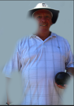
|
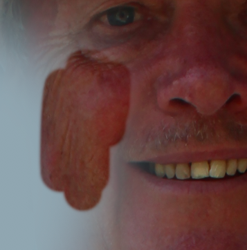
|
|
Again to make all of the images uniform I used the same background tool colour so that the background for all of the images were the same. This created a simplistic and plain one coloured background for all of the images as shown below alongside the unedited images to show the impact that the editing made:
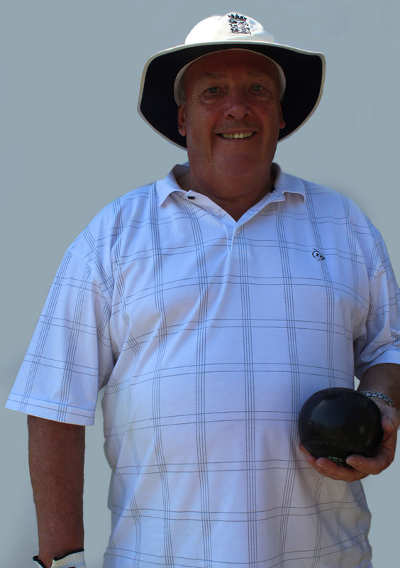
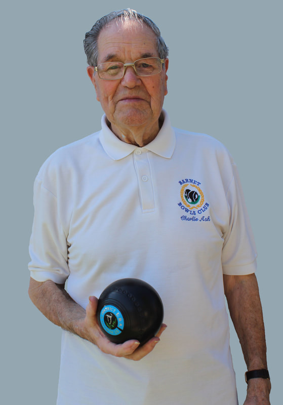
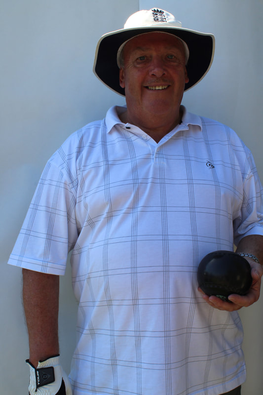
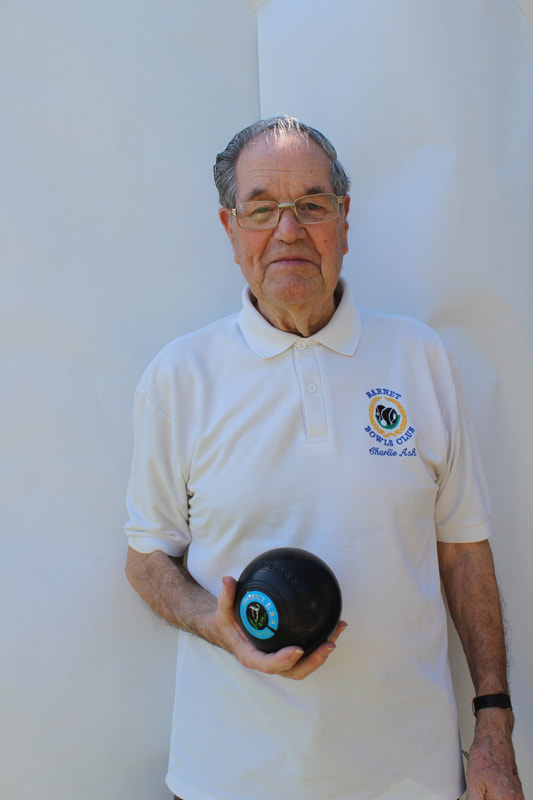
|
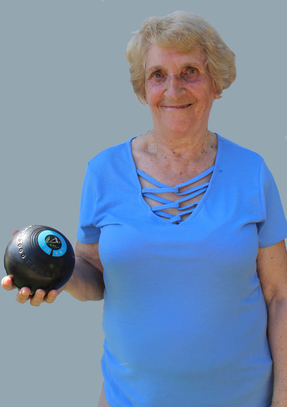
|
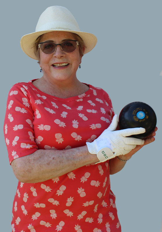
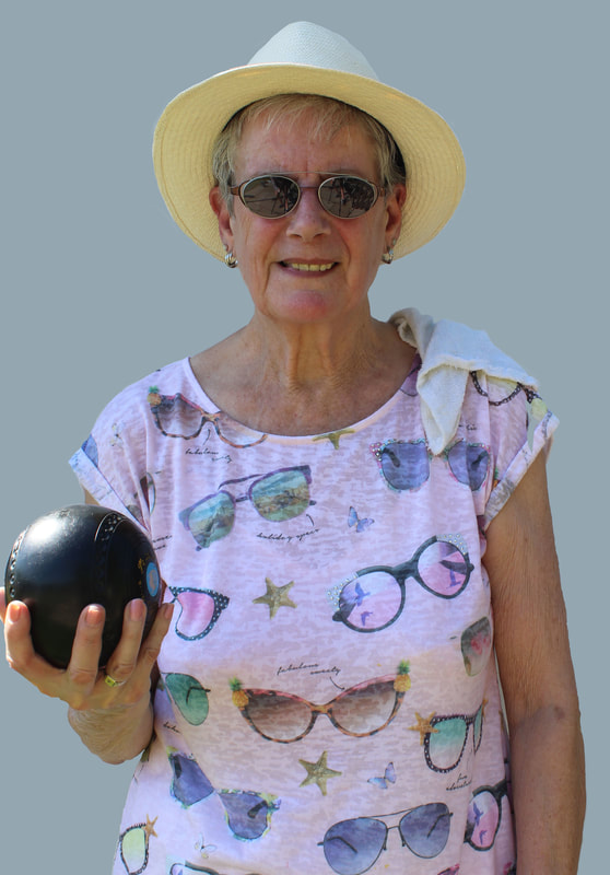
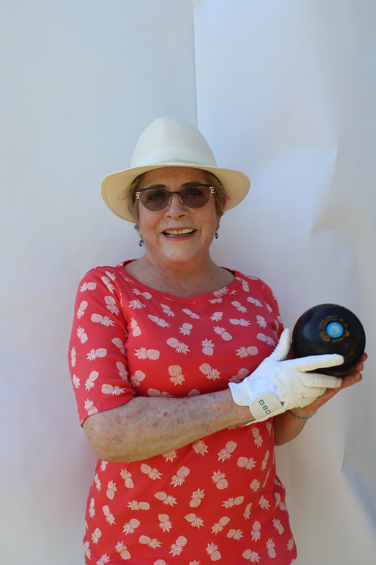
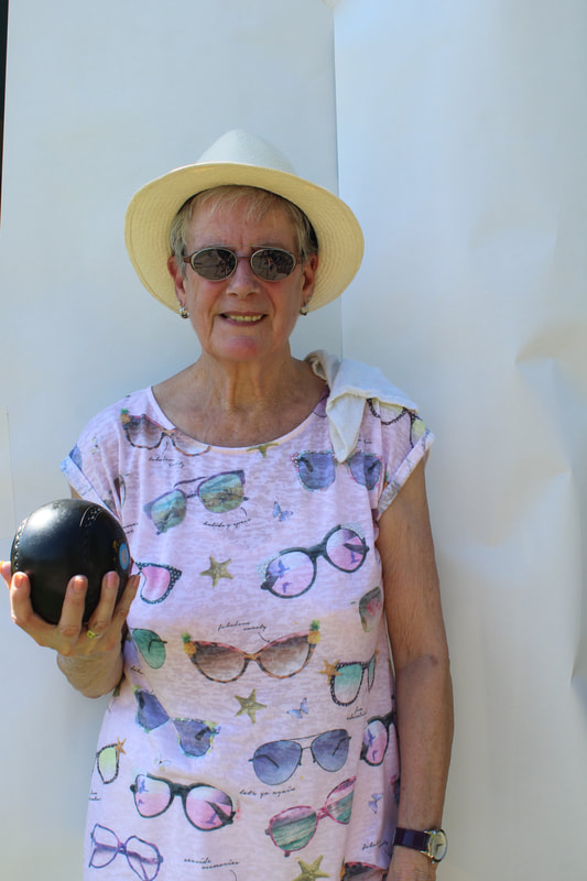
|
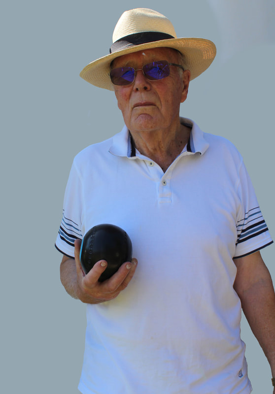
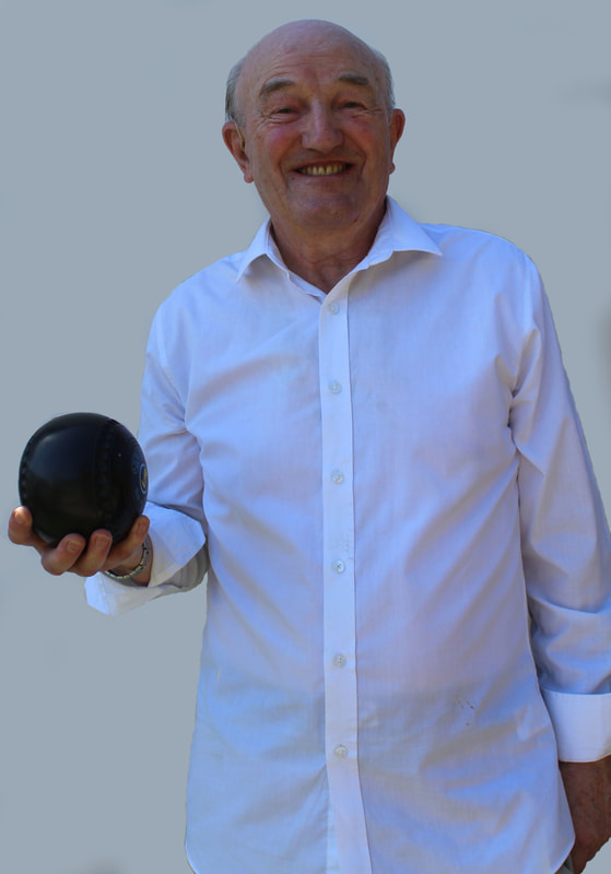
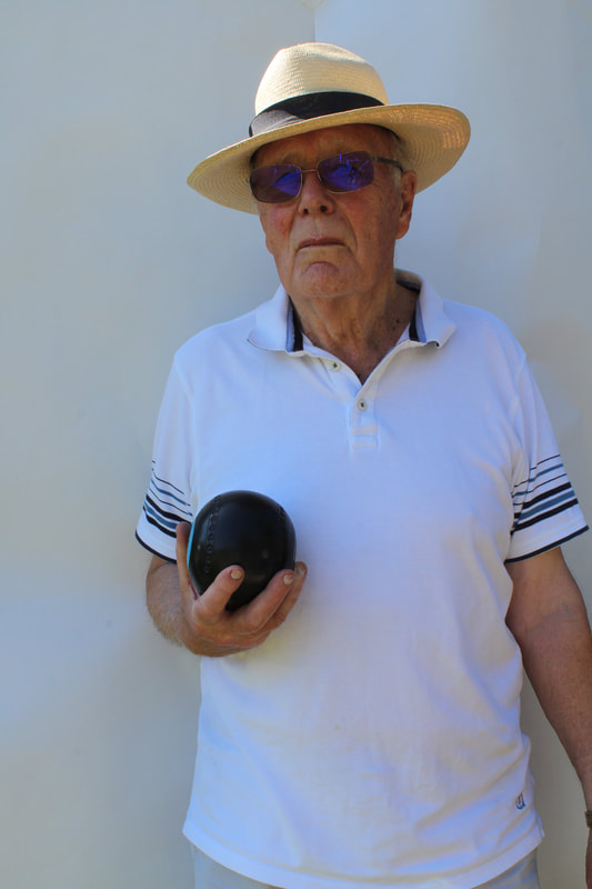
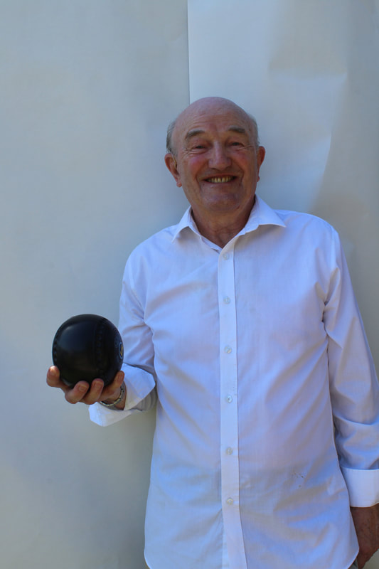
|
Although once edited the images allowing them to flow better together, I did note that the background image of the photo was grey rather than white due to the first colour that I selected. This was not ideal as it was not the bright colour that I aimed for yet I also figured that due to multiple of the subjects wearing white it may have caused them to blur into the background in some way. I also felt that the images were edited effectively as without the comparison of the unedited photographs it was not clear to the eye that the subjects had been placed upon a new background. Once the editing process of these profile images was completed I printed them as A5.
To create the score board where I am placing the portrait images I used a large piece of thin timber. The first step was to place another thinner and smaller piece of timber down the middle so that I could form the 'rink' side and the 'score' side. I then divided the wood horizontally so that I would have five sections the first section was slightly smaller as it was the title so didn't need as much space this was 15cm high and 55cm wide, the other for sections were 21cm high and 55cm wide. The other half was slightly longer at 64cm. These measurements allowed me to place A5 size images within the gaps alongside the score board number represented in the images at the top. I then painted the board using an undercoat first so that the wood colour was not coming through and then I mixed a light green and dark blue to make the perfect colour to match the original score board colour of the green.
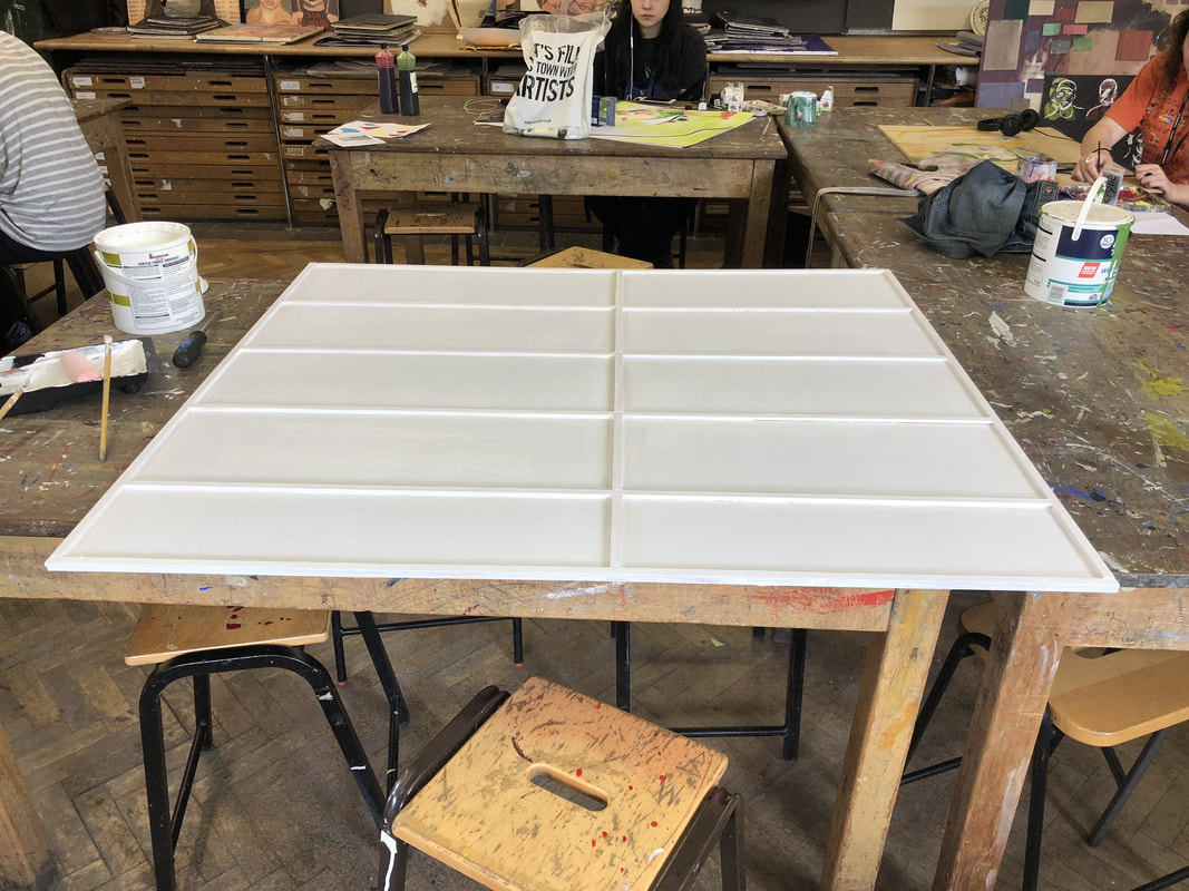
|
|
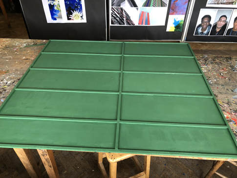
|
Next I had to create the labels and scores to fit into the measured areas. To do this I went on photoshop and created images that fit into the exact size of my spaces, then I used horizontal type tool and typed in the words allocated to that area. Different words had different font sizes as they had different locations to fill.
|
|
Next, I cut cream card to fit into the shaped panels I had made and then cut out letters to spell out the words and numbers needed. I sprayed this down with spray mount creating my final result which can be seen below.
I think that my final piece is representative of freedoms and limitations, in many different aspects - it demonstrates freedom from the choice that these individuals have to play there sport they have decided to take part in whilst also showing limitations due to rules and regulations that go alongside their activity. The scoreboard part of my final piece additionally explores the limit with the sport as it has clear borders and specific measurements that have to be taken int account for the creation to be furthered. The images that are more of a documentary style explore the freedoms as I documented mannerisms that came through choice - although potentially inspired by rules. |
I think that my final piece was successful because it demonstrates both the individuals as people and how the sport is played allowing a deeper understanding of the sport and whom plays it within my work. Also, the presentation represents the sport in a more stylistic manner displaying not only a object often seen on bowling grounds but additionally demonstrating them as people. Furthermore, there is a variation of both portraits and more abstract images allowing variety.
Although if I was to this again I would order my prints matt so that all of the images had the same texture and I would also potentially add three panels on the left hand side to segregate the photos and numbers further like the original score board.
In addition to this I further displayed my ten documentary style images from my 7th development as I feel that these are different from the typology images as they examine the game less than the people playing. I printed the images in both A2 & A3 to give a varied effect of my images and placed them onto foam board as I felt that this would allow as much of the image to be seen as possible, placing them on the wall space I had been provided in a chronological order so that the images displayed the indicate details of the sport alongside a small and simplistic narrative of how the game is played with norms and values of bowel culture displayed through the photos. As well as this I am going to display astroturf and bowels underneath my images to set the scene as if the images are on the grounds in which the images are taken, this will hopefully be enhanced by the score board near by.
