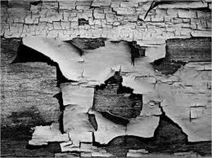
Abstraction
abstract
adjective
ˈabstrakt/
adjective
ˈabstrakt/
- 1.
existing in thought or as an idea but not having a physical or concrete existence.
"abstract concepts such as love or beauty" - 2.
relating to or denoting art that does not attempt to represent external reality, but rather seeks to achieve its effect using shapes, colours, and textures.
"abstract pictures"
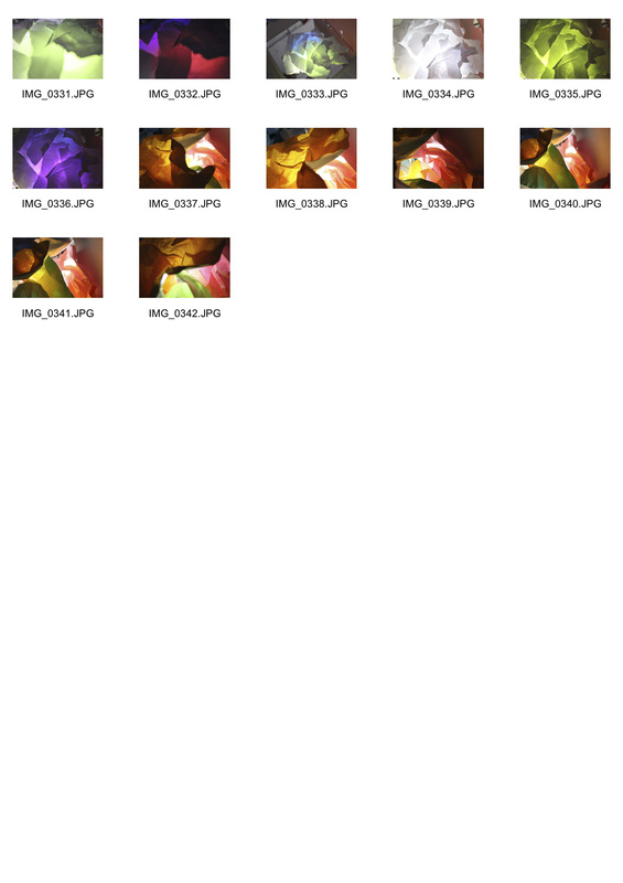
The White Paper Test
|
|
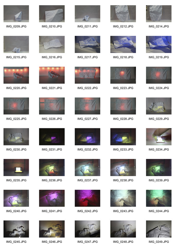
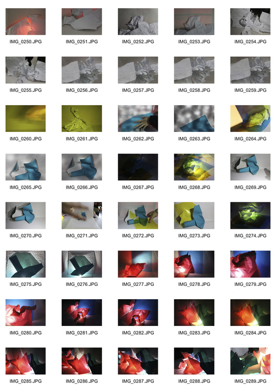
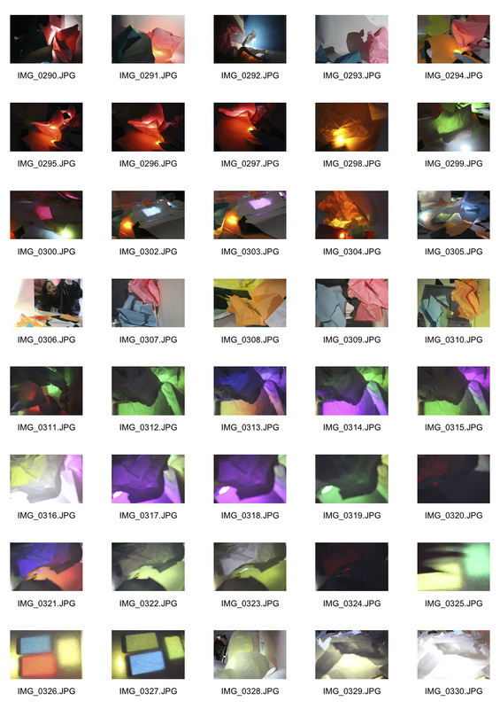
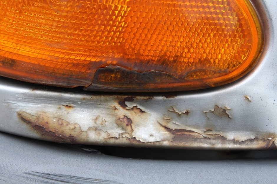
When given a piece of plain white A4 paper I photographed the simplistic object against a white back drop. We were given the task to create some abstract images. We had a lot of creative freedom, and were able to change the shape of the paper through crumbling it up and folding it, the lights through coloured gels and coloured lights and shading around it as well as the texture of the paper. This could be done by scrunching the paper up, folding it into smaller thicker pieces, using mirrors to add a layering effect onto the paper, burning the paper, using coloured lights under the paper and using coloured gels. This created the simplistic white A4 into an entirely different image, which was almost unrecognisable.
Below are some selected images. I choose them for a multituted of reasons. Yet, I think that the images that included colours merges were the most successful as the light enhanced the textures of the crumbled paper, as well as the colour combinations combining so much so that at a first glance there is little correlating the image with just simple paper. Making it more abstract. I also feel that some images that are clearly paper are also effective. For example; due to some images having shadows due to the layering of the paper as well as intense light that adds further depth to the image, as they include both shadows and light. |
Brendan Austin
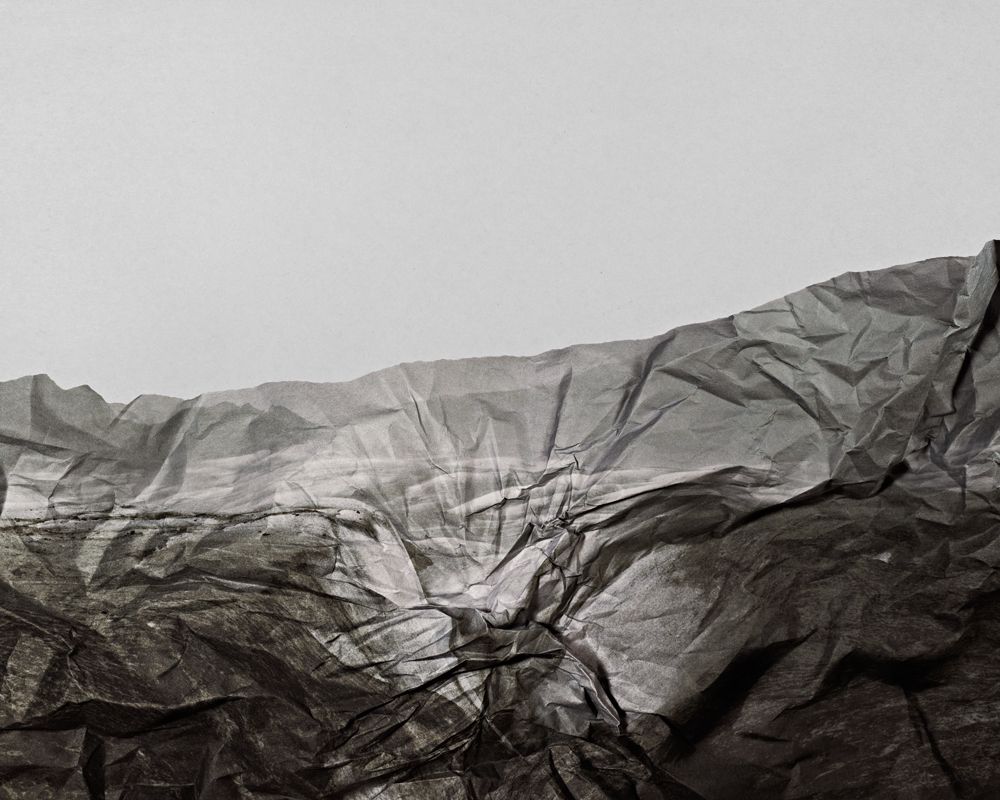
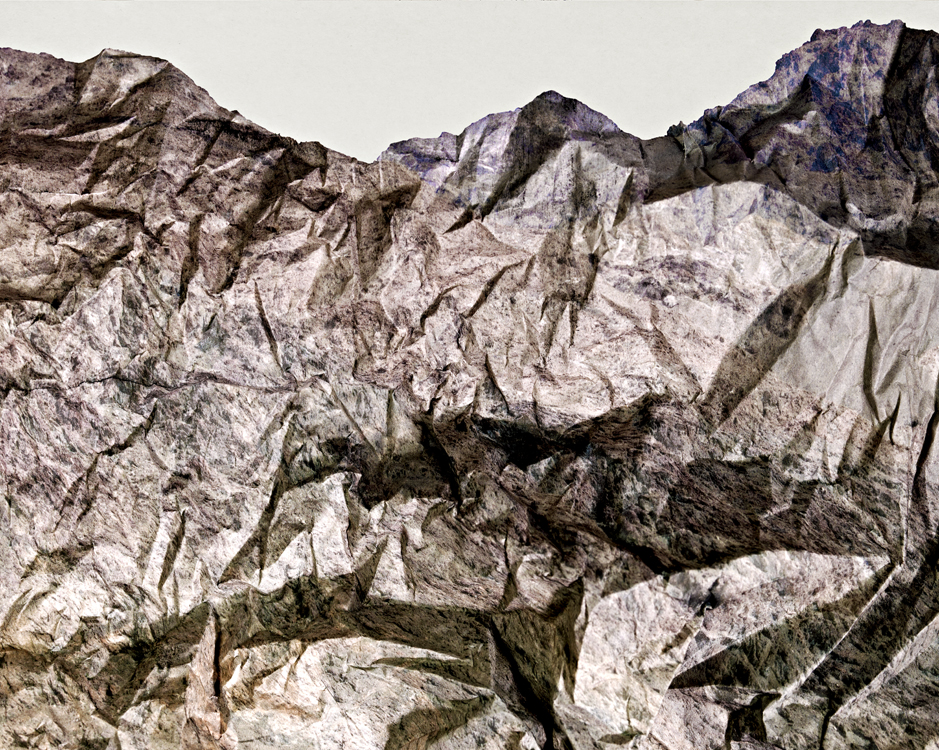
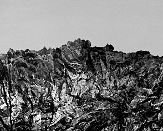
Brendan Austin is a photographer whom creates photographs out of crumbled pieces of paper. He calls them 'Paper Mountains'. Austin examines what we mean by nature and the way humans have impacted upon it. "The isolated desert city running on oil generators, the mars like landscapes of a volcanic environment and the mountains made from paper all attempt to start a conversation concerning the loss of meaning and reality." The resulting images appear both recognisable as landscapes but also suggest a sense of how artificial our world may have come, creating natural materials such as paper which comes from wood and turning it into a different type of natural object.. This artist allowed me to understand how you create one simplistic image into another with different angles and focusing on different pieces from the paper, the crumpling of the paper, the smaller balls of paper and tea stained or burnt paper made the images more realistic.
Out of all of her images the one I felt was most successful was the middle photograph. I think it captures how different an object can appear through a different perceptions. The lighter tone of this photo, being a light brown and not black creates a more simplistic and natural image which correlates well with the aim of the images being to create 'Paper Mountains'. Instead of the black which often has connotations with deaths, minimising the growth of the 'natural' image created.
Out of all of her images the one I felt was most successful was the middle photograph. I think it captures how different an object can appear through a different perceptions. The lighter tone of this photo, being a light brown and not black creates a more simplistic and natural image which correlates well with the aim of the images being to create 'Paper Mountains'. Instead of the black which often has connotations with deaths, minimising the growth of the 'natural' image created.
|
|
|
Francois Delfosse
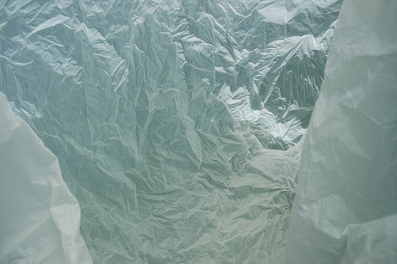
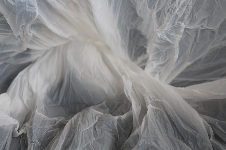
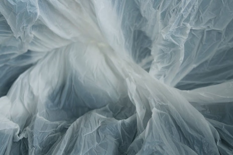
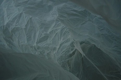
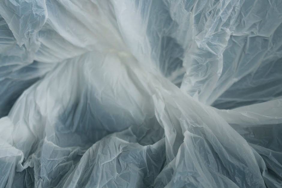
Another chosen photographer was Francois Delfosse. He is an abstract artist whom took photographs inside of a plain white plastic shopping bag, this had the effect of looking like 'Antarctica in a bag'. He says that the images were taken in a “glacier cave just North of the South Pole”, and then added that they are “viewed from the inside of a plastic bag”. I find his photography very effective as the images seem beautiful when they are thought to be untouched snowy glaciers caves yet because they are plastic bags out view changes to how its beautiful that he has changed the way we see ordinary objects. Below are some of my favourite images he created within 'Antarctica in a bag'.
The images further correlate with Austin's 'Paper Mountains' as they are forming a natural looking view and scenery with manmade materials. Connecting to abstraction as again, the view on the images is simply based upon what the viewer of the image wants to see as it is so subjective.
The images further correlate with Austin's 'Paper Mountains' as they are forming a natural looking view and scenery with manmade materials. Connecting to abstraction as again, the view on the images is simply based upon what the viewer of the image wants to see as it is so subjective.
|
|
|
|
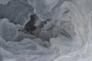
To recreate Delfosse's Antartica in a bag I placed a white plastic bag with no print or wording within and placed the camera at different angles within the bag. I did this outdoors to allow natural light, additionally due to the bag being quiet transparent the images had to be taken so that other colours from the surroundings were not included in to the image. Whilst doing so I additionally created different shapes and twists within the bag so that different textures could be created within the originally simplistic plastic carrier bag. Textures that further could be perceived as features of Antarctica such as ice calving and snow.
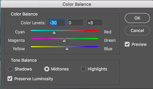
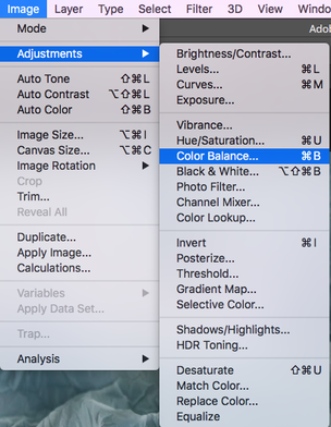
The images created did have a very similar effect to that of Delfosse's yet his seemed icier as they had a more blue and therefore cold undertone. Therefore I decided to edit my images in such a way to create the chill that was portrayed through his. This was completed through the steps below. |
|
|
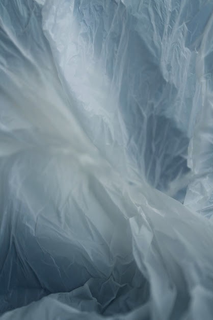
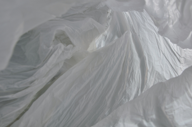
I have chosen these images as once they have been edited they allude to the ice features that they are meant to portray. The wrinkles within the plastic bag within these photographs additionally allows the viewer to grasp the different shading and folds within the image that connects to the icicles that are meant to be within Antartica.
Artist and Me
|
The inspiration I took, are the fine details within the folds of the plastic, as they allow the viewer to grasp the detail within the images and how focused the photograph is on a small detail as intricate aspects of the image are outlined. Furthermore, the addition of the ice blue colours to the image through photoshop create a more harmonious image as blue is considered beneficial to the mind and body. This was present within the image below so I aimed to duplicate this further within my images. I additionally, felt that the more compact layers of plastic that therefore creates a brighter white was beneficial to the image. This is because it allows depth into the image. I saw this within the first image as the side of the plastic bag is present in the bottom right corner yet it doesn't look manmade although it is so structured. It looks more like a natural creation. This was repeated within my own work by using the centre of the bag within my work as a centre point for the entire photograph. The aspects of the images that differ, are due to the original artist using dark more shadowing effects with his images as the photo's look as if they have been taken once the sun had set, but due to the sunlight used to photograph the image my interpretation is slightly lighter. |
Tamara Lorez
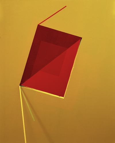
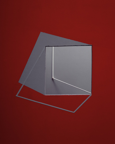
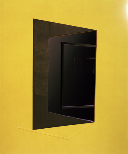
Tamara Lorez is another artist whom creates various constructions which she then photographs to exploit their abstract properties. Her images are effective as they use bright block colours and sharp lines giving the final outcomes a very clean cut look. Contrary to the last two artists she makes very unnatural and quite structural shapes within her images. The block bright coloured backgrounds she uses allows the image within the centre to have further dimensions through shading. Additionally she uses contrasting colours such as yellow and black to emphasise the difference and allow her pieces to stand out more. The diagonal lines are filled with restless and uncontrolled energy. They can appear to be either rising or falling and convey action and motion. Their kinetic energy and apparent movement create tension and excitement.
|
|
|
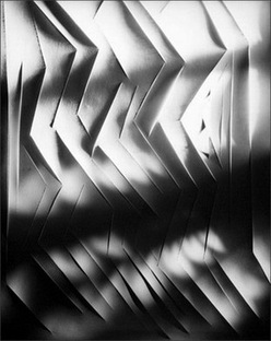
Francis Bruguière
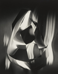
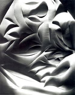
Francis Bruguière 1879-1945 was an American photographer. He additionally worked as a directer, producer, painter and sculptor. The photographs that Francis produced were often experimental and presented shape and pattern. It is said that his photographs were captured under the impression of an abstract, surrealist or cubist creative way. The original event which inspired much of Bruguière's work was 'The Great 1906 San Francisco earthquake', as San Francisco was his birth place. In the images below, Bruguière has used a piece of plain white A4. Yet he has manipulated them to create images that portray more that the simplicity of a normal piece of paper and created more interesting photographs. He has done this by cutting inside the paper and creating patterns such as a zigzag in the last photograph. In addition to this he has also combined light into his photography with the use of shadows and light coming through the hole that have been cut in the paper. As well as this, Bruguière has made the paper the focus of his images with the cuts and shapes within the paper very sharp and prominent within the photographs.
|
|
|
Manipulation
|
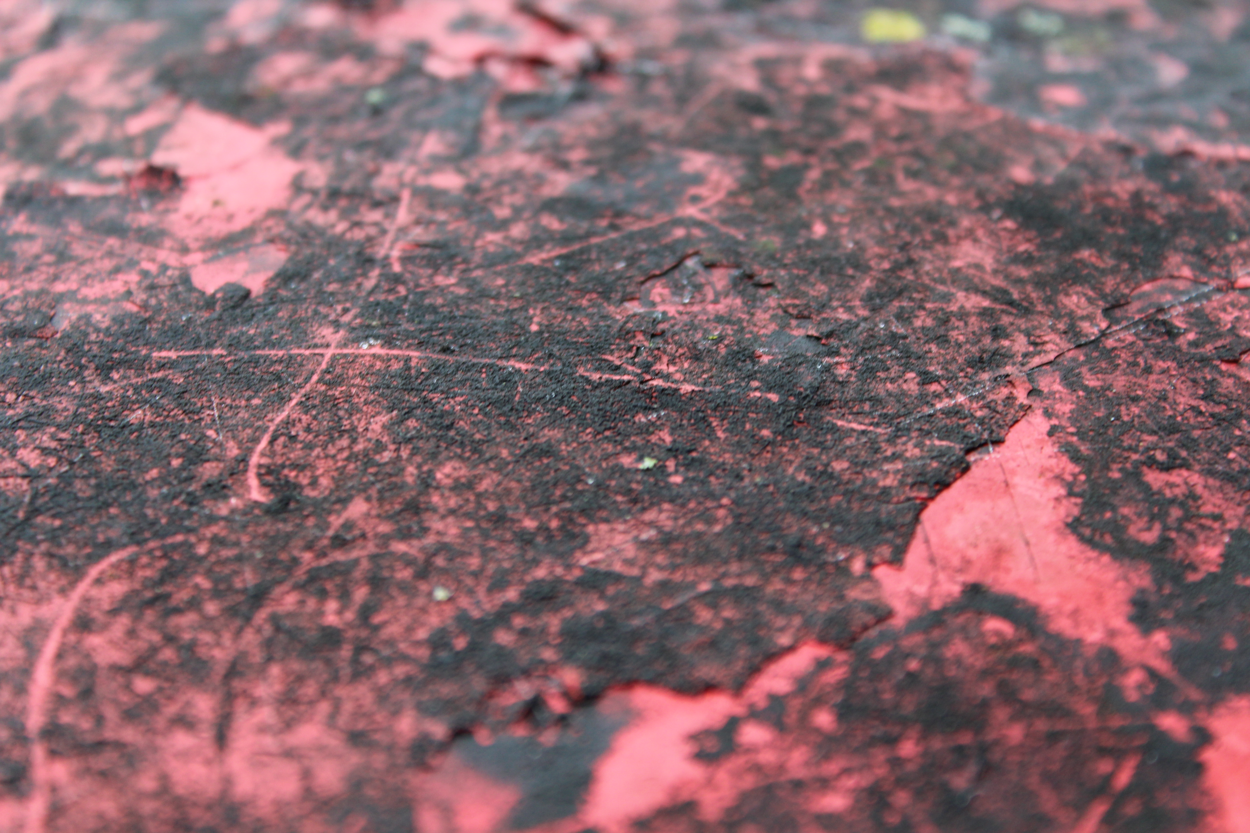
When manipulating photographs I recognised that there are two methods in which this can happen. The images to the right are manipulated physically. To do this I printed the images and then used different techniques such as painting the photo, I did this on the background so that the subject of the photograph stands out more. Additionally, I used water to sit on top of the image, effecting the image as it shaped it created a different perception to the viewer. Once such water dried it further created a more blurred and unfocused image, manipulating the photograph further as the water had allowed ink to move around the piece of paper that it had been located onto.
|
|
|
Digital manipulation
|
|
|
Digitally photographs can be manipulated too. On the top left is the original image, the second has been manipulated through the use of colour, brightness and contrast to create a very differently toned image, as the image is darker, with more of a contrast as well as cyan, magenta and blue.
Another method was layering images on top of each other so that different features repeated themselves. As the different layers had different opacities.
|
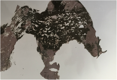
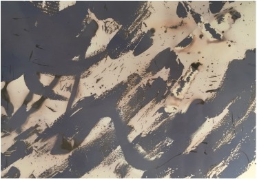
Chemigrams
Creating a chemigram is a very similar process to creating a photogram. Yet the photographic paper is not spoiled if exposed to light as that is not how the final image is developed. To create a chemigram you place various objects and liquids onto the photographic paper, such as cello tape, honey, moisturiser, washing up liquid and oil. You can create patterns with the objects such as placing the moisturiser all over your face and having a silhouette shape on your photographic paper. Once this is complete you can decide to place your photographic paper into the fixer or developer. If you place the paper into the fixer first, then the image will be lighter and some of the liquids used will turn slightly lilac. If you place the paper into the developer first, then the image will be darker. Once you have created the desired effect you wash of all of the products in water and washing up liquid so that any residue from the tape and other liquids does not remain on the paper. This process will produce images like the ones below.
|
|
I manipulated both of these images in two different ways. I printed the image out and painted the background black, so that the only focus within the image was the subject. Next, I covered the paper in water. I though that this would make the ink of the image and the paint smudge yet the water just sat on the image giving the effect on the right. Although it was not how I intended the image was manipulated. After this, I added washing up liquid to the water that I had previously placed the paper in. I repeated the method with washing up liquid and this created an effect where the bubbles from the washing up liquid made a reflective pattern in the paper.
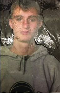
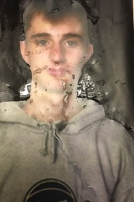
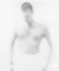
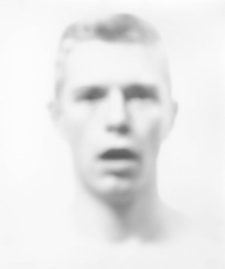
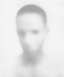
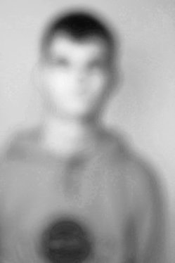
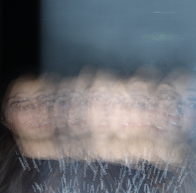
Bill Jacobson
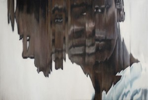
Bill Jacobson creates blurred and soften portraits, that reflect his preoccupation with loss and mortality in the early 1990's. He does this by taking unfocused images that he calls "blurry, defocused, or perhaps diffused". Additionally, Jacobson is considering his observations of the AIDS epidemic. This is shown by the hard to grasp faces as it conveys the sense of futility in trying to capture a human likeness in memory or portrait. Bill Jacobson was interested in this issue because they felt it was important to consider the photographs as a metaphor for an inner state or an interior way of being. He used out of focus images in his work to portray the combination of beauty and melancholy within his work.
|
|
|
|
|
|
|
|
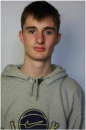
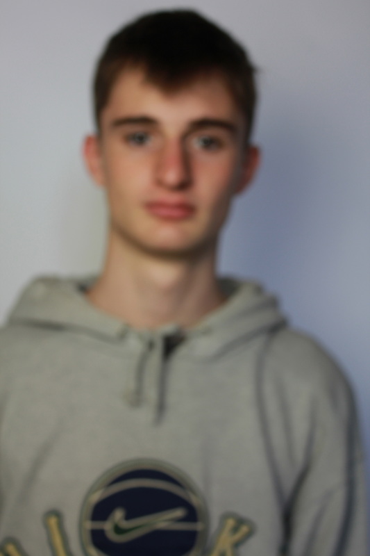
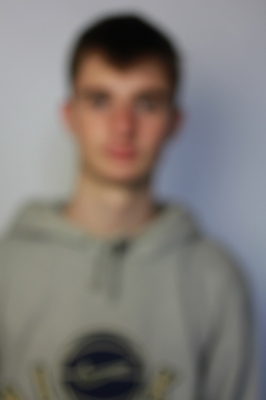
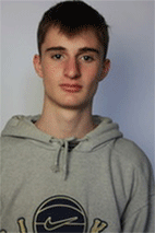
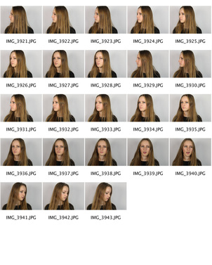
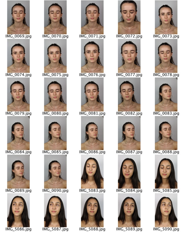
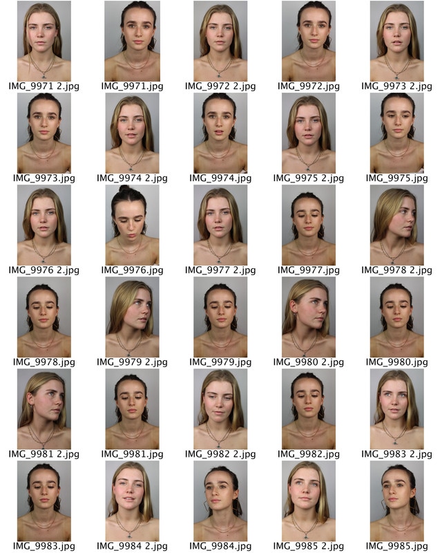
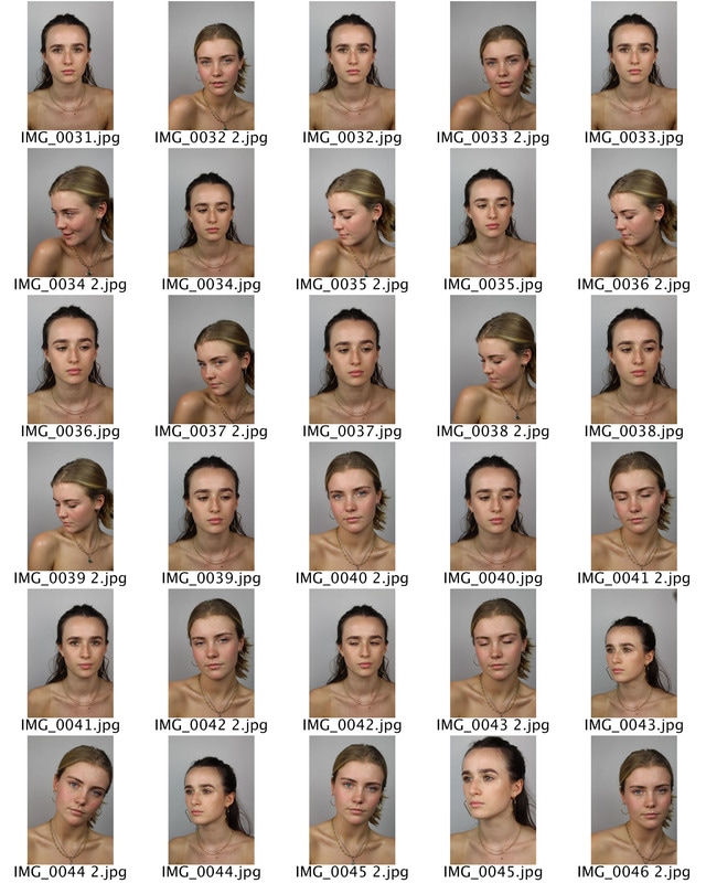
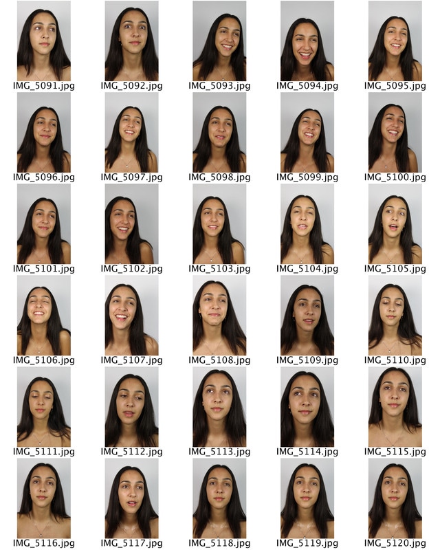
I took inspiration from Bill Jacobson's blurred portrait images, to create the photographs above. To do this I placed my camera on a tripod in a fixed position and asked Theo to stay in the same place and with the same facial expression the only thing I changed in the photographs was the focus. I placed my camera into manual focus and started the image at first with a sharp focus to a completely blurred image.
|
I edited the photographs of Theo in two ways. The first edit was inspired by Bill Jacobson, I turned the image black and white so that his clothing didn't stand out too much compared to his blurred features. As it included the colour yellow that is quite eye catching compared to the grey in the rest of the image. This also adds perplexity the image. The other edit I made was Gif. This showed the difference that the focus can make in a photograph and how there are various ways to make an image 'unfocused'.
|
|
The videos above also are a response to Bill Jacobson. In the first film I asked the subject to walk towards the camera. At first she was out of focus yet as she came closer towards the camera her face became more focused and her features were clearer. In the second film the subject stood still and I moved the camera lens in an out of focus. The two methods created different effects that mirror Jacobson's work.
|
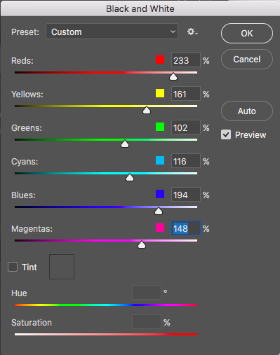
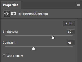
I re-edited this image as I felt that the first set of edited images did not portray Jacobson's photography. As him images merged the features of the subject and the background more. To do this I placed my image into photoshop, adjusted it to black and white and made many of the tones that were in the original picture lighter such as red from the subjects skin and blue and yellow from his clothing. Once this was done I also decreased the contrast between the different shades of black and white and brightened the entire image so that the features were even harder to depict. I think that this was successful as features such as his nose and eyes are barley visible, yet could be improved if the photograph was of better quality and was more white than grey.
|
|
|
|
|
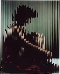
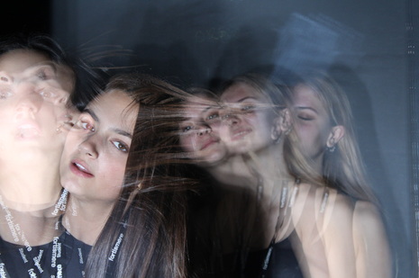
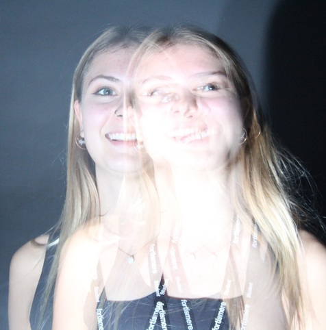
Erwin Blumenfeld
|
|
|
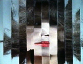
Erwin Blumenfeld is a fashion photographer and artist whom was born in Germany 1897. Before his death he's work was placed into magazines such as Vogue. In addition to this he also created a film named 'Beauty in motion', this used beautiful models from the 40's and 50's and made the images disorientated. He did this with mirrors, and glass so that parts of the models faces were out of place and disjointed. Transforming 'perfection'. In the first photograph, Blumenfeld has used darker colours to bring more mood and effect to the image. The subject of the composition is particularly dark, with deep colours such as black and crimson. This contrasts with the background which is a lighter, grey colour. This effect can be related to the subject, who appears to be serious and downcast which therefore manages to create a more dominant photograph. The lady in the photograph is positioned in the centre meaning that the viewers attention is drawn to her. As she has been broken up and distorted in vertical sections, we are unable to fully view the expression on her face and therefore we can only assume, from her positioning and the colours that Blumenfeld has selected, what she is feeling. The distortion taking place within this photograph makes it clear that Blumenfeld was interested in abstraction. The second of Blumenfelds images, has connotations with passion, desire and love because of the subjects vivid red lipstick. These connotations are particularly symbolic as the vibrant red stands out compared to the more dull brown. As brown represent nature and honestly it contradicts the unrealistic colour of the subjects lips. Yet due to the vertical splits within the image, the photograph begins to express the chaos that is within the beauty industry. The subject being in the entire frame of the image also depicts the ordered and simplistic lifestyle that may have been advertised for women in the 40's-50's. Additionally, the subject is in perfect focus, making her the only object to look at within the photograph, there is no intricate or hidden symbols elsewhere within the photo.
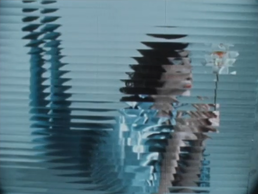
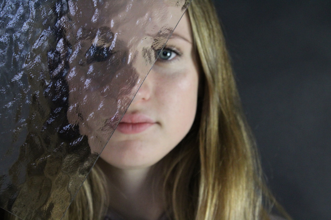
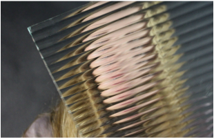
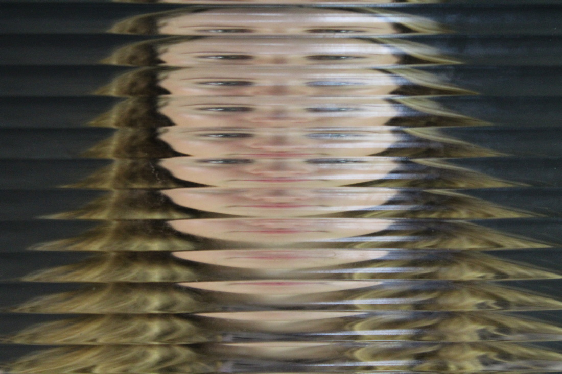
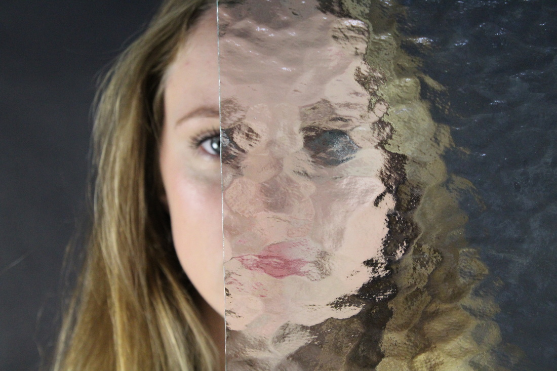
I decided to replicate this with fogged and blurred glass and then with glass that gave a repeated effect. In the six images below. With the first type of glass I took three photographs to display the different effects available. The first image I felt was effective because it gave a split effect. On one side of the subjects face you could see her facial features perfectly presenting a clean cut and slightly clinical image and the black background that left mystery for the viewer. In conjunction with the mysterious and fait facial features of the other side of her face, that were not as easily visible due to the glass. The location of the subject in the first image also alludes to more mystery because she is leaning towards the left side of the photograph with the mirror. In addition to this her blue eyes, contradict this mysterious effect given by the rest of the image as blue represents loyalty and trust. Although, I think that this photography would be more effective if the subject was more central within the image so that the black background was not such as large component in the photo as it does not allude to a lot.
I decided to replicate this with fogged and blurred glass and then with glass that gave a repeated effect. In the six images below. With the first type of glass I took three photographs to display the different effects available. The first image I felt was effective because it gave a split effect. On one side of the subjects face you could see her facial features perfectly presenting a clean cut and slightly clinical image and the black background that left mystery for the viewer. In conjunction with the mysterious and fait facial features of the other side of her face, that were not as easily visible due to the glass. The location of the subject in the first image also alludes to more mystery because she is leaning towards the left side of the photograph with the mirror. In addition to this her blue eyes, contradict this mysterious effect given by the rest of the image as blue represents loyalty and trust. Although, I think that this photography would be more effective if the subject was more central within the image so that the black background was not such as large component in the photo as it does not allude to a lot.
|
|
|
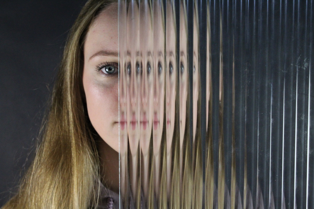
In my methods to replicate Blumenfeld's 'Beauty in motion' I used two types patterned glass, one that gave a smudged and blended effect that seemed to blur the features of the subject and another that created sharp lines and repeated the same features of the subject that was behind the glass. This was effective as both types of glass had a large juxtaposition, so I got two very contrasting effect.
Fast shutter speed
|
Slow shutter speed
|
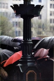
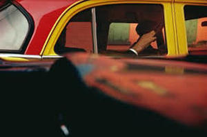
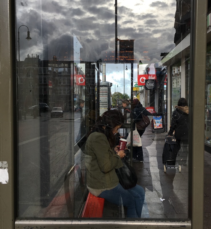
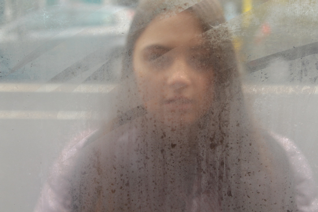
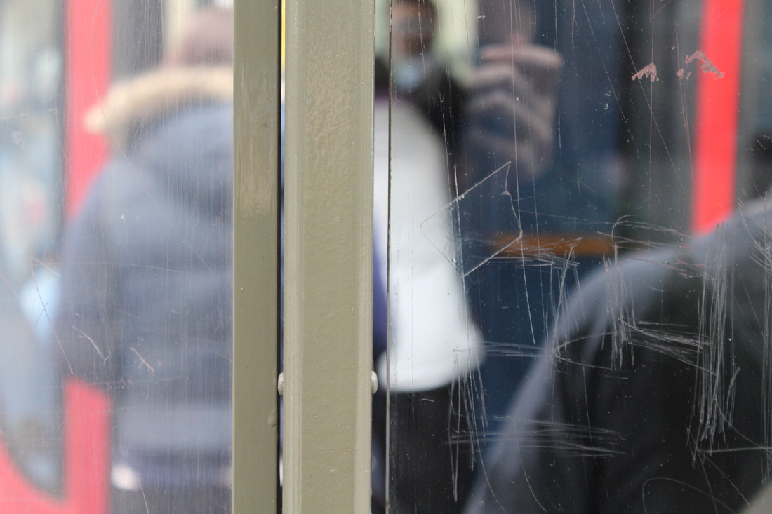
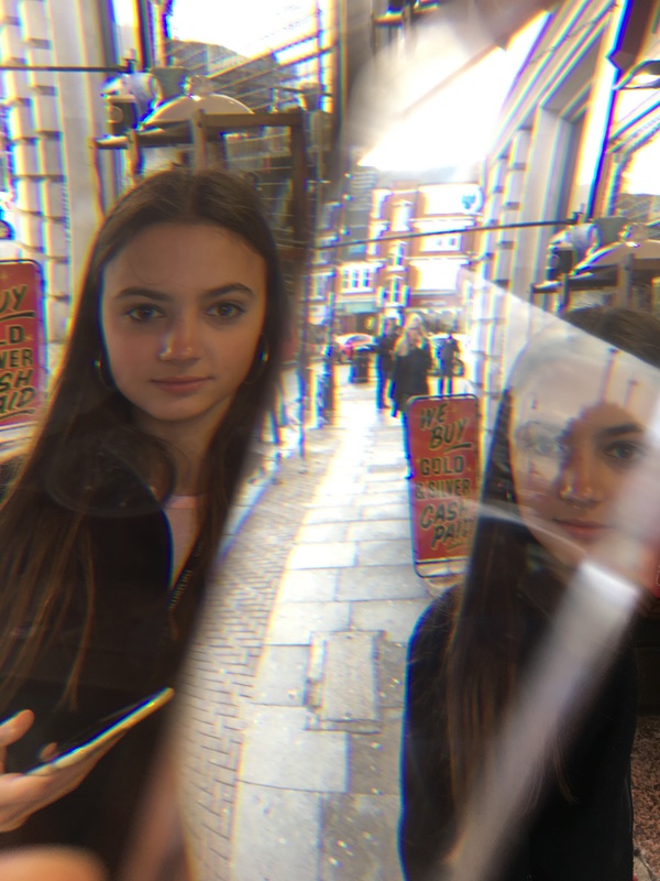
Saul Leiter
Saul Leiter was an American photographer and painter, one of his focuses was street photography. He took photographs through rainy car windows and fogged up glass to only give a glimpse of the people he photographed, the focus of the image allows those looking at the photo to create there own impression of those they are viewing, and also displays the barrier between the photographer and the subject. Contextually, Leiter lies between modernism and post modernism. With his photographic career stemming from the 40's; visually his imagery is formatted in a documentary style, yet with closer expectation we see themes of alienation and isolation.
|
|
|
The first photograph creates a eerie and mysterious effect, due to the lack of context through the use of the misted glass, as well as the lack of range in its colour palette. Furthermore, the offset subject gives and unsettling atmosphere to the image due to the unconventional angle that is very unseen in portrait photography. The composition of the second image, presents order within chaos. Initally we see that the photograph has been taken in a economically stable area, with a crowd of people going to work. The photographer then mirrors this creating a compositionally harmonious image, with the grid like format, as the black lamppost performing as a masculine divide as well as the contrast of the bright white buildings and the stark black umbrella's. Yet this is opposed with the sea of black umbrellas and the one vibrant red umbrella, symbolising creativity in an otherwise controlled enviroment.
|
|
I went around my local area and took photographs through misted glass, mirrors and other transparent or reflective images to portray Leiter's message of the barrier between the photographer and the subject. I additionally did this with a clear crystal that produced a kaleidoscope effect. When taking these photographs I realised that the most effective images were composed when the subject was through two different materials so there was a clear separation between having a barrier and not.
|
|
|
|
|
|
|
|
I decided to slightly edit one of my responses to Saul Leiter as his images included a lot of contrasting bright colours. I tried to recreate this but felt that the contrasting made the subject look to orange toned so I thought of brightening the image also. I think that it has allowed the images to be more similar to Leiters, yet I have not reached my desired effect as the second/ edited images looks to dark and obviously edited whilst Saul Leiters look more natural and un edited.
|

|
|
Strand 1:
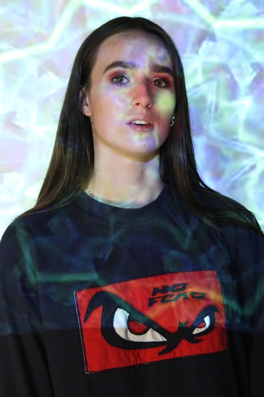
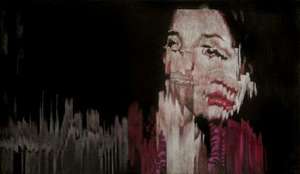
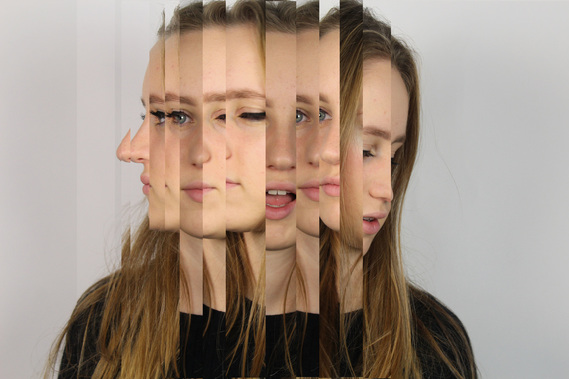
Jens Hesse
German painter Jens Hesse’s work is heavily influenced by digital malfunctions and distortions that finally create a flawed portrait image. Cleverly using corduroy fabric as the base material of her photography, Hesse creates fragmented images that are abstract and representational at once showing a glimpse of reality. Not only does her work exhibit how people depend on technology and how easily it can be damaged or fractured. It could also be seen to express many emotions and feelings within one individual as the layers represent who these people identify as. Many of her images have blank one colour background , highlighting the subject of the images. The subject attracts attention even more because the colours used as a background are quite banal and lack any emotion, the backdrops act more as a dissimilarity to the subject and there clothing. Although the subjects do merge across the majority of the image .
|
|
|
|
|
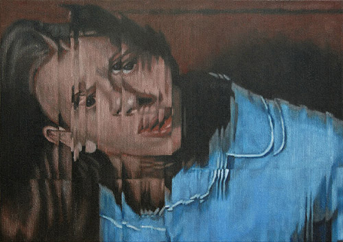
Whilst trying to recreate Jens Hesse's digital malfunction portraits, I changed my camera settings to a long shutter speed so that my subjects movements were all captured. I did some images in day light but this deemed to be ineffective as the split images did not created the desired effect. Next I used strobes lights in the dark room in addition to the long shutter speed, this again didn't created the desired effect as the images did not flow together. So I decided to create the 'digital malfunction' using photoshop.
|
|
|
|
|
Strand 2:
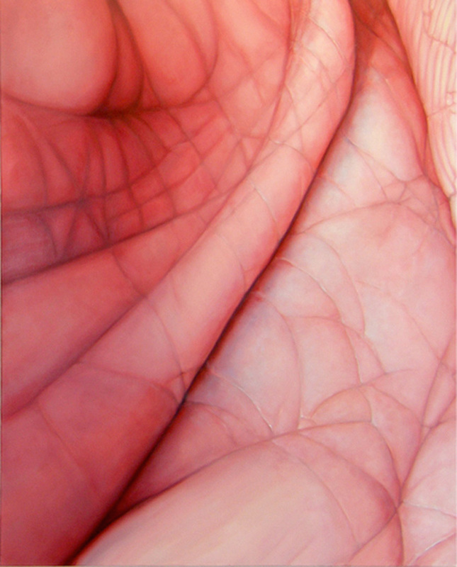
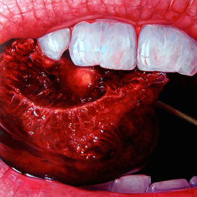
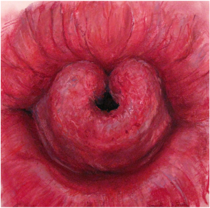
Edie Nadelhaft
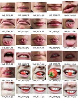
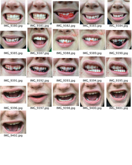
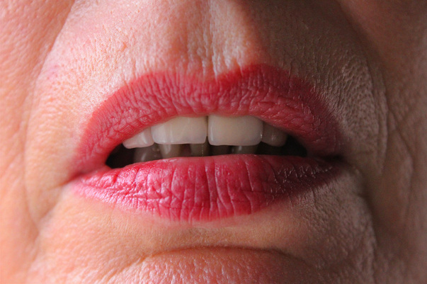
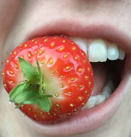
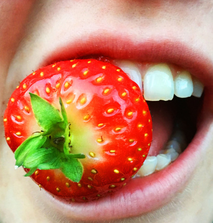
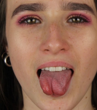
Edie Nadelhaft is a Manhattan-based painter and mixed media artist whose work is inspired by a fascination with the physical world and thoughtful consideration of the impact of digital culture on visual and sensual experience, she is an contemporary artist know for her bold,visceral oil paintings. Nadelhaft connects to abstraction to me as at a first glance her images are unclear to what exactly they are and what they represent yet at a more in depth look it is clear. Nadelhaft takes very up close paintings of many features but the moth interested me the most as peoples mouthes vary due to the many features that the mouth includes, such as teeth, tongue and lips. Yet I also decided to include the one photograph of the hands as the skin print is additionally very individual. One aspect of her images that I think is effective, is the use of saturation, as the bright red lips and cherry contrast with the either white bright teeth to the black inside of mouth.
|
|
|
|
|
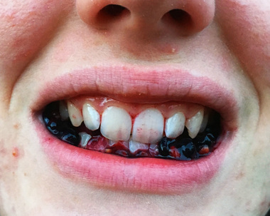
In my response to Edie Nadelhaft, I took many up close photographs of mouthes. I first asked the subjects to create different expressions with their mouthes. After this I involved strawberries and blackberries as they would bleed the juices in the mouth creating the contrasting red colours that Nadelhaft uses. After this I saturated the images further on photoshop, as this made the lips in the first image attention grabbing. I did this in the other images as well as it contrasted the pale skin tones and the red toned fruits and lips. Finally I used the brightening and contrasting tool to separate the skin and teeth to the mouth and fruit.
|
|
|
|
|
Strand 3:
Aaron Siskind
|
|
|
|
|
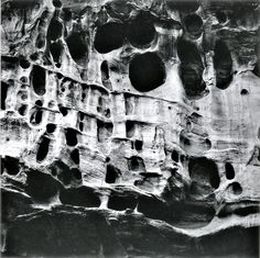
Aaron Siskind was an American photographer widely considered to be closely involved with, if not a part of, the abstract expressionist movement. In his biography, Siskind wrote that his interest in photography sparked when he received a camera for a wedding gift and started taking pictures on his honeymoon. Siskind bases his work on the details of both nature and architecture. He presents them as flat surfaces to create a new image out of them, which, he claimed, stands independent of the original subject. His work has often been described as crossing the line between photography and painting. Siskind was an active member of the New York Photo League. Working with that group he produced several significant socially conscious series of images in the 1930's. Among them, the 'Harlem Document' remains the most famous.
|
|
|
|
|
|
|
|
Chosen Strand:
Distorted Portraits
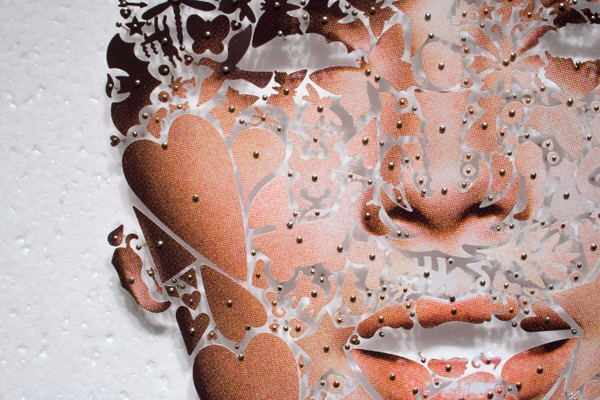
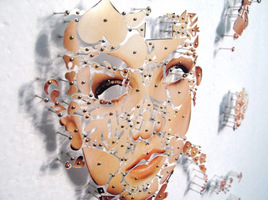
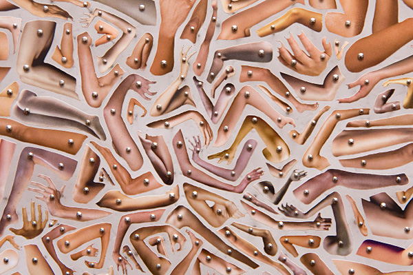
David Adey
David Adey uses carefully cut fragments of printed skin from the photographs of celebrities in popular magazines, to create elaborate, pinned collages. In some instances he reconstructs the original photos using component pieces cut into geometric shapes and symbols, each placed perfectly on the canvas with a single pin. Other times he creates giant whirling textures as with his piece Swarm, a process that can take up to 200-300 hours. His consept can be seen as recreating the human body with new shapes and patterns that represtent an individual. Much like Jens Hesses work the subjects irregualr features, and visible background through the eyes and mouth presents the subjects as empty. Potenitally displaying that the models within high fashion magazines loose their identity and mental makeup becasue of the materialistic surroudings and the unrealistic beauty standards. This process could be seen as the 'manual' photoshop, that people see in photographs everyday.
|
|
|
First Response - Distorted Portraits
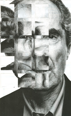
My first response to David Adey was to photograph simplistic portraits, print them out on A4 and using scissors and a Stanley knife cutting the portraits in to irregular shapes and sizes. Once this was done I replaces the cut out features in the order that the face would look naturally. But due to the gaps and some missing segments the faces that were at first very simplistic became distorted. My aim was to portray that without changing any features in particular faces looked both astray yet put together. Although, I was not completely fulfilled with the final picture as I thought that the background was too much of a feature in the images, especially as it was plain and banal and not expressing anything in particular or relating to the subject. Additionally, the subjects showed little emotion and so I felt as if the photographs had little meaning.

|
|
Second Response - Merging Features
|
From my first response, the idea came to me of merging two people togther from the cut out of the features. I did this in two ways, the first being cutting out only one portoirt and placing it on top off a printed out A4 creating a layered effect. The other by printing out both portraits, cutting them and layering them so that the features merge together. I felt as if this method was effective as it connected features with harsh lines, yet still produced a realistic face. Yet, it was hard to create an entire face with more that two people, especially without the majority of the face being from one person as the subjects had very different facial features, that became difficult to combine.
|
|
|
Third Response - 3D Distorted Portrait
The next method was to create a 3D distorted portrait, so that the different sections of the photograph were at different heights, this would then give an abstract image as it would be difficult to view the simple portrait as what it originally was. To do this I printed out a close up photographs of my subjects showing different emotion. Because these images were so close up it meant that the subjects emotion was very important because initially that is all that was visible. These photographs are shown below.
|
|
|
|
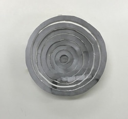
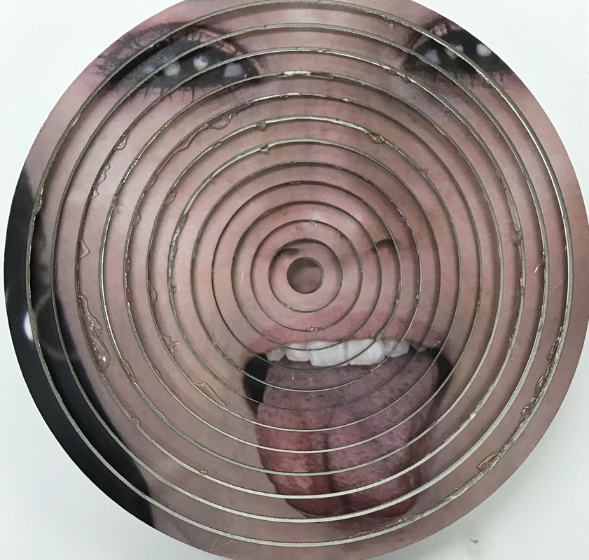
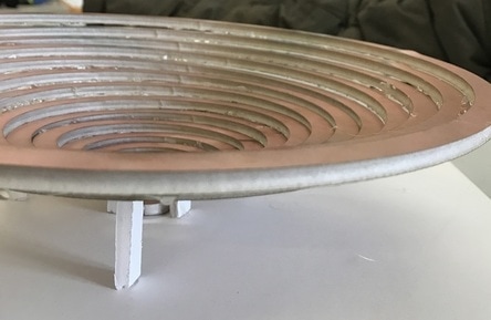
To create this effect I printed theses images out in black and white on A3, as I thought that the black and white would create more of an abstract effect and that the prints needed to be large so the effect was visible from afar. Once printed I spray mounted the photographs onto foam board and using a pencil and a compass created a ring effect on the last image. After this was complete, I used a Stanley knife to cut the rings out of the foam photo. Next, I cut three small legs for each ring to stand on as it got higher the legs would go up by 5mm, so that the next ring was taller creating an illusion like effect or a cone. I stuck the rings onto the cardboard background using a glue gun. Although this did create the effect I hoped as the cone effect was visible and the layers rose evenly the final outcome looked disorganised and non symmetrical because the cutting was done by hand. Additionally the photographs being in black and white made it to difficult to view the subjects features. Finally, I did not like this outcome as from a side view the legs were very visible and this made the image look messy and not perfectly complete as the illusion was ruined slightly but the visibility of what gave the cone effect. The photograph shows an incomplete version of the final result as it was not possible to finish due to the rings not connecting in size.
|
Interim Piece
|
As I chose to explore portirture in my project, I wanted to create a series of images that explored the idea of creating work that explored intangible emotions through photographing people. Because of this, I chose to explore adolescents, through photographing simple images of my peers with fun, vibrant poses, I then juxtaposed this with intricate collaging in order to give the idea of an optical illusion and three dimensional effect. This was done in order to try and convey the idea that teenagers are frequently conveyed as nothing more than what they get up to on the weekends however really, they are far more complex and that the emotions they show may additionally have more of a hidden meaning.
To create my this piece, I printed out the image above in colour on A3 and spray mounted them onto an A3 piece of foam board. Then to create perfect rings that fit within each other I used a laser cutter. I did this by writing into the computer that the piece of paper I was cutting was A3 and then measuring the amount of the face that I wanted to be in the final piece. Once this was complete, I found the centre of the area I wanted to use and added circles going up by a radius of 10mm each time to create the ring effect. After this, I cut the rings out with the ring cutter and started to assemble the cone like shape. I placed the first and smallest ring in the centre of the card and using a glue gun raised the layers onto of each other, with the occasional stand underneath so that the cone was stable. |
|
Gordon Magnin
|
|
|
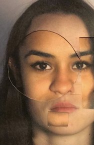
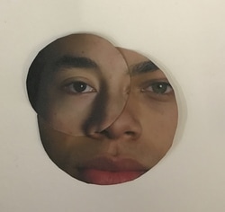
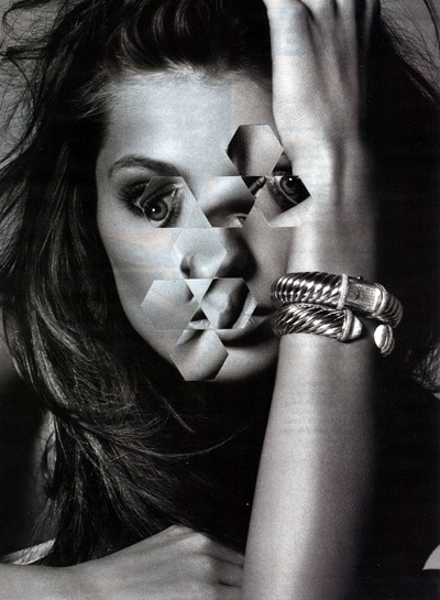
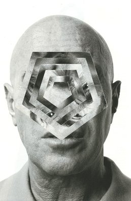
Gordon Magnin is a Los Angeles based artist who advances simplistic portrait images into geometrical illusions. The photographs are particularly compelling as the faces within many of his pieces are still visible and easy to identify. The method he uses to create this type of photography is by cutting small main features out of the subject and placing them in the incorrect position, or as he has done in the last image rotating rings of a pentagon. His images challenges the intended objective, interpretation, and significance of our daily views of celebrity, advertising, and consumer based images.
Gif Response

I created a gif to respond to Gordon Magnin's geometric portraits and I thought it showed the process of his images. To do this I cut out segments of my original image spun them 90 degrees and continued this method until I got to the centre of the face, I then saved each frame for 0.1 seconds and looped them to show both the simplistic portrait and the geometric and illusional portrait. Yet I was not completely fulfilled with this gif as it looked very simplistic and the squares did not fit into the image perfectly.
Fourth response - Distortion of beauty in a gif
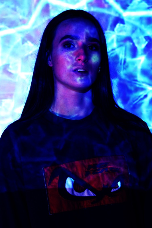
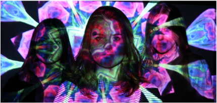
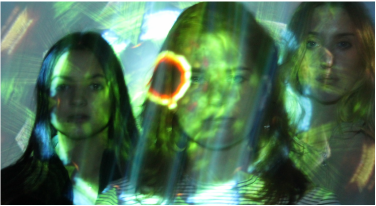
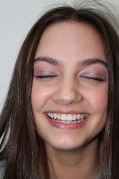
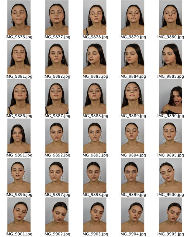
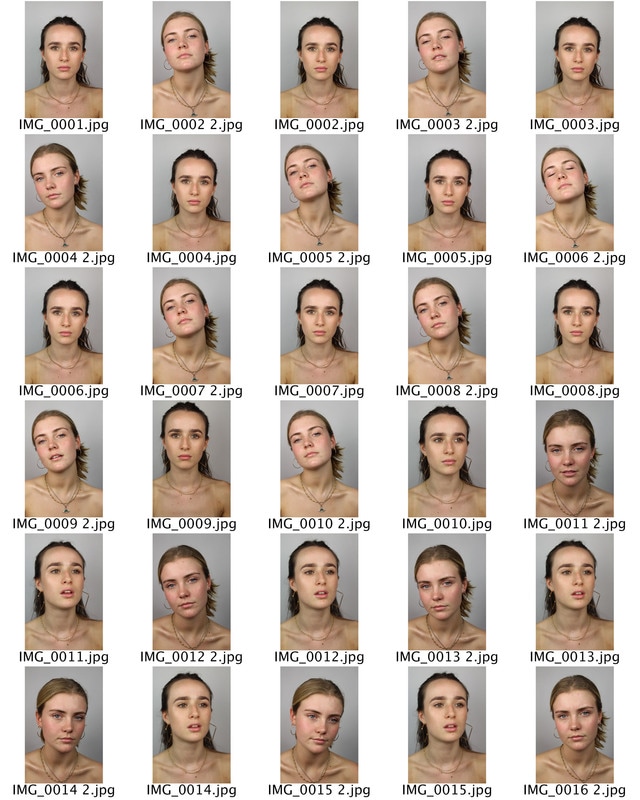
Next, I have decided to develop Gordon Magnins dismantled portraits. But portray, how society has an ideal standard of beauty especially for women.I wanted to challenges this ideal and unrealistic beauty standard and prove that there is much more to the face that what initially meets the eye with these photographs. To do this I have, taken close up portraits of girls below with subtle glossy makeup adding a sheen to their skin and particular features. This was effective as the gloss caught the light, and portrayed truth within beauty as light reveals. People trust their eyes more than any sense except maybe touch. We are so confident in the power of sight to reveal the truth. So the light reflecting of the skin of the subjects, juxtaposes with the unrealistic standards of beauty that are false and not feasible. Additionally the rest of the makeup on the subjects skin was subtle or non existent to make this feature of the photograph stand out further.
|
|
|
|
|

|
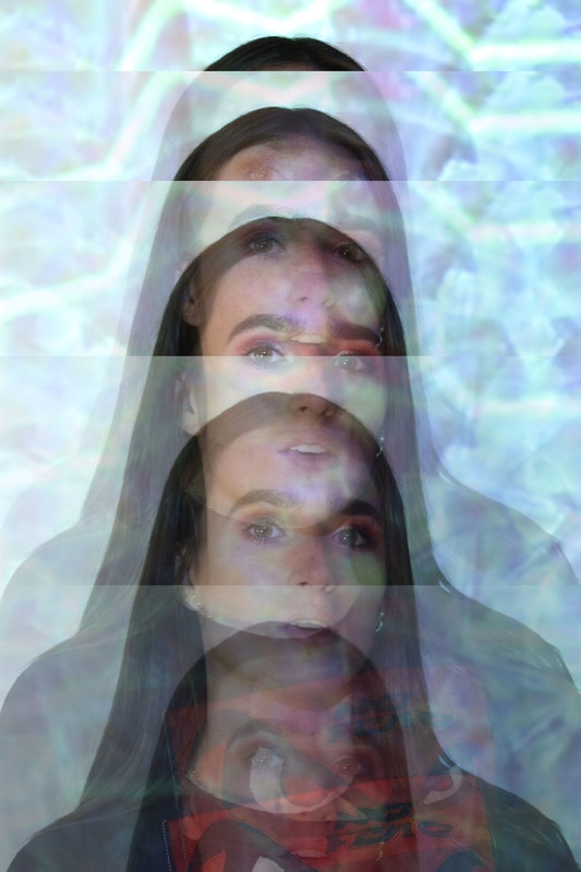
I created a gif for the next stage of my development. I did this by inserting the image on the right into photoshop and using elliptical marquee tool to cut out circles from the image and turned them 90° Clockwise. I did this by copy and pasting the new round images onto the background photograph. I repeated this process fifteen times. Once this was complete I turned all of the saved images into a gif by pressing 'File' then, 'Scripts' and finally 'Load Files into Stack' and uploaded all of the images onto 'Timeline' and timed in for 0.1 seconds. Then, I reversed the gif I had already made so that the gif flowed in a cycle of the addition of circle until the final result back to the original photo.
The result is effective as it shows the transition and process within making the gif. Additionally it also covers the subjects entire face, connecting to the distortion of beauty as the slow shift of the subjects facial features become more and more distorted. The use of the circles is additionally effective as, circle's are universal symbol with extensive meaning. It represents the notions of totality, wholeness, original perfection and timelessness. With the connection to original perfection, the shifting of the image juxtaposes the shape that often is associated with perfection and faultlessness into a more askew image. Yet I felt that the rest of the gif was too bare and did not have movement within the background or of the subjects chest. Additionally, I think that I should have more images and more subjects of different skin tones, hair colours, ethnicities and body shapes as this is a large part of societies and medias ideals of beauty. With the different subjects I could challenge this one image of beauty.
The result is effective as it shows the transition and process within making the gif. Additionally it also covers the subjects entire face, connecting to the distortion of beauty as the slow shift of the subjects facial features become more and more distorted. The use of the circles is additionally effective as, circle's are universal symbol with extensive meaning. It represents the notions of totality, wholeness, original perfection and timelessness. With the connection to original perfection, the shifting of the image juxtaposes the shape that often is associated with perfection and faultlessness into a more askew image. Yet I felt that the rest of the gif was too bare and did not have movement within the background or of the subjects chest. Additionally, I think that I should have more images and more subjects of different skin tones, hair colours, ethnicities and body shapes as this is a large part of societies and medias ideals of beauty. With the different subjects I could challenge this one image of beauty.
|

|
Chosen Images
|
|
|
|
|
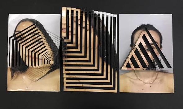
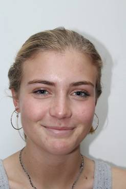
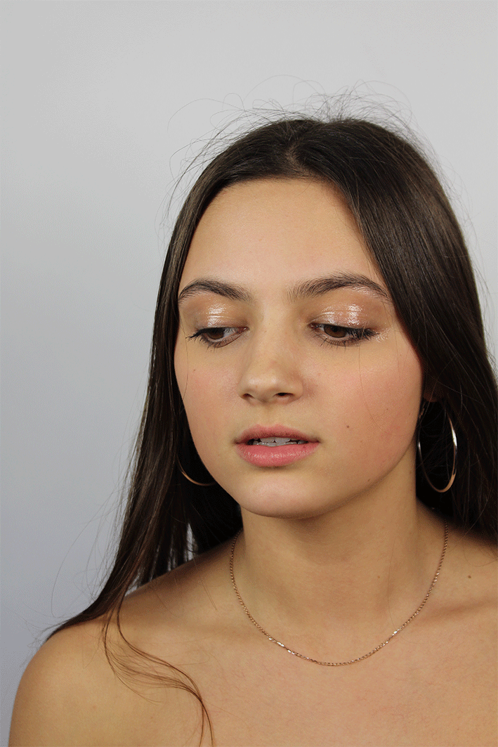
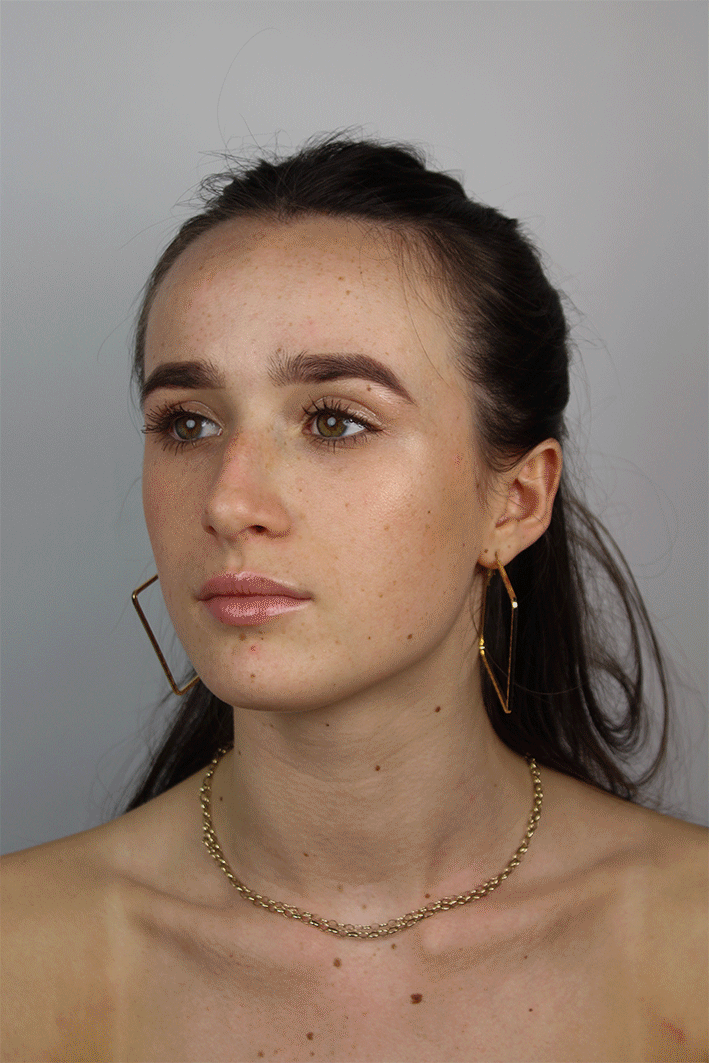
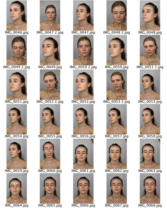
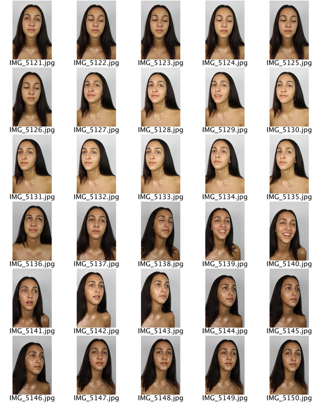
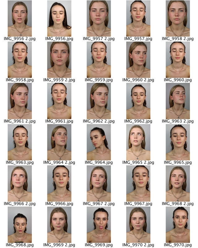
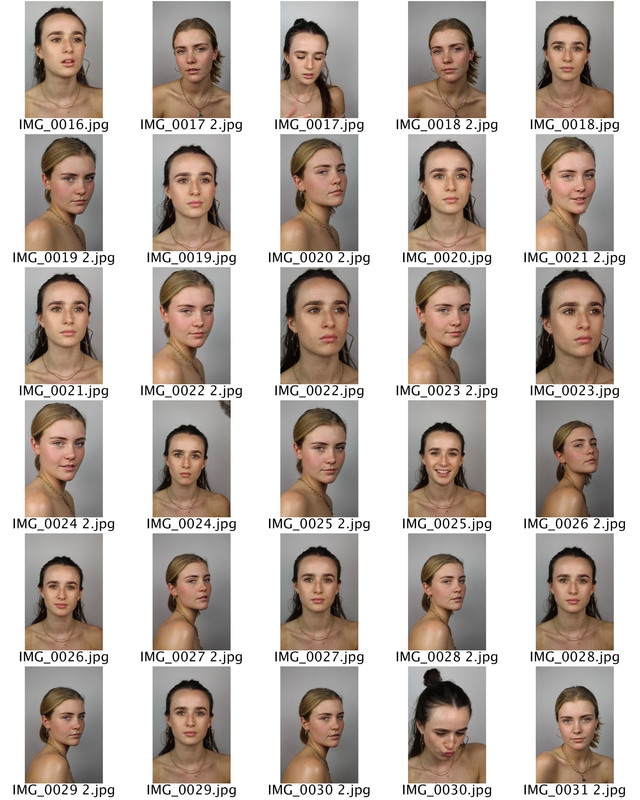
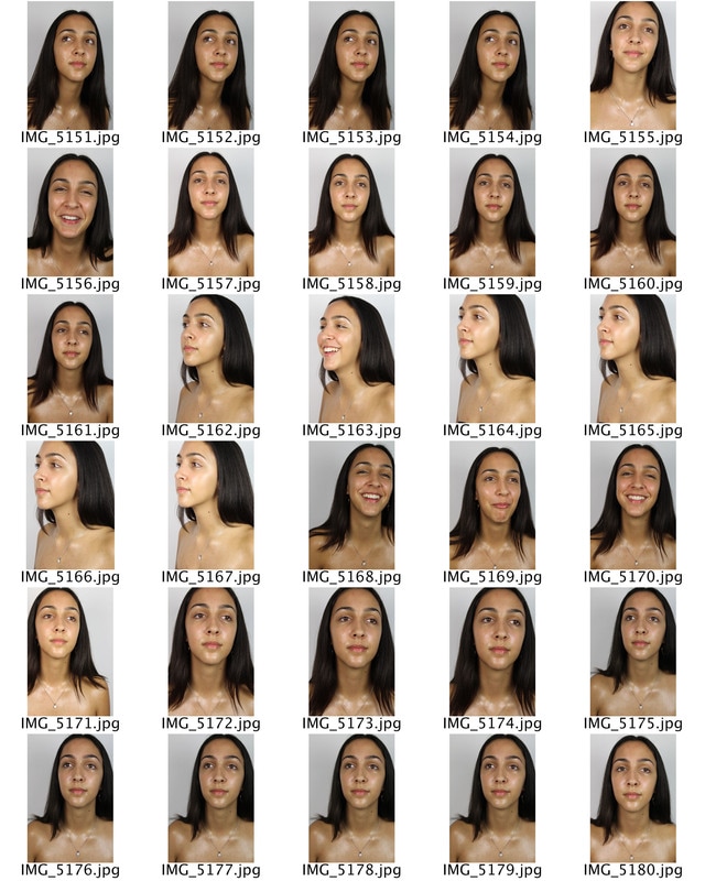
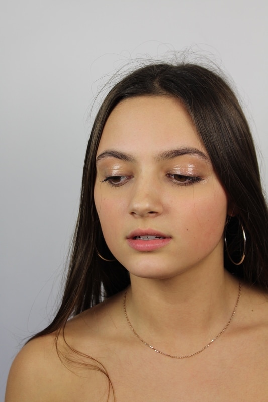
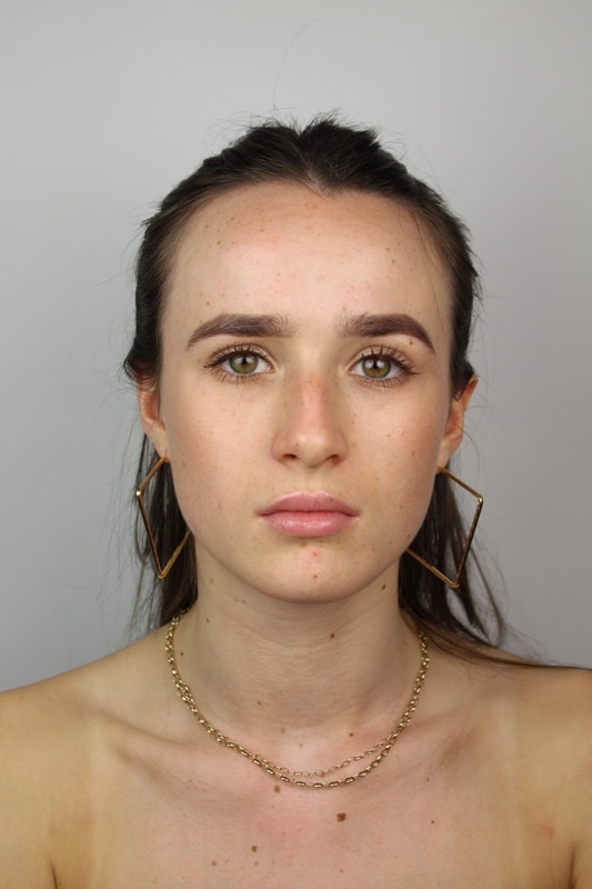
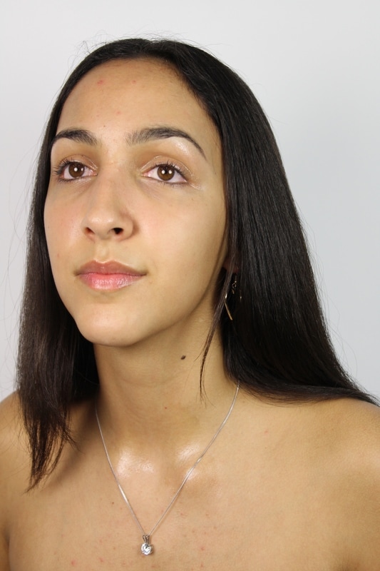
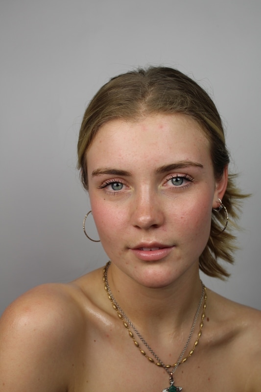
I selected these images as all of the subjects seem nude, and therefore vulnerable. This has connotations to the stereotypical female whom is a damsel in distress. The wearing of minimal makeup further removes a mask for women removing unrealistic beauty standards and allowing flaws to be present within the images such a moles and spots. Within the images I aimed to combat the view that girls are weak. Yet all of the women within the images are wearing jewellery. Choosing jewelry that holds a meaning is both sentimental and historic, as the jewellery may have a past. Many of the necklaces worn by the girls used to be their mothers alluding to an idea or to communicate to others the values that you hold in a concise, visual fashion. The final addition I made to the images was the use of petroleum jelly, to create a gloss and shine to particular features of each individual. The use of this product highlighted particular features as it was reflected in the light. I tried to differ the significant feature from each portrait, whilst also applying it to parts of the female body that are often sexualised such as collar bones. To raise further awareness of how girls are portrayed especially within the media.
As a way of visually make a comment on sexism, I distorted the portraits showing how distorted the perception of beauty is along with how society and especially secondary socialising agents such as the media portray and treat women.
I printed my images with a gloss so that the shine from the petroleum jelly was further prominent on the images. Next I spray mounted them onto a piece of black foam board and cut around the border in a diagonal so that they seem almost as if they were floating. Then to create the further distortion of the images I used a programme called 2D design, I measured my photographs and put them into the measurements into my computer so that the computer knew the size of the image that was being cut out. I then created four separate templates for each individual, hexagons on one, equilateral triangles on another, circles and rectangles. Once I had made the four templates and shapes that grew larger in size I placed them into a laser cutter at the upper left position. This cut through the image creating perfect and symmetrical shapes, that cannot be made with the human eye. This was then repeated twice as the laser cutter was not strong enough to cut through both the image and the foam board as it wasn't hot enough, yet if it was any hotter the paper would burn. This created the different cut outs of the images.
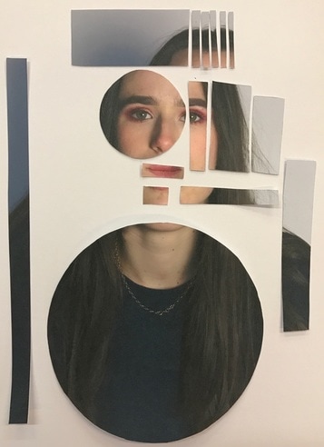
To present my work I had an idea of leaving it as a activity for whom ever see's the images. The photographs can me moved onto one and other and moved within themselves due to the shapes. Allowing whom ever views the image to create their own distortion of beauty. Furthermore the freedom that the viewer of the images have to change the images (which is often very unlikely in many exhibitions due to do not touch signs) makes the photographs both more personal and meaningful. It shows that sexism can be fixed as easily as ordering a image, it is just how one decides to order it and what they want the final outcome to be.
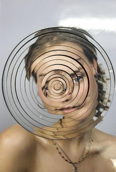
I later realised that the loose strips may be interactive but also have the opportunity to be distributed. So with the circular portrait I left it loose allowing those at the exhibition to create something else within the photograph. Yet for the hexagon, rectangle and triangle, I layered them on top of each other so that some of the face was visible creating a optical illusion like effect.